Vision
Design Style
Fonts
Font Family
font-family: sans-serif;Lettercase
Title Case
All Headings are in Title Case
Initial Caps
Sentence Case
Plain text is in sentence case (first word capitalised only).
All Caps
Widget titles, customer-created values that are all caps or well-known acronyms are the ONLY permissible use of all caps. Acronyms should be defined using the full words for the first instance on a page or in content, from then on they can be used as simple acronyms throughout the rest of the page.
L2M (Lead 2 Money)
Font Size
Font size should start with the browser default of 1em and increment in "minor thirds" or a ratio of 1.2:1. Only use relative CSS em font sizes to handle setting variations in size. Additionally, semantic markup like <strong> rather than <b> should be used. Otherwise, structural markup appropriate for the content (e.g. H1, H2, H3, etc.) should be relied on to provide the size and weight for text.
H1 - font-size: 1.728em; color: #364ca0;
H2 - font-size: 1.44em; color: #364ca0
H3 - font-size: 1.2em; color: #47484a
H4 - font-size: 1.0em; color: black;
H5 - font-size: 1.0em; color: black; font-weight: bold;
strong - font-size: 1.0em; color: black;
em - font-size: 1.0em; color: #636466;
<p>p</p>
<H1 class="cald_header">H1</H1>
<H2 class="cald_header">H2</H2>
<H3 class="cald_header">H3</H3>
<H4 class="cald_header">H4</H4>
<H5 class="cald_header">H5</H5>
<strong>strong</strong>
<em>em</em>
body {
background-color: white;
color: rgba(99,100,102,1.0); /* #636466 */
font-family: sans-serif;
}
h1, h2, h3, h4, h5, h6, strong, dt {
text-decoration: none;
}
strong, dt {
color: black;
}
h1.cald_header, h2.cald_header, h3.cald_header, h4.cald_header {
margin: 0px 0px 10px 0px;
color: #47484a !important;
border-bottom: solid 1px #bfbfbf;
background: none;
background-color: white !important;
background-image: none;
}
/* Font sizes are minor thirds with a 1em base */
h1.cald_header {
background-color: black;
margin: -10px -10px 10px -10px;
font-size: 1.728em;
padding: 2px 2px 2px 0px;
color: rgba(54,76,160,1.0) !important;
}
h2.cald_header {
background-color: #00A8E3;
margin: -10px -10px 10px -10px;
font-size: 1.44em;
padding: 4px 4px 4px 0px;
color: rgba(54,76,160,1.0) !important;
}
h3.cald_header {
background-color: #d9d9d9;
color: black !important;
margin: -10px -10px 10px -10px;
font-size: 1.2em;
padding: 7.75px 7.75px 7.75px 0px;
}
h4.cald_header {
color: black !important;
border-bottom: solid 1px #bfbfbf;
margin: -10px -10px 10px -10px;
font-size: 1.0em;
padding: 10px 10px 10px 0px;
}
h5.cald_header {
background-color: #f3f3f3;
color: black !important;
font-size: 1em;
margin: 0px 0px 10px 0px;
font-weight: bold;
}
.cald_bkgd > .cald_content > h1.cald_header, .cald_bkgd > .cald_content > h2.cald_header, .cald_bkgd > .cald_content > h3.cald_header, .cald_bkgd > .cald_content > h4.cald_header {
margin: 0px 0px 10px 0px;
padding: 0px 0px 0px 0px;
}Text Alignment
Currency, decimals and percentages should be aligned right to the decimal or smallest integer. All other text should be left-aligned
| Name | Date | Attainment % | Sales in USD |
|---|---|---|---|
| String Name | 01/01/2016 | 1000% | $10,000.00 |
| String Name | 01/01/2016 | 1% | $100.00 |
| String Name | 01/01/2016 | 0% | $1.00 |
| String Name | 01/01/2016 | 100% | $1,000.00 |
<table class="cald_table cald_alternate cald_banded" style="width: 100%;">
    <tr class="cald_tr_heading ">
        <th>Name</th>
        <th>Date</th>
        <th class="cald_currency">Attainment %</th>
        <th class="cald_currency">Sales in USD</th>
    </tr>
    <tr class="cald_tr_cells cald_odd">
        <td>String Name</td>
        <td>01/01/2016</td>
        <td class="cald_currency">1000%</td>
        <td class="cald_currency">$10,000.00</td>
    </tr>
    <tr class="cald_tr_cells cald_even">
        <td>String Name</td>
        <td>01/01/2016</td>
        <td class="cald_currency">1%</td>
        <td class="cald_currency">$100.00</td>
    </tr>
    <tr class="cald_tr_cells cald_odd">
        <td>String Name</td>
        <td>01/01/2016</td>
        <td class="cald_currency">0%</td>
        <td class="cald_currency">$1.00</td>
    </tr>
    <tr class="cald_tr_cells cald_even">
        <td>String Name</td>
        <td>01/01/2016</td>
        <td class="cald_currency">100%</td>
        <td class="cald_currency">$1,000.00</td>
    </tr>
</table>

<p>
    <label>Decimal Input</label><br>
    <input class="form-control cald_currency" style="width:10em;" value="0.00">
</p>
.cald_currency {
text-align: right;
}Colors
Base Palette
#364ca0
#636466
#FFFFFF
#00abe3
#f7941d
UI Color Palette
Bold text
Mobile select
Plain text
Disabled text
Border lines
Mobile text
Grid rows
Page margin
Heading text
Link
text
Hover
Selected column
Selected row
Reserved Status Colors
Error text
Error no text
Error chart
Warning text
Warning no text
Warning chart
Success text
Success no text
Success chart
Reserved Chart Data Visualization Colors
Lines, bars and ring sections
1
2
3
4
5
6
7
8
9
10
11
12
13
14
15
16
Areas and pie slices
1
2
3
4
5
6
7
8
9
10
11
12
13
14
15
16
Iconography
Iconography should be flat, solid color. It's recommended to start with the Icomoon library. (Reference information on the Icomoon web site.) The Font-Awesome web fonts should be used also, to support progress indication. The default Bootstrap icon library is possible as well. Pay careful attention to file names and only use icons exactly as originally intended by the file names. If an icon for a feature peculiar to Sales Management cannot be found in the library, based on file name not image, then a custom icon will need to be created with a new, unique visual metaphor for the purpose. AVOID using social media emojis / smileys.
font-size: 1.0em;
font-size: 1.2em;
font-size: 1.44em;
font-size: 1.728em;
<head>
        <link rel="stylesheet" type="text/css" href="css/font-awesome.min.css">
        <link rel="stylesheet" type="text/css" href="css/bootstrap.min.css">
        <link rel="stylesheet" type="text/css" href="fonts/icomoon/style.css">
</head>
<body>

	ICOMOON:
	<span class="icon-name"></span>

	BOOTSTRAP:
	<span class="glyphicon glyphicon-name"></span>

	FONT AWESOME:
	<i class="fa fa-name"></i>

</body>
This is the complete set. Not all icons seen here should be used in products. Icons that have been standardized for particular use are highlighted in this color. Hover over the icon for usage details. Do not use icons marked in red without consulting UX and Legal.
Product Logos
There are 10 scaled images per product per type of logo. 3 for Apple devices (@2x, @3x, @4x), 5 for Android devices (ldpi, mdpi, hdpi, xhdpi, xxhdpi, xxxhdpi) and 1 SVG. The mdpi file is the original 1x size of the logo.
- Use stroke images for dashboards and entry points where a boundary around the logo will be provided by the context (e.g. in a widget frame or within a listing).
- Use black and white images within applications where logo colors would otherwise disrupt highlighting of selections, traffic lighting status colors and notification colors.
- Use circle images where a self-contained frame or border/margin is needed around logo, like on a dashboard or in a reports listing.
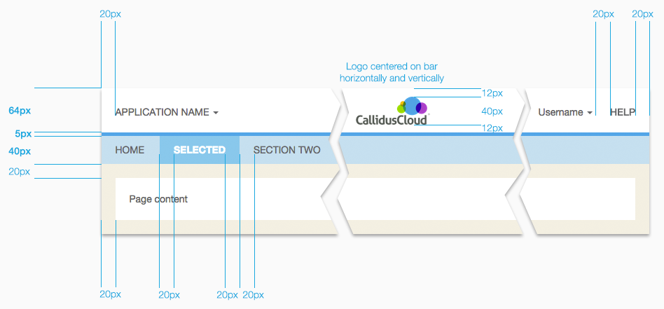
Layout
The top header section is global CallidusCloud navigation and actions. The top left navigation is reserved for switching between applications in the Lead To Money suite. The top right is reserved for help contents and profile management of the currently logged in user.
Everything should be laid out on a 5-pixel grid as much as possible. Margins and padding for the page should be 20 pixels, major content areas should be either 10 or 20 pixels to separate sections of text. Margins need to be set so that there is never more than a 20-pixel combined margin around content areas. Content should never be placed in the margin area, it is only to be used for spacing between content sections.
Heading
Page contentMargins vs Borders
Margins
Use margins to delineate sections that are loosely related. For example, interaction in one panel will not affect the contents of the other.
Role: administrator
Members: 15
Lead: Soandso
Assistant: Moe
Member: Joe
| From | Subject |
|---|---|
| person@example.com | RE: subject line of email |
| person@example.com | RE: subject line of email |
| person@example.com | RE: subject line of email |
Borders
Use lines or borders to delineate sections that are closely related. For example, interaction in one section will update the other.
| Territory Name |
|---|
| Executive |
| Manager |
| Manager2 |
| Sales |
| Sales2 |
| Manager3 |
Header Bars
Default Header Bar
Each button/link loads a pageHeader With Submenus
Menu categories instead of page linksTertiary Bar
For contextual search or other page-level capabilitiesNo Submenus
Typically used for mobileEmbedded
Embedded in a 3rd Party Product
No change to the Callidus colors or branding. The three-dot overflow menu handles the user profile and help menu links that would have been in the heading.

3rd-party Product Heading
Callidus content
Remove the css box-shadow from.cald_contentwhen embedded in other products. Override with
box-shadow: none;
Embedded in Salesforce Lightning UI
Note the blue border on the top of Callidus content areas is dropped when seen within Lightning, since Lightning has the blue line at the bottom of their menu system, creating that same division. There is also deeper menu system integration. The tabs drop to expose the Callidus product menus (as opposed to simply embedding a headless version of the product in an iframe.
Embedded in a 3rd Party Product and Co-branded
Basic color changes to match the parent application. Monochrome Callidus logo (if allowed) to keep Callidus brand but not disrupt parent applcation.
3rd-party Product Heading
Callidus content
Remove the css box-shadow from.cald_contentwhen embedded in other products. Override with
box-shadow: none;
Embedded in Another Callidus Product
The blue menu system is the embedded product. The white header, including the dark blue line, is the parent application.
<header class="cald_header">
    <div class="cald_header">
        <div class="cald_left cald_app_name">
            Application Name <span class="caret"></span>
        </div>
        <div class="cald_logo" id="cald_logo"></div>
        <!-- this ends up on the far right -->
        <div class="cald_right cald_help_link">Help</div>
        <div class="cald_right">Username <span class="caret"></span></div>
    </div>
</header>
<header class="cald_header_ribbon"></header>
<nav class="cald_header">
    <ul class="nav nav-pills">
      <li role="presentation" class="cald_header_menuitem">Home</li>
      <li role="presentation" class="cald_header_menuitem_selected">Selected Page</li>
      <li role="presentation" class="cald_header_menuitem">Page Two</li>
    </ul>
</nav>
header {
text-align: center;
padding: 0px;
min-height: 60px;
vertical-align: middle;
background-color: white;
z-index: 1000;
width: 100%;
border-bottom: none;
height: 60px;
}
.cald_header_ribbon {
background-image: linear-gradient( 90deg, #fab423 0%, #94c84a 25%, #00a7e0 50%, #00ABE3 60%, #364CA0 80%, #904D9E 90%, #a96dae 100% );
background-repeat: no-repeat;
background-size: contain;
min-height: 5px;
max-height: 5px;
height: 5px;
width: 100%;
}
header.cald_header {
position: static;
}
header.cald_header.cald_mobile {
position: static;
/*height: 32px;*/
height: 35px;
min-height: 35px;
}
header.cald_pinned {
position: fixed;
top: 0px;
left: 0px;
z-index: 1000;
width: 100%;
background-color: white;
transition: top 0.0s linear;
}
div.cald_header {
position: relative;
}
nav.cald_header {
height: 40px;
min-height: 5px;
width: 100%;
z-index: 1000;
margin: 0px;
padding: 0px;
position: static;
background-color: white;
color: #636466;
}
nav.cald_header.cald_pinned {
position: fixed;
top: 64px;
left: 0px;
z-index: 1000;
width: 100%;
transition: top 0.0s linear;
}
.cald_logo {
background-color: transparent;
background-image: url("../img/CallidusCloud_logo_product_dark.png");
background-position: center;
background-repeat: no-repeat;
background-size: contain;
height: 40px;
width: 117px;
display: inline-block;
position: absolute;
top: 50%;
left: 50%;
margin: 10px 10px 10px -58px;
}
.cald_left {
float: left;
padding: 20px 0px 20px 20px;
}
.cald_right {
float: right;
padding: 20px 20px 20px 0px;
}
.cald_mobile .cald_logo {
/*height: 33px; */
height: 25px;
margin: 5px 0px 0px -52px;
}
.cald_mobile .cald_left {
padding: 10px;
}
.cald_mobile .cald_right {
padding: 10px;
}
.cald_header_menuitem {
height: 40px;
margin: 0px;
padding: 10px 20px;
border: none;
text-align: center;
vertical-align: middle;
}
.cald_header_menuitem_selected {
height: 40px;
padding: 10px 20px;
border: none;
text-align: center;
vertical-align: middle;
font-weight: bold;
background-color: white;
border-bottom: solid 2px rgba(0,171,227,1.0);
color: black;
}
.cald_header_menuitem_hover {
height: 40px;
margin: 0px;
padding: 10px 20px;
border: none;
text-align: center;
vertical-align: middle;
/*color: #636466;*/
font-weight: bold;
position: relative;
background-color: white;
color: black;
}Headings
Page content needs to be visually prioritized based on frequency of use, or average duration of use per session, or sequence of tasks within a user's workflow. To aid in this, there are primary, secondary, tertiary styles. View an example of all these styles applied.
There should only be one primary section per page. Avoid more than one secondary heading also. There shouldn't be more than 2-3 tertiary headings. Use the alternate heading for any additional sections. The subsection is for callout panels, details, explanations, etc.
Primary Heading
Primary content
Secondary Heading
Secondary content
Tertiary Heading
Tertiary content
Alternate Heading
Additional content
Subsection Heading
Subsection / details
<h1 class="cald_header">Primary Heading</h1>

<h2 class="cald_header">Secondary Heading</h2>

<h3 class="cald_header">Tertiary Heading</h3>

<h4 class="cald_header">Alternate Heading</h4>

<div class="cald_subsection">
    <h5 class="cald_header">Subsection Heading</h5>
</div>
h1, h2, h3, h4, h5, h6, strong, dt {
text-decoration: none;
}
.alert-danger h1, .alert-danger h2, .alert-danger h3, .alert-danger h4, .alert-danger h5, .alert-danger h6, .alert-danger strong {
color: #a94442;
border: none;
margin-top:0px;
}
.alert-warning h1, .alert-warning h2, .alert-warning h3, .alert-warning h4, .alert-warning h5, .alert-warning h6, .alert-warning strong {
color: #8a6d3b;
border: none;
margin-top:0px;
}
.alert-info h1, .alert-info h2, .alert-info h3, .alert-info h4, .alert-info h5, .alert-info h6, .alert-info strong {
color: #31708f;
border: none;
margin-top:0px;
}
h1>a[name], h2>a[name], h3>a[name], h4>a[name], h5>a[name], h6>a[name],
h1>a[name]:hover, h2>a[name]:hover, h3>a[name]:hover, h4>a[name]:hover, h5>a[name]:hover, h6>a[name]:hover,
h1>a[name]:active, h2>a[name]:active, h3>a[name]:active, h4>a[name]:active, h5>a[name]:active, h6>a[name]:active {
color: black;
text-decoration: none;
}
h1:not([class="cald_header"]), h2:not([class="cald_header"]) {
color: rgba(54,76,160,1.0);
margin-top: 10px;
}
h3:not([class="cald_header"]) {
color: #47484a;
margin-top: 10px;
}
h1.cald_header, h2.cald_header, h3.cald_header, h4.cald_header {
margin: 0px 0px 10px 0px;
color: #47484a !important;
border-bottom: solid 1px #bfbfbf;
background: none;
background-color: white !important;
background-image: none;
}
/* Font sizes are minor thirds with a 1em base */
h1.cald_header {
background-color: black;
margin: -10px -10px 10px -10px;
font-size: 1.728em;
padding: 4px 2px 2px 0px;
color: rgba(54,76,160,1.0) !important;
}
h2.cald_header {
background-color: #00A8E3;
margin: -5px -10px 10px -10px;
font-size: 1.44em;
padding: 3px 4px 2px 0px;
color: rgba(54,76,160,1.0) !important;
}
h3.cald_header {
background-color: #d9d9d9;
color: black !important;
margin: -5px -10px 10px -10px;
font-size: 1.2em;
padding: 6px 5px 4px 0px;
}
h4.cald_header {
color: black !important;
border-bottom: solid 1px #bfbfbf;
margin: -3px -10px 10px -10px;
font-size: 1.0em;
padding: 7px 10px 5px 0px;
}
h5.cald_header {
background-color: #f3f3f3;
color: black !important;
font-size: 1em;
margin: 0px 0px 10px 0px;
font-weight: bold;
}
.cald_bkgd > .cald_content > h1.cald_header,
.cald_bkgd > .cald_content > h2.cald_header,
.cald_bkgd > .cald_content > h3.cald_header,
.cald_bkgd > .cald_content > h4.cald_header {
margin: 0px 0px 10px 0px;
padding: 0px 0px 0px 0px;
}
.cald_subsection {
background-color: #f3f3f3;
padding: 10px;
margin: 0px;
}Grids
Like sections of a page, grids and lists need to be visually prioritized based on frequency of use, or average duration of use per session, or sequence of tasks within a user's workflow. To aid in this, there are primary, secondary, tertiary grid styles.
Grid With A Toolbar
Reserve a row space for toolbar actions and filters. Use text for actions as much as feasible. For very common operations that have a well-known metaphor, an icon button is acceptable. If an action will be used frequently, then it should be a text-based button to make it a larger target, possibly style it as a primary action if that is the case.
Page Heading Used as Grid Heading
Heading
Heading
Heading
Non-banded row
Data cell
Data cell
Banded row
Data cell
Data cell
Non-banded row
Data cell
Data cell
Banded row
Data cell
Data cell
Hover row
Data cell
Data cell
Selected row
Data cell
Data cell
Grid Sort Indication
Sorted indicator persists. Sortable icon only shows on hover or selection.
<table class="cald_table cald_alternate cald_banded uig_table">
    <tr class="cald_tr_heading ">
        <th>
            Sorted  <a href="javascript:void(0);" class="sort_icon"><span class="icon-arrow-down4"></span></a>
        </th>
        <th onMouseOver="$('#can_sort').show();" onMouseOut="$('#can_sort').hide();">
            Sortable <a href="javascript:void(0);" class="sort_icon" id="can_sort" style="display:none;"><span class="icon-arrow4"></span></a>
        </th>
    </tr>
. . .
</table>
.sort_icon {
margin-left: 1em;
}Grid Selection
Column hover is from the heading only. The column heading hover color sticks as the column heading selection color (This is an exception to the usage of the hover color). Row hover is anywhere on the row.
| Heading | Heading | Selected column | Heading |
|---|---|---|---|
| Non-banded row | Data cell | Selected column | Data cell |
| Banded row | Data cell | Selected column | Data cell |
| Selected row | Selected row | Selected column | Selected row |
| Hover | Hover | Hover | Hover |
| Selected row | Selected row | Selected column | Selected row |
| Selected row | Selected row | Selected column | Selected row |
| Non-banded row | Data cell | Selected column | Data cell |
| Banded row | Data cell | Selected column | Data cell |
text white;
Hover, selected column heading
text #636466;
Selected row cell
text #636466;
Selected column cell
<table class="cald_table cald_tertiary cald_banded">
    <caption></caption>
    <thead>
        <tr class="cald_tr_heading ">
            <th>Heading</th>
            <th>Heading</th>
            <th class="cald_selected">Selected column</th>
            <th>Heading</th>
        </tr>
    </thead>
    <tbody>
        <tr class="cald_tr_cells cald_odd">
            <td>Non-banded row</td>
            <td>Data cell</td>
            <td class="cald_selected">Selected column</td>
            <td>Data cell</td>
        </tr>
        <tr class="cald_tr_cells cald_even">
            <td>Banded row</td>
            <td>Data cell</td>
            <td class="cald_selected">Selected column</td>
            <td>Data cell</td>
        </tr>
        <tr class="cald_tr_cells cald_odd cald_selected">
            <td>Selected row</td>
            <td>Selected row</td>
            <td class="cald_selected">Selected column</td>
            <td>Selected row</td>
        </tr>
        <tr class="cald_tr_cells cald_even cald_hover">
            <td>Hover</td>
            <td>Hover</td>
            <td class="cald_selected">Hover</td>
            <td>Hover</td>
        </tr>
        <tr class="cald_tr_cells cald_odd cald_selected">
            <td>Selected row</td>
            <td>Selected row</td>
            <td class="cald_selected">Selected column</td>
            <td>Selected row</td>
        </tr>
        <tr class="cald_tr_cells cald_even cald_selected">
            <td>Selected row</td>
            <td>Selected row</td>
            <td class="cald_selected">Selected column</td>
            <td>Selected row</td>
        </tr>
        <tr class="cald_tr_cells cald_odd">
            <td>Non-banded row</td>
            <td>Data cell</td>
            <td class="cald_selected">Selected column</td>
            <td>Data cell</td>
        </tr>
        <tr class="cald_tr_cells cald_even">
            <td>Banded row</td>
            <td>Data cell</td>
            <td class="cald_selected">Selected column</td>
            <td>Data cell</td>
        </tr>
    </tbody>
</table>
/* Grid styles */
.cald_table th, .cald_table td {
padding: 5px 5px 4px 5px;
}
.cald_tr_heading, .cald_tr_cells {
border-bottom: solid 1px #bfbfbf;
padding: 5px 5px 4px 5px;
}
.cald_banded .cald_tr_heading, .cald_banded .cald_tr_cells {
border: none;
}
.cald_banded th, .cald_banded td {
border: none;
padding: 5px;
}
.cald_tertiary .cald_tr_heading {
background-color: #d9d9d9;
}
.cald_tertiary .cald_tr_cells {
}
.cald_tertiary.cald_banded .cald_tr_cells.cald_even {
background-color: #ececec;
}
.cald_tr_cells.cald_selected, .cald_selected, .cald_tr_cells.cald_odd.cald_selected, .cald_tr_cells.cald_even.cald_selected {
background-color: #fee1a9 !important;
color: #636466 !important;
}
td.cald_selected, .cald_tr_cells.cald_even td.cald_selected {
background-color: #fcd27e !important;
color: #636466 !important;
}
.cald_hover, .cald_tr_cells.cald_hover, .cald_tr_cells.cald_hover a, .cald_tr_cells.cald_hover .cald_selected, .cald_tr_cells.cald_hover td.cald_selected, .cald_tr_heading th.cald_selected {
background-color: #FDB823 !important;
color: white !important;
}Primary Grid
Usage: one per page
<!-- Primary Grid - banded -->
<table class="cald_table cald_primary cald_banded">
    <tr class="cald_tr_heading ">
        <th>Heading</th>
        <th>Heading</th>
    </tr>
    <tr class="cald_tr_cells cald_odd">
        <td>Non-banded row</td>
        <td>Data cell</td>
    </tr>
    <tr class="cald_tr_cells cald_even">
        <td>Banded row</td>
        <td>Data cell</td>
    </tr>
    <tr class="cald_tr_cells cald_odd">
        <td>Non-banded row</td>
        <td>Data cell</td>
    </tr>
    <tr class="cald_tr_cells cald_even">
        <td>Banded row</td>
        <td>Data cell</td>
    </tr>
    <tr class="cald_tr_cells cald_odd">
        <td>Non-banded row</td>
        <td>Data cell</td>
    </tr>
    <tr class="cald_tr_cells cald_hover">
        <td>Hover row</td>
        <td>Data cell</td>
    </tr>
    <tr class="cald_tr_cells cald_selected">
        <td>Selected row</td>
        <td>Data cell</td>
    </tr>
</table>

<!-- Primary Grid - bordered -->
<table class="cald_table cald_primary">
    <tr class="cald_tr_heading">
        <th>Heading</th>
        <th>Heading</th>
    </tr>
    <tr class="cald_tr_cells">
        <td>Data cell</td>
        <td>Data cell</td>
    </tr>
    <tr class="cald_tr_cells">
        <td>Data cell</td>
        <td>Data cell</td>
    </tr>
    <tr class="cald_tr_cells">
        <td>Data cell</td>
        <td>Data cell</td>
    </tr>
    <tr class="cald_tr_cells">
        <td>Data cell</td>
        <td>Data cell</td>
    </tr>
    <tr class="cald_tr_cells">
        <td>Data cell</td>
        <td>Data cell</td>
    </tr>
    <tr class="cald_tr_cells cald_hover">
        <td>Hover row</td>
        <td>Data cell</td>
    </tr>
    <tr class="cald_tr_cells cald_selected">
        <td>Selected row</td>
        <td>Data cell</td>
    </tr>
</table>
.cald_table th, .cald_table td {
	padding: 5px 5px 4px 5px;
}

.cald_tr_heading, .cald_tr_cells {
	border-bottom: solid 1px #bfbfbf;
	padding: 5px 5px 4px 5px;
}

.cald_banded .cald_tr_heading, .cald_banded .cald_tr_cells {
	border: none;
}

.cald_banded th, .cald_banded td {
	border: none;
	padding: 5px;
}

.cald_tr_cells.cald_hover {
	background-color: #FDB823;
}

.cald_tr_cells.cald_selected {
	background-color: #fee1a9;
}

.cald_primary .cald_tr_heading {
	background-color: black;
	color: white;
}

.cald_primary.cald_banded .cald_tr_cells.cald_even, .cald_primary_section .cald_alternate.cald_banded .cald_tr_cells.cald_even {
	background-color: #d3eef9;
}
Secondary Grid
Usage: one per page
<!-- Secondary Grid - banded -->
<table class="cald_table cald_secondary cald_banded">
    <tr class="cald_tr_heading ">
        <th>Heading</th>
        <th>Heading</th>
    </tr>
    <tr class="cald_tr_cells cald_odd">
        <td>Non-banded row</td>
        <td>Data cell</td>
    </tr>
    <tr class="cald_tr_cells cald_even">
        <td>Banded row</td>
        <td>Data cell</td>
    </tr>
    <tr class="cald_tr_cells cald_odd">
        <td>Non-banded row</td>
        <td>Data cell</td>
    </tr>
    <tr class="cald_tr_cells cald_even">
        <td>Banded row</td>
        <td>Data cell</td>
    </tr>
    <tr class="cald_tr_cells cald_odd">
        <td>Non-banded row</td>
        <td>Data cell</td>
    </tr>
    <tr class="cald_tr_cells cald_hover">
        <td>Hover row</td>
        <td>Data cell</td>
    </tr>
    <tr class="cald_tr_cells cald_selected">
        <td>Selected row</td>
        <td>Data cell</td>
    </tr>
</table>

<!-- Secondary Grid - bordered -->
<table class="cald_table cald_secondary">
    <tr class="cald_tr_heading">
        <th>Heading</th>
        <th>Heading</th>
    </tr>
    <tr class="cald_tr_cells">
        <td>Data cell</td>
        <td>Data cell</td>
    </tr>
    <tr class="cald_tr_cells">
        <td>Data cell</td>
        <td>Data cell</td>
    </tr>
    <tr class="cald_tr_cells">
        <td>Data cell</td>
        <td>Data cell</td>
    </tr>
    <tr class="cald_tr_cells">
        <td>Data cell</td>
        <td>Data cell</td>
    </tr>
    <tr class="cald_tr_cells">
        <td>Data cell</td>
        <td>Data cell</td>
    </tr>
    <tr class="cald_tr_cells cald_hover">
        <td>Hover row</td>
        <td>Data cell</td>
    </tr>
    <tr class="cald_tr_cells cald_selected">
        <td>Selected row</td>
        <td>Data cell</td>
    </tr>
</table>
.cald_table th, .cald_table td {
	padding: 5px 5px 4px 5px;
}

.cald_tr_heading, .cald_tr_cells {
	border-bottom: solid 1px #bfbfbf;
	padding: 5px 5px 4px 5px;
}

.cald_banded .cald_tr_heading, .cald_banded .cald_tr_cells {
	border: none;
}

.cald_banded th, .cald_banded td {
	border: none;
	padding: 5px;
}

.cald_tr_cells.cald_hover {
	background-color: #FDB823;
}

.cald_tr_cells.cald_selected {
	background-color: #fee1a9;
}

.cald_secondary .cald_tr_heading {
	background-color: #00A8E3;
	color: white;
}

.cald_secondary.cald_banded .cald_tr_cells.cald_even {
	background-color: #ececec;
}
Tertiary Grid
Usage: try to avoid more than 2-3 per page
<!-- Tertiary Grid - banded -->
<table class="cald_table cald_tertiary cald_banded">
    <tr class="cald_tr_heading ">
        <th>Heading</th>
        <th>Heading</th>
    </tr>
    <tr class="cald_tr_cells cald_odd">
        <td>Non-banded row</td>
        <td>Data cell</td>
    </tr>
    <tr class="cald_tr_cells cald_even">
        <td>Banded row</td>
        <td>Data cell</td>
    </tr>
    <tr class="cald_tr_cells cald_odd">
        <td>Non-banded row</td>
        <td>Data cell</td>
    </tr>
    <tr class="cald_tr_cells cald_even">
        <td>Banded row</td>
        <td>Data cell</td>
    </tr>
    <tr class="cald_tr_cells cald_odd">
        <td>Non-banded row</td>
        <td>Data cell</td>
    </tr>
    <tr class="cald_tr_cells cald_hover">
        <td>Hover row</td>
        <td>Data cell</td>
    </tr>
    <tr class="cald_tr_cells cald_selected">
        <td>Selected row</td>
        <td>Data cell</td>
    </tr>
</table>

<!-- Tertiary Grid - bordered -->
<table class="cald_table cald_tertiary">
    <tr class="cald_tr_heading">
        <th>Heading</th>
        <th>Heading</th>
    </tr>
    <tr class="cald_tr_cells">
        <td>Data cell</td>
        <td>Data cell</td>
    </tr>
    <tr class="cald_tr_cells">
        <td>Data cell</td>
        <td>Data cell</td>
    </tr>
    <tr class="cald_tr_cells">
        <td>Data cell</td>
        <td>Data cell</td>
    </tr>
    <tr class="cald_tr_cells">
        <td>Data cell</td>
        <td>Data cell</td>
    </tr>
    <tr class="cald_tr_cells">
        <td>Data cell</td>
        <td>Data cell</td>
    </tr>
    <tr class="cald_tr_cells cald_hover">
        <td>Hover row</td>
        <td>Data cell</td>
    </tr>
    <tr class="cald_tr_cells cald_selected">
        <td>Selected row</td>
        <td>Data cell</td>
    </tr>
</table>
.cald_table th, .cald_table td {
	padding: 5px 5px 4px 5px;
}

.cald_tr_heading, .cald_tr_cells {
	border-bottom: solid 1px #bfbfbf;
	padding: 5px 5px 4px 5px;
}

.cald_banded .cald_tr_heading, .cald_banded .cald_tr_cells {
	border: none;
}

.cald_banded th, .cald_banded td {
	border: none;
	padding: 5px;
}

.cald_tr_cells.cald_hover {
	background-color: #FDB823;
}

.cald_tr_cells.cald_selected {
	background-color: #fee1a9;
}

.cald_tertiary .cald_tr_heading {
	background-color: #d9d9d9;
}

.cald_tertiary.cald_banded .cald_tr_cells.cald_even {
	background-color: #ececec;
}
Alternate Grid
Usage: for all other tables on a page, or combine with an appropriate heading with buttons below the heading to create tables with a toolbar. See example.
<!-- Alternate Grid - banded -->
<table class="cald_table cald_alternate cald_banded">
    <tr class="cald_tr_heading ">
        <th>Heading</th>
        <th>Heading</th>
    </tr>
    <tr class="cald_tr_cells cald_odd">
        <td>Non-banded row</td>
        <td>Data cell</td>
    </tr>
    <tr class="cald_tr_cells cald_even">
        <td>Banded row</td>
        <td>Data cell</td>
    </tr>
    <tr class="cald_tr_cells cald_odd">
        <td>Non-banded row</td>
        <td>Data cell</td>
    </tr>
    <tr class="cald_tr_cells cald_even">
        <td>Banded row</td>
        <td>Data cell</td>
    </tr>
    <tr class="cald_tr_cells cald_odd">
        <td>Non-banded row</td>
        <td>Data cell</td>
    </tr>
    <tr class="cald_tr_cells cald_hover">
        <td>Hover row</td>
        <td>Data cell</td>
    </tr>
    <tr class="cald_tr_cells cald_selected">
        <td>Selected row</td>
        <td>Data cell</td>
    </tr>
</table>

<!-- Alternate Grid - bordered -->
<table class="cald_table cald_alternate">
    <tr class="cald_tr_heading">
        <th>Heading</th>
        <th>Heading</th>
    </tr>
    <tr class="cald_tr_cells">
        <td>Data cell</td>
        <td>Data cell</td>
    </tr>
    <tr class="cald_tr_cells">
        <td>Data cell</td>
        <td>Data cell</td>
    </tr>
    <tr class="cald_tr_cells">
        <td>Data cell</td>
        <td>Data cell</td>
    </tr>
    <tr class="cald_tr_cells">
        <td>Data cell</td>
        <td>Data cell</td>
    </tr>
    <tr class="cald_tr_cells">
        <td>Data cell</td>
        <td>Data cell</td>
    </tr>
    <tr class="cald_tr_cells cald_hover">
        <td>Hover row</td>
        <td>Data cell</td>
    </tr>
    <tr class="cald_tr_cells cald_selected">
        <td>Selected row</td>
        <td>Data cell</td>
    </tr>
</table>
.cald_table th, .cald_table td {
	padding: 5px 5px 4px 5px;
}

.cald_tr_heading, .cald_tr_cells {
	border-bottom: solid 1px #bfbfbf;
	padding: 5px 5px 4px 5px;
}

.cald_banded .cald_tr_heading, .cald_banded .cald_tr_cells {
	border: none;
}

.cald_banded th, .cald_banded td {
	border: none;
	padding: 5px;
}

.cald_tr_cells.cald_hover {
	background-color: #FDB823;
}

.cald_tr_cells.cald_selected {
	background-color: #fee1a9;
}

.cald_alternate .cald_tr_heading {
	border-bottom: solid 1px #bfbfbf;
	padding-bottom: 4px;
}

.cald_alternate.cald_banded .cald_tr_cells.cald_even {
	background-color: #ececec;
}
Complex Data Grids
Row Spans and Column Spans
| QTR | Month | Business Unit | |||||
|---|---|---|---|---|---|---|---|
| ANZ | INDIA | US | |||||
| Measures | Measures | Measures | |||||
| Total Value | Deposit Value | Total Value | Deposit Value | Total Value | Deposit Value | ||
| Q1 2014 | January | 25,000,000 | 250,000 | 25,000,000 | 25,000 | 25,000,000 | 25,000,000 |
| February | 2,500 | 25,000,000 | 25,000,000 | 25,000,000 | 25,000,000 | 25,000,000 | |
| March | 25,000 | 25,000,000 | 25,000,000 | 25,000 | 25,000,000 | 25,000,000 | |
| Q2 2014 | April | 25,000,000 | 25,000,000 | 25,000 | 250 | 25,000,000 | 25,000,000 |
| May | 25,000,000 | 25,000,000 | 25,000,000 | 25,000,000 | 25,000,000 | 25,000,000 | |
| June | 25,000,000 | 25,000,000 | 25,000 | 250 | 25,000,000 | 25,000,000 | |
<table class="cald_table cald_alternate cald_analytic">
	<thead>
		<tr class="cald_tr_heading">
			<th class="cald_dimension" rowspan="4">QTR</th>
			<th class="cald_dimension" rowspan="4">Month</th>
			<th class="cald_dimension" colspan="6">Business Unit</th>
		</tr>
		<tr class="cald_tr_heading">
			<th colspan="2">ANZ</th>
			<th colspan="2">INDIA</th>
			<th colspan="2">US</th>
		</tr>
		<tr class="cald_tr_heading">
			<th class="cald_dimension" colspan="2">Measures</th>
			<th class="cald_dimension" colspan="2">Measures</th>
			<th class="cald_dimension" colspan="2">Measures</th>
		</tr>
		<tr class="cald_tr_heading">
			<th>Total Value</th>
			<th>Deposit Value</th>
			<th>Total Value</th>
			<th>Deposit Value</th>
			<th>Total Value</th>
			<th>Deposit Value</th>
		</tr>
	</thead>
	<tbody>
		<tr class="cald_tr_cells">
			<th rowspan="3">Q1 2014</th>
			<th>January</th>
			<td>25,000,000</td>
			<td>250,000</td>
			<td>25,000,000</td>
			<td>25,000</td>
			<td>25,000,000</td>
			<td>25,000,000</td>
		</tr>

		<tr class="cald_tr_cells">
			<th>February</th>
			<td>2,500</td>
			<td>25,000,000</td>
			<td>25,000,000</td>
			<td>25,000,000</td>
			<td>25,000,000</td>
			<td>25,000,000</td>
		</tr>

		<tr class="cald_tr_cells">
			<th>March</th>
			<td>25,000</td>
			<td>25,000,000</td>
			<td>25,000,000</td>
			<td>25,000</td>
			<td>25,000,000</td>
			<td>25,000,000</td>
		</tr>

		<tr class="cald_tr_cells">
			<th rowspan="3">Q2 2014</th>
			<th>April</th>
			<td>25,000,000</td>
			<td>25,000,000</td>
			<td>25,000</td>
			<td>250</td>
			<td>25,000,000</td>
			<td>25,000,000</td>
		</tr>

		<tr class="cald_tr_cells">
			<th>May</th>
			<td>25,000,000</td>
			<td>25,000,000</td>
			<td>25,000,000</td>
			<td>25,000,000</td>
			<td>25,000,000</td>
			<td>25,000,000</td>
		</tr>

		<tr class="cald_tr_cells">
			<th>June</th>
			<td>25,000,000</td>
			<td>25,000,000</td>
			<td>25,000</td>
			<td>250</td>
			<td>25,000,000</td>
			<td>25,000,000</td>
		</tr>

	</tbody>
</table>
/* Grid styles */
.cald_table th, .cald_table td {
	padding: 5px 5px 4px 5px;
}

.cald_table th .cald_truncate, .cald_table td .cald_truncate {
	white-space: nowrap;
	overflow: hidden;
	text-overflow: ellipsis;
}

.cald_tr_heading, .cald_tr_cells {
	border-bottom: solid 1px #bfbfbf;
	padding: 5px 5px 4px 5px;
}

.cald_alternate .cald_tr_heading {
	border-bottom: solid 1px #bfbfbf;
	padding-bottom: 4px;
}

.cald_alternate .cald_tr_cells {
}

.cald_analytic th {
	background-color: #ededed;
}

th.cald_dimension, .cald_analytic .cald_tr_heading:first-child th {
	background-color: #d9d9d9;
}

.cald_analytic th, .cald_analytic td {
	border-left: solid 1px #ececec;
	border-right: solid 1px #ececec;
}

.cald_analytic th:first-child, .cald_analytic td:first-child {
	border-left: none;
}

.cald_analytic th:last-child, .cald_analytic td:last-child {
	border-right: none;
}

.cald_analytic .cald_tr_heading, .cald_analytic .cald_tr_cells {
	border-bottom: solid 1px #919293;
}

/* If all cell values with be numeric... */
.cald_analytic .cald_tr_cells td {
	text-align: right;
}
Hierarchical Grids and Selection
Interactive demo of behavior and visual styles for hierarchical grids and selection.
Set options for interactive demo.
<tag attribute="value">Text</tag>.classname {
color: blue;
background-image: url("/path/img");
}Forms
Inputs and their labels should be lined up on a grid system to make them easier to visually scan and locate a particular field on a page. Inputs should be sized appropriately for the expected value. This further helps visually distinguish specific inputs and avoid errors by users attempting to put the wrong value in the incorrect field simply because all the inputs were the same size. Inputs should be seeded with valid defaults as much as possible so that potentially the user could simply hit submit without having to modify any inputs.
Labels primarily should be oriented above the input they identify to allow for translation text expansion and to maintain a uniform grid pattern, regardless of label length, along the left (or right margin depending on language direction) for easy visual scanning. The rare exception might be a login where there are only 2-3 inputs and whitespace, visual scanning and readability are not at risk. Sufficient whitespace should be used above form labels to ensure the label is only visually associated with the one input it identifies (if there are two inputs equidistant between a label, it can be ambiguous which field the label is identifying).
If a well-known layout pattern for a set inputs is known (e.g. addresses) it should be used.
Required Fields
The 'required' attribute should be set and the word 'Required' should be parenthetically suffixed to the label for the field. If all inputs in a form or page are required, there only needs to be a note to that effect at the start of the form. If only a few inputs are required, those inputs should be marked as required individually. If the majority of the inputs are required with only a few inputs optional, there should be a note at the start of the form that all inputs are required except as noted, and the optional fields marked accordingly.
Disabling
Labels and the inputs must be disabled together.
- If the user CAN do something to enable the inputs within the current session, render as disabled inputs.
- If the user CANNOT do anything to enable the inputs within the current session, render as read-only text.
Button Styles
Labels should be short and in initial caps. Avoid long phrases and sentences on buttons. Consider using an adjacent info popup for clarification of the action instead.
Primary is the action that would take place if the user did nothing but hit the Enter key, Return key or spacebar.
<a class="cald_button_tertiary">Tertiary Enabled</a>
<button class="btn btn-default cald_3D_button_default">Secondary</button>
<button class="btn btn-default cald_3D_button_default selected">Selected</button>
<button class="btn btn-primary cald_3D_button_primary">Primary</button>

<a class="cald_button_tertiary disabled">Tertiary Disabled</a>
<button class="btn btn-default cald_3D_button_default" disabled>Disabled</button>

<!-- DROP DOWN BUTTON -->
<div class="cald_drop_button">
    <button class="btn btn-default cald_3D_button_default">Action menu <span class="caret"></span></button>
    <div id="dropButtonMenu" class="cald_header_submenu">
        <div class="cald_header_submenuitem_hover">Action 1</div>
        <div class="cald_header_submenuitem">Action 2</div>
        <div class="cald_header_submenuitem">Action 3</div>
    </div>
</div>

<!-- SPLIT BUTTON -->
<div class="btn-group cald_drop_button">
    <button id="splitButton" class="btn btn-default cald_3D_button_default">Execute Action</button>
    <button class="btn btn-default cald_3D_button_default dropdown-toggle"><span class="caret"></span></button>
    <div id="splitButtonMenu" class="cald_header_submenu">
        <div class="cald_header_submenuitem_hover">Set button to Action 1</div>
        <div class="cald_header_submenuitem">Set button to Action 2</div>
        <div class="cald_header_submenuitem">Set button to Action 3</div>
    </div>
</div>
.cald_dialog_buttonbar {
text-align: center;
vertical-align: middle;
width: 100%;
padding: 20px;
padding-bottom: 0px;
}
.cald_button_bar {
margin-top: 2em;
text-align: right;
}
.cald_button_bar_left {
margin-top: 2em;
text-align: left;
}
.btn.btn-primary.cald_interactive {
box-shadow: none;
background:-webkit-linear-gradient(#337ab7,#337ab7);
background:linear-gradient(#337ab7,#337ab7);
}
.btn.btn-default.cald_interactive {
box-shadow: none;
background:-webkit-linear-gradient(#ffffff,#ffffff);
background:linear-gradient(#ffffff,#ffffff);
}
.btn.btn-primary.cald_interactive:hover, .btn.btn-primary.cald_interactive:active {
box-shadow: none;
background:-webkit-linear-gradient(#337ab7,#337ab7);
background:linear-gradient(#337ab7,#337ab7);
}
.btn.btn-default.cald_interactive:hover, .btn.btn-default.cald_interactive:active {
box-shadow: none;
background:-webkit-linear-gradient(#ffffff,#ffffff);
background:linear-gradient(#ffffff,#ffffff);
}
.btn.btn-default.cald_interactive:disabled {
box-shadow: none;
background:-webkit-linear-gradient(#dddddd,#dddddd);
background:linear-gradient(#dddddd,#dddddd);
}
.cald_button_tertiary {
margin-left: 20px;
margin-right: 20px;
cursor: pointer;
}
.cald_button_tertiary + button, .cald_button_tertiary + input[type='button'] {
margin-left: 15px;
}
.cald_button_tertiary.disabled, .cald_button_tertiary.disabled:hover {
color: #919293;
text-decoration: none !important;
cursor: not-allowed;
}
.cald_3D_button_primary {
border-radius: 5px;
box-shadow:0 0 3px 0px;
background:-webkit-linear-gradient(#47a9ff,#337ab7);
background:linear-gradient(#47a9ff,#337ab7);
}
.cald_3D_button_default {
background:-webkit-linear-gradient(#ffffff,#dddddd);
background:linear-gradient(#ffffff,#dddddd);
border-radius: 5px;
}
.cald_3D_button_primary:hover, .cald_3D_button_primary:active, .cald_3D_button_primary.selected {
border-radius: 5px;
box-shadow:0 0 3px 0px;
background:-webkit-linear-gradient(#337ab7,#47a9ff);
background:linear-gradient(#337ab7,#47a9ff);
}
.cald_3D_button_default:hover, .cald_3D_button_default:active, .cald_3D_button_default.selected {
background:-webkit-linear-gradient(#dddddd,#ffffff);
background:linear-gradient(#dddddd,#ffffff);
border-radius: 5px;
}
.cald_3D_button_primary.selected {
border: solid 1px #337ab7;
}
.cald_3D_button_default.selected {
border: solid 1px #337ab7;
}
.cald_3D_button_default:disabled {
background:-webkit-linear-gradient(#ececec,#dddddd);
background:linear-gradient(#ececec,#dddddd);
color: #636466;
}
.cald_drop_button {
position: relative;
display: inline-block;
}Button Order
Buttons aligned right, primary far right.
Button Alignment
This section describes alignment of buttons in various situations.
Short Form
Buttons aligned bottom right, primary far right.
Long Page preferred
Buttons pinned bottom right, always visible, primary far right.
Long Page not preferred, avoid
Buttons pinned top right, always visible, primary far right.
Long Page with Search / Filter This is an exception
This is a different pattern as the buttons here are intended as a toolbar for a page and not a form submit mechanism. Buttons pinned top left (always visible), primary far left. Search / filter always top right.
Dialogs and Mobile
Buttons centered (always visible), primary right. This puts the actions in proper proximity on screen for thumb / hand-held usage.
<!-- STANDARD BUTTON BAR - ALIGNED RIGHT -->
<div class="cald_button_bar">
    <button class="btn btn-default cald_3D_button_default" disabled>Disabled</button>
    <button class="btn btn-default cald_3D_button_default">Normal</button>
    <button class="btn btn-primary cald_3D_button_primary">Primary</button>
</div>

<!-- EXCEPTION BUTTON BAR WITH FILTER - ALIGNED LEFT -->
<div class="cald_button_bar_left">
    <button class="btn btn-primary cald_3D_button_primary">Primary</button>
    <button class="btn btn-default cald_3D_button_default">Normal</button>
    <button class="btn btn-default cald_3D_button_default" disabled>Disabled</button>
    <input placeholder="Filter" class="pull-right form-control" size="25" style="width: 15em;">
</div>

<!-- STANDARD DIALOG / MOBILE BUTTON BAR - CENTERED -->
<div class=" cald_dialog_buttonbar">
    <button class="btn btn-default cald_3D_button_default" disabled>Disabled</button>
    <button class="btn btn-default cald_3D_button_default">Normal</button>
    <button class="btn btn-primary cald_3D_button_primary">Primary</button>
</div>
.cald_dialog_buttonbar {
text-align: center;
vertical-align: middle;
width: 100%;
padding: 20px;
padding-bottom: 0px;
}
.cald_button_bar {
margin-top: 2em;
text-align: right;
}
.cald_button_bar_left {
margin-top: 2em;
text-align: left;
}
.btn.btn-primary.cald_interactive {
box-shadow: none;
background:-webkit-linear-gradient(#337ab7,#337ab7);
background:linear-gradient(#337ab7,#337ab7);
}
.btn.btn-default.cald_interactive {
box-shadow: none;
background:-webkit-linear-gradient(#ffffff,#ffffff);
background:linear-gradient(#ffffff,#ffffff);
}
.btn.btn-primary.cald_interactive:hover, .btn.btn-primary.cald_interactive:active {
box-shadow: none;
background:-webkit-linear-gradient(#337ab7,#337ab7);
background:linear-gradient(#337ab7,#337ab7);
}
.btn.btn-default.cald_interactive:hover, .btn.btn-default.cald_interactive:active {
box-shadow: none;
background:-webkit-linear-gradient(#ffffff,#ffffff);
background:linear-gradient(#ffffff,#ffffff);
}
.btn.btn-default.cald_interactive:disabled {
box-shadow: none;
background:-webkit-linear-gradient(#dddddd,#dddddd);
background:linear-gradient(#dddddd,#dddddd);
}
.cald_3D_button_primary {
border-radius: 5px;
box-shadow:0 0 3px 0px;
background:-webkit-linear-gradient(#47a9ff,#337ab7);
background:linear-gradient(#47a9ff,#337ab7);
}
.cald_3D_button_default {
background:-webkit-linear-gradient(#ffffff,#dddddd);
background:linear-gradient(#ffffff,#dddddd);
border-radius: 5px;
}
.cald_3D_button_primary:hover, .cald_3D_button_primary:active {
border-radius: 5px;
box-shadow:0 0 3px 0px;
background:-webkit-linear-gradient(#337ab7,#47a9ff);
background:linear-gradient(#337ab7,#47a9ff);
}
.cald_3D_button_default:hover, .cald_3D_button_default:active {
background:-webkit-linear-gradient(#dddddd,#ffffff);
background:linear-gradient(#dddddd,#ffffff);
border-radius: 5px;
}
.cald_3D_button_default:disabled {
background:-webkit-linear-gradient(#ececec,#dddddd);
background:linear-gradient(#ececec,#dddddd);
color: #636466;
}Dialogs
The title of a dialog should match the link that launched it. Use the secondary blue heading style for the title bar so the dialog stands out against the page. (Do not use the primary black heading style.) When there are multiple action buttons, the default action should use the 'primary' button style as long as the default action is not destructive and does not require the user to respond to a question. There can be only one default action. Using the primary button style is not required when there is only one action, though it should still have the behavior of a default action (e.g. hitting return without doing anything else first should result in executing the default action) Buttons should be centered in dialogs.
Info:Modal dialog, use modal only when other operations must be blocked until the dialog decision is made.
Dialog Title
Dialog contents
Info:Normal dialog, use when other page operations are possible even though the dialog is up. The dialog title bar should allow dragging so the user can move the dialog out of the way to access the page. Optionally, this is also where minimize/maximize could be leveraged.
Dialog Title
Dialog contents
<div class="cald_content cald_disabled_section">
    This area represents an entire browser page in the background.
    <div class="cald_dialog cald_content" id="example_dialog" style="width: 400px;">
        <h2 class="cald_header">
            Dialog Title
            <span class="glyphicon glyphicon-remove pull-right cald_titlebar_icon" aria-hidden="true"></span>
        </h2>
        <p>Dialog contents</p>
        <form action="javascript:void(0);" class="form-inline cald_dialog_buttonbar">
            <p>
                <button class="btn btn-default cald_3D_button_default">Cancel</button>
                <button class="btn btn-primary cald_3D_button_primary">Default action</button>
            </p>
        </form>
    </div>
</div>
<script type="text/javascript">

$(document).ready(function(e) {
    /* Extend the JQuery $() function with a center() method */
    $.fn.center = function() {
        $(this).parent().css("height", $(this).parent().outerHeight());
        $(this).parent().css("width", $(this).parent().outerWidth());
        $(this).parent().css("position", "relative");
        $(this).css("position", "absolute" );
        $(this).css("top", Math.round($(this).parent().outerHeight()/2) - Math.round($(this).outerHeight()/2) + "px");
        $(this).css("left", Math.round($(this).parent().outerWidth()/2) - Math.round($(this).outerWidth()/2) + "px");
    }

    $("#example_dialog").center();
});

</script>
.cald_content {
background-color: white;
padding: 20px;
}
.cald_dialog {
margin:auto auto auto 7%;
box-shadow: 0px 5px 25px 0px rgba(51,51,51,0.85);
padding: 10px;
}
.cald_titlebar_icon {
margin-left: 3px;
}
.cald_dialog_buttonbar {
text-align: center;
vertical-align: middle;
width: 100%;
padding: 20px;
padding-bottom: 0px;
}
.cald_disabled_section {
background: rgba(0,0,0,0.5) !important;
}
.cald_dialog h1.cald_header, .cald_dialog h2.cald_header, .cald_dialog h3.cald_header, .cald_dialog h4.cald_header {
padding: 10px;
font-size: 1em;
color: white !important;
background-image: url("../img/2017/Pattern-for-CPQ_CLM_Commissions@1x.png"), linear-gradient( 90deg, rgba(54,76,160,1.0) 25%, rgba(0,171,227,1.0) 100% );
}
.cald_3D_button_primary {
border-radius: 5px;
box-shadow:0 0 3px 0px;
background:-webkit-linear-gradient(#47a9ff,#337ab7);
background:linear-gradient(#47a9ff,#337ab7);
}
.cald_3D_button_default {
background:-webkit-linear-gradient(#ffffff,#dddddd);
background:linear-gradient(#ffffff,#dddddd);
border-radius: 5px;
}
.cald_3D_button_primary:hover, .cald_3D_button_primary:active {
border-radius: 5px;
box-shadow:0 0 3px 0px;
background:-webkit-linear-gradient(#337ab7,#47a9ff);
background:linear-gradient(#337ab7,#47a9ff);
}
.cald_3D_button_default:hover, .cald_3D_button_default:active {
background:-webkit-linear-gradient(#dddddd,#ffffff);
background:linear-gradient(#dddddd,#ffffff);
border-radius: 5px;
}
Notifications
Notifications should be in human-readable form and provide sufficient detail that a user understands the notice. Avoid surfacing system-generated messages like cryptic back-end object names and event codes that are not meaningful unless it's confirmed the user will recognize the specific message and know what follow up action to take. Notifications should be located on screen and in the area where the user is working or should be looking.
Basic
Info:Page or dialog-level information notification.
Warning:Page or dialog-level warning notification.
Error:Page or dialog-level error notification.
Success:Page or dialog-level success notification.
<p class="alert alert-info cald_notification_box"><span class="icon-info2" aria-hidden="true"></span>
<span class="sr-only">Info:</span>Page or dialog-level information notification.</p>

<p class="alert alert-warning cald_notification_box"><span class="glyphicon glyphicon-alert" aria-hidden="true"></span>
<span class="sr-only">Warning:</span>Page or dialog-level warning notification.</p>

<p class="alert alert-danger cald_notification_box"><span class="icon-minus-circle2" aria-hidden="true"></span>
<span class="sr-only">Error:</span>Page or dialog-level error notification.</p>

<p class="alert alert-success cald_notification_box"><span class="icon-checkmark-circle2" aria-hidden="true"></span>
<span class="sr-only">Success:</span>Page or dialog-level success notification.</p>
/* All other classes are Bootstrap classes */
.cald_notification_box {
padding: 10px;
margin: 5px;
border-radius: 0px;
}In-page Notification
Warning: The application is currently working in 'offline' mode.
The remainder of the page contents…
Dialog Notification
Success
Success:The new position was successfully saved.
Toaster Notification
A toaster-style notification is one that slides in from the edge of the window and should automatically dismiss itself after sufficient time to read the message. Warning/error type messages should require the user to dismiss them if the user will be unable to proceed without addressing the issue cited in the message.
Toaster
Warning message one.
Warning message two.
Warning message three.
<!-- widths and heights need to be adjusted per usage -->
<div class="cald_bkgd" style="position: relative;height: 250px;">
<div class="cald_content" style="width:100%;height: 100%;">
This area represents an entire browser page in the background.
<div class="alert-warning cald_toaster">
<h3 class="cald_header">Toaster<span class="glyphicon glyphicon-remove pull-right cald_titlebar_icon" aria-hidden="true"></span></h3>
<div class="cald_toaster_msgs" style="width:173px;height: 91px;">
<p>Warning message one.</p>
<hr>
<p>Warning message two.</p>
<hr>
<p>Warning message three.</p>
</div>
</div>
</div>
</div>/* width, height and position need to be adjusted per usage */
.cald_toaster {
width:175px;
height: 130px;
position: absolute;
right: 10px;
bottom: 20px;
box-shadow: 0px 7px 15px 0px rgba(187,187,187,0.85);
padding: 10px;
}
.cald_toaster_msgs {
overflow-y: scroll;
overflow-x: hidden;
margin: -10px;
padding: 10px;
font-size: smaller;
}
.cald_toaster h1.cald_header, .cald_toaster h2.cald_header, .cald_toaster h3.cald_header, .cald_toaster h4.cald_header {
margin: -10px -10px 10px -10px;
}
.cald_toaster h1.cald_header, .cald_toaster h2.cald_header, .cald_toaster h3.cald_header, .cald_toaster h4.cald_header {
padding: 10px;
font-size: 1em;
color: #47484a !important;
background-image: url("../img/2017/Pattern-for-CPQ_CLM_Commissions@1x.png"), linear-gradient( 90deg, #fafafa 25%, #fafafa 100% );
border-top: solid 2px rgba(0,171,227,1.0);
}Square Notification
For common success, fail and warning type notification use the reserved traffic lighting colors. Otherwise square notifications should be treated as data visualizations and use the data visualization color palette.
99%
Default100
Success50
Warning0
Error<div class="cald_status_square">
<h1>99%</h1>
<span class="cald_status_subtext">Default</span>
</div>
<div class="cald_status_square cald_success">
<h1>100</h1>
<span class="cald_status_subtext">Success</span>
</div>
<div class="cald_status_square cald_warning">
<h1>50</h1>
<span class="cald_status_subtext">Warning</span>
</div>
<div class="cald_status_square cald_error">
<h1>0</h1>
<span class="cald_status_subtext">Error</span>
</div>.cald_status_square {
height: 84px;
width: 84px;
text-align: center;
vertical-align: middle;
padding: 5px;
margin: 5px;
color: white;
display: inline-block;
background-color: rgba(54,76,160,1.0);
}
.cald_status_square h1, .cald_status_number {
padding: 0px;
margin: 5px 0px;
color: white;
font-weight: normal;
}
.cald_status_square.cald_success {
background-color: #309030;
}
.cald_status_square.cald_warning {
background-color: #d9b500;
}
.cald_status_square.cald_error {
background-color: #ad3a3a;
}
.cald_status_subtext {
font-size: smaller;
}No Data Notification
Whenever pages, components, grids, charts or other elements load but no data is available, a human-readible message should be displayed explaining the situation and providing instructions or options to take action, if necessary, to correct the problem. Do not use a dialog to notify about no data situations because dialogs can be dismissed and that leaves the area with no data blank and without explanation (if the user leaves and comes back, or prematurely dismissed the dialog without reading how to take corrective action.)
Page
Data Source Offline
Error:The page cannot be displayed because the data source appears to be offline.Grid
Grid Heading
| Column Heading | Column Heading | Column Heading |
|---|---|---|
No Matching ResultsWarning:There are no records matching the current query. Try revising your query using less query terms or try partial query terms with the wildcard character * to retrieve more results. |
||
Charts
No Data To Display
Warning:There is no data available to display for the period, product or persons selected.<!-- PAGE-LEVEL NO DATA NOTIFICATION -->
<div class="alert alert-danger cald_notification_box">
<h2>Session Expired</h2>
<span class="glyphicon glyphicon-alert" aria-hidden="true"></span>
<span class="sr-only">Error:</span> The page contents cannot be displayed because the login session has expired. <a href="javascript:void(0);">Log in</a> again to access this page.
</div>
<!-- GRID NO DATA NOTIFICATION - NOTE THE COLSPAN FOR THE MESSAGE -->
<table class="cald_table cald_alternate cald_banded" style="width: 100%;">
<tr class="cald_tr_heading ">
<th>Column Heading</th>
<th>Column Heading</th>
<th>Column Heading</th>
</tr>
<tr class="cald_tr_cells cald_odd">
<td colspan="3">
<div class="alert alert-info cald_notification_box">
<h2>No Matching Results</h2>
<span class="icon-info2" aria-hidden="true"></span>
<span class="sr-only">Info:</span> There are no records matching the current query. Try revising your query using less query terms or try partial query terms with the wildcard character * to retrieve more results.
</div>
</td>
</tr>
</table>
<!-- CHART NO DATA NOTIFICATION - NOTE THE DIV WRAPPER AROUND THE CHART AND SEPARATE MESSAGE -->
<div>
<div id="chart"></div>
<div id="cald_no_data_msg">
<div class="alert alert-warning cald_notification_box">
<h3>No Data To Display</h3>
<span class="glyphicon glyphicon-alert" aria-hidden="true"></span>
<span class="sr-only">Warning:</span> There is no data available to display for the period, product or persons selected.
</div>
</div>
</div>
/* The other classes are from Bootstrap and JQuery */
.cald_notification_box {
padding: 10px;
margin: 5px;
border-radius: 0px;
}
Error Notification
Error messages should provide instructions for recovery from the error. Avoid surfacing system-generated messages like stack traces to the user unless it's confirmed they will recognize the specific message and know what follow up action to take. Avoid alarming, negative messages for situations where the user can easily recover.
Error: The username or password was incorrect.
Warning: The transaction details could not be loaded because the database server could not be contacted. Wait 10 minutes and try again, or contact someone@example.com to restart the database server.
<form action="javascript:void(0);">
<input class="" value=" Some text value">
<span class="icon-minus-circle2 text-danger" aria-hidden="true"></span><span class="text-danger"> An integer value is required</span>
</form>
<p class="alert alert-danger cald_notification_box"><span class="icon-minus-circle2" aria-hidden="true"></span>
<span class="sr-only">Error:</span> The username or password was incorrect.</p>
<p class="alert alert-warning cald_notification_box"><span class="glyphicon glyphicon-alert" aria-hidden="true"></span>
<span class="sr-only">Warning:</span> The transaction details could not be loaded because the database server could not be contacted. Wait 10 minutes and try again, or contact someone@example.com to restart the database server.</p>
/* All other classes are Bootstrap classes */
.cald_notification_box {
	padding: 10px;
	margin: 5px;
	border-radius: 0px;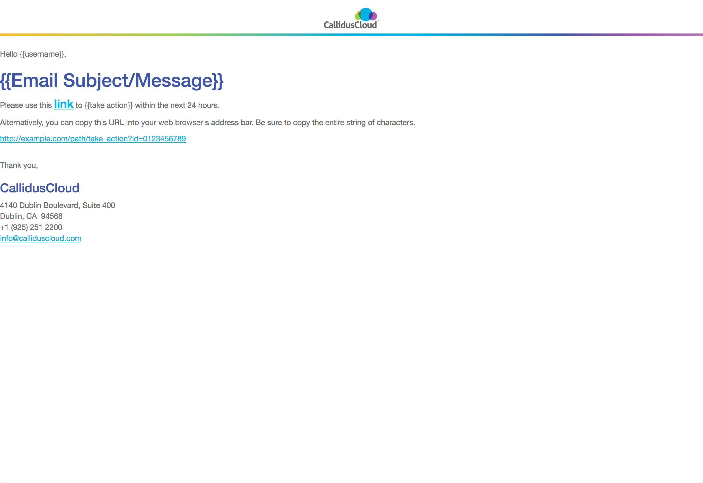
}Email Notification
The actual HTML template is here. In use, it should look like the screen capture below.
<!DOCTYPE html>
<html>
<head>

	<meta charset="UTF-8">
	<meta http-equiv="X-UA-Compatible" content="IE=edge">
	<meta name="viewport" content="width=device-width, initial-scale=1">
	<meta name="description" content="Email notification for CallidusCloud Lead To Money Suite">
	<meta name="author" content="Balu Gillella, Kevin Lynn Brown">

	<title>Lead to Money Suite - CallidusCloud</title>

	<!-- Bootstrap core CSS -->
	<link href="https://maxcdn.bootstrapcdn.com/bootstrap/3.3.5/css/bootstrap.min.css" rel="stylesheet">

	<!-- HTML5 shim and Respond.js for IE8 support of HTML5 elements and media queries -->
	<!--[if lt IE 9]>
	<script src="https://oss.maxcdn.com/html5shiv/3.7.2/html5shiv.min.js"></script>
	<script src="https://oss.maxcdn.com/respond/1.4.2/respond.min.js"></script>
	<![endif]-->

	<style type="text/css">
		/* CLIENT-SPECIFIC STYLES */
		#outlook a{padding:0;} /* Force Outlook to provide a "view in browser" message */
		.ReadMsgBody{width:100%;} .ExternalClass{width:100%;} /* Force Hotmail to display emails at full width */
		.ExternalClass, .ExternalClass p, .ExternalClass span, .ExternalClass font, .ExternalClass td, .ExternalClass div {line-height: 100%;} /* Force Hotmail to display normal line spacing */
		body, table, td, a{-webkit-text-size-adjust:100%; -ms-text-size-adjust:100%;} /* Prevent WebKit and Windows mobile changing default text sizes */
		table, td{mso-table-lspace:0pt; mso-table-rspace:0pt;} /* Remove spacing between tables in Outlook 2007 and up */
		img{-ms-interpolation-mode:bicubic;} /* Allow smoother rendering of resized image in Internet Explorer */

		/* RESET STYLES */
		body{margin:0; padding:0;}
		img{border:0; height:auto; line-height:100%; outline:none; text-decoration:none;}
		table{border-collapse:collapse !important;}
		body{height:100% !important; margin:0; padding:0; width:100% !important;}

		/* iOS BLUE LINKS */
		.appleBody a {color:#68440a; text-decoration: none;}
		.appleFooter a {color:#999999; text-decoration: none;}

		/* MOBILE STYLES */
		@media screen and (max-width: 525px) and (orientation: landscape) and (orientation: portrait) {

		/* ALLOWS FOR FLUID TABLES */
		table[class="wrapper"]{
		width:100% !important;
		}

		/* ADJUSTS LAYOUT OF LOGO IMAGE */
		td[class="logo"]{
		text-align: left;
		padding: 20px 0 20px 0 !important;
		}

		td[class="logo"] img{
		margin:0 auto!important;
		}

		/* USE THESE CLASSES TO HIDE CONTENT ON MOBILE */
		td[class="mobile-hide"]{
		display:none;
		}

		img[class="mobile-hide"]{
		display: none !important;
		}

		img[class="img-max"]{
		max-width: 100% !important;
		height:auto !important;
		}

		/* FULL-WIDTH TABLES */
		table[class="responsive-table"]{
		width:100%!important;
		}

		/* UTILITY CLASSES FOR ADJUSTING PADDING ON MOBILE */
		td[class="padding"]{
		padding: 10px 5% 15px 5% !important;
		}

		td[class="padding-copy"]{
		padding: 10px 5% 10px 5% !important;
		text-align: left !important;
		}

		td[class="padding-meta"]{
		padding: 30px 5% 0px 5% !important;
		text-align: center;
		}

		td[class="no-pad"]{
		padding: 0 0 20px 0 !important;
		}

		td[class="no-padding"]{
		padding: 0 !important;
		}

		td[class="section-padding"]{
		padding: 10px 15px 10px 15px !important;
		}

		}

		H1, H2, H3, H4, H5, H6 {
		color: black;
		}

		A, A:hover, A:active {
		color: #00abe3;
		}

		.cald_navbar {
		background: none;
		background-color: white;
		border: none;
		border-bottom: solid 5px #00A8E3;
		border-radius: 0px;
		height: 69px;
		color: #636466;
		}

		TABLE.cald_icon_div {
		width: 100% !important;
		}

		.cald_icon_div {
		text-align:center;
		margin-bottom:10px;
		}

		.pull-right.cald_icon_div {
		text-align: right;
		}

		.cald_header_section {
		text-align: center;
		vertical-align: middle;
		border: none !important;
		border-radius: none !important;
		}

		.cald_header_section_right {
		text-align: right;
		vertical-align: middle;
		padding: 20px;
		}

		.cald_header_nomenubar {
		background-color: rgb(190, 224, 238);
		margin: 5px 0;
		height: 5px;
		float: left;
		width: 100%;
		}

	</style>

</head>
<body style="margin: 0; padding: 0; font-family: 'Helvetica Neue', Helvetica, Arial, sans-serif; color: #636466 !important; font-size: 15px; height:100% !important; margin:0; padding:0; width:100%;">

<!-- HEADER -->
<table border="0" cellpadding="0" cellspacing="0" width="100%" style="border-collapse:collapse; background-color: white;">
	<tr>
		<td width="100" style="text-align:center; padding: 0 0 10px 0;">
			<div class="navbar navbar-default cald_navbar" style="min-height: 60px; margin-bottom: 0px; margin-top: 5px; border-width: medium medium 5px; border-style: none none solid; border-image: none; border-color: rgb(231, 231, 231) rgb(231, 231, 231) rgb(255, 255, 255); background: transparent none repeat scroll 0% 0%; border-radius: 0px; color: rgb(99, 100, 102); height: 60px;">
				<img src="http://www.calliduscloud.com/wp-content/uploads/2017/01/CallidusCloud_Logo-222.png" width="107" height="40" style="vertical-align:middle; background-position: 0 -82px; background-repeat: no-repeat; background-size: 60% auto; display: inline-block; height: 40px; margin: 10px auto 8px; width: 107px;" border="0">
			</div>
			<div class="col-md-12 col-xs-12 cald_header_nomenubar" id="bottom_div" style="width: 100%; background-image: linear-gradient( 90deg, #fab423 0%, #94c84a 25%, #00a7e0 50%, #00ABE3 60%, #364CA0 80%, #904D9E 90%, #a96dae 100% ); float: left; height: 5px; margin: 0;"></div>
		</td>
	</tr>
</table>

<!-- GREETING SECTION -->
<table border="0" cellpadding="0" cellspacing="0" width="100%" style="border-collapse:collapse; margin-top: 1%; margin-right: 15%">
	<tr>
		<td class="padding-copy" style="text-align:left;">
			<span style="font-family: 'Helvetica Neue', Helvetica, Arial, sans-serif; font-size: 15px;">Hello {{username}},</span>
		</td>
	</tr>
	<tr>
		<td class="padding-copy" style="text-align:left;">
			<h1 style="font-family: 'Helvetica Neue', Helvetica, Arial, sans-serif; font-size: 36px;font-weight: 500;line-height: 1.1;color: rgb(54,76,160);margin-top: 20px;margin-bottom: 10px;">{{Email Subject/Message}}</h1>
		</td>
	</tr>
</table>

<!-- LINK SECTION -->
<table border="0" cellpadding="0" cellspacing="0" width="100%" style="margin-bottom: 20px; border-collapse:collapse">
	<tr>
		<td class="padding-copy" style="text-align:left;">
			<p style="font-family: 'Helvetica Neue', Helvetica, Arial, sans-serif; font-size: 15px;">
				Please use this <a href="http://example.com/path/take_action?id=0123456789" style="font-size: 1.5em;font-weight: bold;-webkit-box-sizing: border-box;-moz-box-sizing: border-box;box-sizing: border-box;background-color: transparent;color: #00abe3;text-decoration: underline;">link</a> to {{take action}} within the next 24 hours.
			</p>
			<p style="font-family: 'Helvetica Neue', Helvetica, Arial, sans-serif; font-size: 15px;">
				Alternatively, you can copy this URL into your web browser's address bar.  Be sure to copy the entire string of characters.
			</p>
			<p style="font-family: 'Helvetica Neue', Helvetica, Arial, sans-serif; font-size: 15px;">
				<a href="http://example.com/path/take_action?id=0123456789" style="background-color: transparent;color: #00abe3;text-decoration: underline;">http://example.com/path/take_action?id=0123456789</a>
			</p>
		</td>
	</tr>
</table>

<p style="orphans: 3;widows: 3;margin: 0 0 10px; font-family: 'Helvetica Neue', Helvetica, Arial, sans-serif; font-size: 15px;">Thank you,</p>
<h3 style="line-height: 1.1; font-family: 'Helvetica Neue', Helvetica, Arial, sans-serif; font-weight: 500; font-size: 24px; color: rgb(54,76,160); box-sizing: border-box;">CallidusCloud</h3>
<p style="orphans: 3;widows: 3;margin: 0 0 10px;font-family: 'Helvetica Neue', Helvetica, Arial, sans-serif; font-size: 15px;">4140 Dublin Boulevard, Suite 400<br>
	Dublin, CA  94568<br>
	+1 (925) 251 2200<br>
	<a href="mailto:info@calliduscloud.com" style="background-color: transparent;color: #00abe3;text-decoration: underline;">info@calliduscloud.com</a>
</p>

</body>
</html>
Progress Indication
Progress indication needs to appear where the user is looking, or where the action is taking place, or if not logical or possible to appear where the user interaction took place, progress indication needs to get the user's attention from where it is displayed.
Usage
- Progress indication that is less than page or window-level should not obscure other areas of the UI from being readable if possible, or else should allow the user to drag the progress indication aside to view other content.
- Progress indication should not disable interactivity unless the disabled actions are not valid while the current operation is in progress.
- If certain interactions are invalid while the current operation is taking place, then either the specific elements (if only a few) or the overall UI should be visually and obviously disabled in appearance. For specific individual components, they each should be disabled individually. Form inputs and their labels should be disabled together. If it's page/dialog/widget-level, e.g. an entire panel, tab, page of the UI to be disabled, then having a transparent gray overlay should be used to cover the background, rather than iterate through everything in the UI and disable each individually when an entire page or window needs disabling.
- Progress should offer the ability to cancel the operation whenever possible. Cancelling should revert to the previous state the product was in. Avoid other methods of dialog dismissal, like a corner X, as it is unclear to a user if that will cancel the operation or merely hide the dialog - which will leave them with no way to tell an operation is still in progress.
- Text-based human-readable information about what is happening and how long it will take is advisable as much as possible.
- Use a progress bar when there is sufficient space and it's possible to show time or number of steps remaining.
- If a number of individual components in the UI need to load around the same time, it would be preferable to treat that as page-level loading with only one progress indicator.
- Indicators should be an appropriate size for the element that is loading. For example, if loading a page, there shouldn't be only a 16 pixel spinner in the top left corner. Likewise, if loading a simple small list box, the page shouldn't be disabled showing a progress dialog (unless it's invalid to interact with the page while that list is loading).
Timing
If the operation will take…
- > 1 second
- Show a progress indicator.
- > 10 seconds
- Show a progress indicator with a general message conveying what is taking place.
- > 1 minute
- Show a progress indicator with a series of specific messages conveying what is taking place.
- > 3 minutes
- Show a progress meter with a series of specific messages conveying the steps that are taking place and/or time remaining. The user should be able to cancel the operation.
- > 5 minutes
- The user should be warned in advance how long the operation will take and have the option to bail out beforehand, as well as cancel during the operation. During the operation, show a progress meter with a series of specific messages conveying the steps that are taking place and time remaining.
Types
There are 4 characteristics that intersect to create the different types: determinate vs. indeterminate (whether the duration is known or not known) and spinner vs. bar. The variations in border thickness are deliberate based on the context where it will be used. Refresh the page to see the examples run.
Loading Spinner
Requires font-awesome web font.
Individual input/component loading when it's not required to block remainder of page interaction. An informative loading message is recommended, but optional if space doesn't permit.
Component or panel loading. For longer duration, and where progress messages are displayed with it.
Page, panel or tab loading where blocking the page or panel is necessary and a loading message is shown with it.
<span class="cald_spinner_color small"><i class="fa fa-spinner fa-spin"></i></span>

<span class="cald_spinner_color medium"><i class="fa fa-spinner fa-pulse slow"></i></span>

<span class="cald_spinner_color large"><i class="fa fa-spinner fa-pulse slow"></i></span>
@keyframes faspin_color {
0% {
color: #00A8E3;
}
25% {
color: #9E57A2;
}
50% {
color: #FDB823;
}
75% {
color: #98C83C;
}
100% {
color: #00A8E3;
}
}
span.cald_spinner_color.small i.fa-spin, span.cald_spinner_color.small {
font-size: 1.25em;
}
span.cald_spinner_color.medium i.fa-pulse, span.cald_spinner_color.medium {
font-size: 1.775em;
}
span.cald_spinner_color.large i.fa-pulse, span.cald_spinner_color.large {
font-size: 2.5em;
}
i.cald_spinner_color, span.cald_spinner_color {
-webkit-animation: faspin_color 7s infinite linear;
animation: faspin_color 7s infinite linear;
}
i.cald_spinner_color.slow, span.cald_spinner_color.slow {
-webkit-animation: faspin_color 15s infinite linear;
animation: faspin_color 15s infinite linear;
}
span.icon-radio-unchecked.done {
font-size: 1.5em;
color: #98C83C;
vertical-align: text-bottom;
font-weight: 900;
}
/* Font-awesome overrides */
.fa-spin.slow {
-webkit-animation: fa-spin 5s infinite linear;
animation: fa-spin 5s infinite linear;
}
.fa-pulse.slow {
-webkit-animation: fa-spin 2s infinite steps(8);
animation: fa-spin 2s infinite steps(8);
}Progress Meter
This is determinate, when the duration, percentage, or number of steps are known and messages can be presented.
Retrieving column names from database. Step 3 of 5.
60% complete<div class="cald_progress_meter">
<p>Retrieving column names from database. Step 3 of 5.
<div class="cald_progress_bar_partial"> </div><div class="cald_progress_bar_incomplete"> </div>60% complete
</p>
</div>.cald_progress_meter {
padding: 20px;
border: solid 1px #bfbfbf;
}
.cald_progress_bar_partial {
display: inline-block;
min-height: 10px;
/* Width must be updated dynamically relative to portion complete */
min-width: 60%;
background-color: #00A8E3;
color: white;
padding-left: 0.25em;
}
.cald_progress_bar_incomplete {
display: inline-block;
min-height: 10px;
/* Width must be updated dynamically relative to portion remaining */
min-width: 40%;
background-color: #d9d9d9;
text-align: right;
}
Component Level (in-page)
Spinner blocking or replacing the component space. Spinner would be replaced with loaded contents after a <1 second delay for the user to see the successful green state. Refresh the page to see the animation run.
<span class="cald_spinner_color small"><i class="fa fa-spinner fa-spin"></i></span> Content is loading…

<span class="icon-radio-unchecked done"></span> Done.
@keyframes faspin_color {
0% {
color: #00A8E3;
}
25% {
color: #9E57A2;
}
50% {
color: #FDB823;
}
75% {
color: #98C83C;
}
100% {
color: #00A8E3;
}
}
span.cald_spinner_color.small i.fa-spin, span.cald_spinner_color.small {
font-size: 1.25em;
}
span.cald_spinner_color.medium i.fa-pulse, span.cald_spinner_color.medium {
font-size: 1.775em;
}
span.cald_spinner_color.large i.fa-pulse, span.cald_spinner_color.large {
font-size: 2.5em;
}
i.cald_spinner_color, span.cald_spinner_color {
-webkit-animation: faspin_color 7s infinite linear;
animation: faspin_color 7s infinite linear;
}
i.cald_spinner_color.slow, span.cald_spinner_color.slow {
-webkit-animation: faspin_color 15s infinite linear;
animation: faspin_color 15s infinite linear;
}
span.icon-radio-unchecked.done {
font-size: 1.5em;
color: #98C83C;
vertical-align: text-bottom;
font-weight: 900;
}
/* Font-awesome overrides */
.fa-spin.slow {
-webkit-animation: fa-spin 5s infinite linear;
animation: fa-spin 5s infinite linear;
}
.fa-pulse.slow {
-webkit-animation: fa-spin 2s infinite steps(8);
animation: fa-spin 2s infinite steps(8);
}Panel Level (in-page)
Transparent gray overlay with spinner or progress bar. Overlay popup would dismiss itself (the user should not have to take action to dismiss this type) to reveal the loaded page or panel after a <1 second delay for the user to see the successful green state.
Page Level (progress dialog)
Transparent gray page overlay with progress dialog on top. Dialog title should say what is in progress. Dialog contents should have details of what actions/steps are currently in progress, and show count of steps completed vs steps total and/or time remaining for overall progress to complete. Avoid using an X in the corner to close the dialog as it is not clear if that will cancel the opration or not, and it leaves the user without a way to see whether an operation is still in progress to find out. Cancel is fine as that is explicit what it will do.
This is example is static, not animated.
Operation ABC In Progress
Retrieving column names from database. Step 3 of 5.
60% completeSee Progress Meter HTML tab.See Progress Meter CSS tab.Multiple Dependent Progress Bars
When multiple processes will add up to a total, the total needs to be emphasized more than the constituent processes. Therefore, higher contrast is needed, namely the black font color of heading tags and the darker highlight colors for the main summary/total bar. Do not hide bars as they complete as that changes the layout and makes it difficult to visually track which items are still in progress.
Mockup demonstration of how multiple progress bars should work in all the states during operation (refresh the page or switch tabs and back to replay the animation)
Installing selected features
overall
Feature one
Feature two
Feature three
<h2 class="cald_header">Installing selected features</h2>
<!-- The empty spans are for inserting messages -->
<h5 id="cald_install_msg"><span></span></h5>
<div class="cald_progress_bar">
    <div class="cald_feature_total" id="cald_feature_totals"> </div>
</div>
<h6 id="cald_install_pct_total"><span></span> overall</h6>
<hr>
Feature one
<div class="cald_progress_bar">
    <div class="cald_feature" id="cald_feature1"> </div>
</div>
<small id="cald_install_pct1"><span></span></small>
<hr>
Feature two
<div class="cald_progress_bar">
    <div class="cald_feature" id="cald_feature2"> </div>
</div>
<small id="cald_install_pct2"><span></span></small>
<hr>
Feature three
<div class="cald_progress_bar">
    <div class="cald_feature" id="cald_feature3"> </div>
</div>
<small id="cald_install_pct3"><span></span></small>
<form action="javascript:void(0);" class="form-inline cald_dialog_buttonbar">
    <p><button class="btn btn-default cald_3D_button_default">Cancel</button></p>
</form>
.cald_dialog h1.cald_header, .cald_dialog h2.cald_header, .cald_dialog h3.cald_header, .cald_dialog h4.cald_header {
padding: 10px;
font-size: 1em;
color: white !important;
background-image: url("../img/2017/Pattern-for-CPQ_CLM_Commissions@1x.png"), linear-gradient( 90deg, rgba(54,76,160,1.0) 25%, rgba(0,171,227,1.0) 100% );
}
.cald_dialog_buttonbar {
text-align: center;
vertical-align: middle;
width: 100%;
padding: 20px;
padding-bottom: 0px;
}
.cald_progress_bar {
display: inline-block;
min-height: 10px;
background-color: #d9d9d9;
min-width: 100%;
}
/* Only pay attention to the colors here */
/* Keyframes were just to animate the mockup */
@keyframes cald_progress_bar_total {
0% {
/* Total in-progress color */
background-color: #00A8E3;
min-width: 0%;
}
99% {
background-color: #00A8E3;
min-width: 99%;
}
100% {
/* Total complete color */
background-color: #98c83c;
min-width: 100%;
}
}
/* Only pay attention to the colors here */
/* Keyframes were just to animate the mockup */
@keyframes cald_progress_bar {
0% {
/* Feature in-progress color */
background-color: #72c9e9;
min-width: 0%;
}
99% {
background-color: #72c9e9;
min-width: 99%;
}
100% {
/* Feature complete color */
background-color: #bde573;
min-width: 100%;
}
}
.cald_feature_total {
display: inline-block;
min-height: 10px;
min-width: 100%;
/* Default incomplete bar color */
background-color: #d9d9d9;
padding-left: 0.25em;
}
.cald_feature {
display: inline-block;
min-height: 10px;
min-width: 100%;
/* Default incomplete bar color */
background-color: #d9d9d9;
padding-left: 0.25em;
}Truncation
Text Truncation
<!-- EXAMPLE ONE -->
<div>Lorem ipsum dolor sit amet, vel magna ac, eget purus. Viverra ridiculus pede. Vel dapibus dui ipsum dui vestibulum, quis volutpat, lectus nisl ut leo eu sed, est orci, viverra arcu sem velit cursus. Adipiscing dapibus vehicula porttitor magna, nec est velit tellus sit, taciti sed lorem<span id="ellipses">…</span><span id="truncated_text" style="display:none;">.  Feugiat aliquet scelerisque vestibulum lorem, sed et tellus turpis, at do eros faucibus, aenean felis pede condimentum nam lorem. Leo sodales arcu quis morbi ac, tortor neque in, id felis, elit vel quis pretium mauris ipsum lorem. Urna maecenas vitae, pulvinar vitae. Eleifend imperdiet, tellus dictum. Convallis erat faucibus consequat a sociis lectus.</span> <a href="javascript:void(0);" id="truncate_link">More</a></div>

<!-- EXAMPLE TWO -->
<div>Lorem ipsum dolor sit amet, vel magna ac, eget purus. Viverra ridiculus pede. Vel dapibus dui ipsum dui vestibulum, quis volutpat, lectus nisl ut leo eu sed, est orci, viverra arcu sem velit cursus. Adipiscing dapibus vehicula porttitor magna, nec est velit tellus sit, taciti sed lorem<span id="ellipses2">…</span><span id="truncated_text2" style="display:none;">. Feugiat aliquet scelerisque vestibulum lorem, sed et tellus turpis, at do eros faucibus, aenean felis pede condimentum nam lorem. Leo sodales arcu quis morbi ac, tortor neque in, id felis, elit vel quis pretium mauris ipsum lorem. Urna maecenas vitae, pulvinar vitae. Eleifend imperdiet, tellus dictum. Convallis erat faucibus consequat a sociis lectus.</span></div>
<div style="text-align:center;"><a href="javascript:void(0);" id="truncate_link2" style="text-decoration:none;"><span class="icon-arrow-down"></span></a></div>
/* EXAMPLE ONE */
$( "#truncate_link" ).click(function(e) {
    if ( $(this).text() == "More") {
        $( "#ellipses" ).hide();
        $( "#truncated_text" ).show();
        $(this).text("Less");
    }
    else {
        $( "#ellipses" ).show();
        $( "#truncated_text" ).hide();
        $(this).text("More");
    }
});

/* EXAMPLE TWO */
$( "#truncate_link2" ).click(function(e) {
    if ( $( "#truncated_text2" ).css("display") == "none" ) {
        $(this).children(0).removeClass("icon-arrow-down");
        $(this).children(0).addClass("icon-arrow-up");
        $( "#ellipses2" ).hide();
        $( "#truncated_text2" ).show();
    }
    else {
        $( "#ellipses2" ).show();
        $( "#truncated_text2" ).hide();
        $(this).children(0).removeClass("icon-arrow-up");
        $(this).children(0).addClass("icon-arrow-down");
    }
});
Input Text Truncation
Use an ellipses. Hover on desktop shows full value. Select on mobile show info-popup that shows full value. Avoid wrapping or scrolling text in the input (DO NOT make it so navigating the cursor is the only way to read the value.
<p>
    <label for="input_truncate">Input</label><br>
    <input id="input_truncate"
    	class="form-control cald_ellipsis"
        value="Some really really long string that doesn't fit in the available space."
        title="Some really really long string that doesn't fit in the available space."
        style="width:25em;">
</p>
.cald_ellipsis {
text-overflow: ellipsis;
white-space: nowrap;
overflow: hidden;
}Grid Text Truncation
Use an ellipses. Hover on desktop shows full value. Select on mobile show info-popup that shows full value. Avoid wrapping text in grid cells.
|
Really long header content like you wouldn't believe a header could be
|
Heading |
|---|---|
| Non-banded row |
Really long cell data content like a data cell really shouldn't be
|
| Banded row | Data cell |
| Non-banded row | Data cell |
| Banded row | Data cell |
<!-- This is one example using CSS only.  There are other techniques to achieve the same result. -->
<table class="cald_table cald_alternate cald_banded uig_table" style="width: 340px;">
    <tr class="cald_tr_heading ">
        <th>
            <!-- This technique to get the hover text requires div with column fixed-width added around the cell value -->
            <div style="width:170px;" class="cald_truncate" title="Really long header content like you wouldn't believe a header could be">
                Really long header content like you wouldn't believe a header could be
            </div>
        </th>
        <th>Heading</th>
    </tr>
    <tr class="cald_tr_cells cald_odd">
        <td>Non-banded row</td>
        <td>
            <!-- This technique to get the hover text requires div with column fixed-width added around the cell value -->
            <div style="width:170px;" class="cald_truncate" title="Really long cell data content like a data cell really shouldn't be">
                Really long cell data content like a data cell really shouldn't be
            </div>
        </td>
    </tr>
. . .
</table>
.cald_table th .cald_truncate, .cald_table td .cald_truncate {
white-space: nowrap;
overflow: hidden;
text-overflow: ellipsis;
}Breadcrumb Truncation
Truncation algorithm should be responsive based on available screen real estate. Always show the current location in full. Always try to show the root location in full.
Assuming a hierarchy thus
Top Level Second Level Third Level Fourth Level Fifth Level Current Page
First level of truncation. Try to show both the root and previous location in full.
Top Level Secon… Third… Fourt… Fifth Level Current Page
Second level of truncation. Try to maintain access to all levels. Do not truncate below 5 characters, for recognition.
Top L… Secon… Third… Fourt… Fifth… Current Page
Third level of truncation. Try to show both the root and previous location in full. Collapse in-between nodes to one link.
Top Level 3 more… Fifth Level Current Page
When the collapsed node "3 more…" is clicked and the middle nodes are expanded, it's ok for the root and current location to temporarily be offscreen or truncated to allow access to the inner nodes. Clicking the ellipses on either end brings back the state seen in the third level of truncation above.
Fourth level of truncation. Try to keep the root and current completely visible.
Top Level 4 more… Current Page
Fifth level of truncation. Finally the root can be truncated.
Absolute last resort truncation. Show root and current with a drop menu on the root to get at all in-between nodes.
Top Level Current Page
<!-- ORIGINAL HIERARCHY, NO TRUNCATION -->
<p>
<a href="">Top Level</a>
<span class="icon-arrow-right17"></span>
<a href="">Second Level</a>
<span class="icon-arrow-right17"></span>
<a href="">Third Level</a>
<span class="icon-arrow-right17"></span>
<a href="">Fourth Level</a>
<span class="icon-arrow-right17"></span>
<a href="">Fifth Level</a>
<span class="icon-arrow-right17"></span>
<strong>Current Page</strong>
</p>
<!-- ONE -->
<p>
<a href="">Top Level</a>
<span class="icon-arrow-right17"></span>
<a href="">Secon…</a>
<span class="icon-arrow-right17"></span>
<a href="">Third…</a>
<span class="icon-arrow-right17"></span>
<a href="">Fourt…</a>
<span class="icon-arrow-right17"></span>
<a href="">Fifth Level</a>
<span class="icon-arrow-right17"></span>
<strong>Current Page</strong>
</p>
<!-- TWO -->
<p>
<a href="">Top L…</a>
<span class="icon-arrow-right17"></span>
<a href="">Secon…</a>
<span class="icon-arrow-right17"></span>
<a href="">Third…</a>
<span class="icon-arrow-right17"></span>
<a href="">Fourt…</a>
<span class="icon-arrow-right17"></span>
<a href="">Fifth…</a>
<span class="icon-arrow-right17"></span>
<strong>Current Page</strong>
</p>
<!-- THREE -->
<p>
<a href="">Top Level</a>
<span class="icon-arrow-right17"></span>
<a href="">3 more…</a>
<span class="icon-arrow-right17"></span>
<a href="">Fifth Level</a>
<span class="icon-arrow-right17"></span>
<strong>Current Page</strong>
</p>
<!-- THREE - EXPANDED -->
<p>
<a href="" onClick="return false;">…</a>
<span class="icon-arrow-right17"></span>
<a href="" onClick="return false;">Secon…</a>
<span class="icon-arrow-right17"></span>
<a href="" onClick="return false;">Third…</a>
<span class="icon-arrow-right17"></span>
<a href="" onClick="return false;">Fourt…</a>
<span class="icon-arrow-right17"></span>
<a href="" onClick="return false;">…</a>
</p>
<!-- FOUR -->
<p>
<a href="">Top Level</a>
<span class="icon-arrow-right17"></span>
<a href="">4 more…</a>
<span class="icon-arrow-right17"></span>
<strong>Current Page</strong>
</p>
<!-- FIVE -->
<p>
<a href="">Top L…</a>
<span class="icon-arrow-right17"></span>
<a href="">4 more…</a>
<span class="icon-arrow-right17"></span>
<strong>Current Page</strong>
</p>
<!-- LAST RESORT, USE A DROP MENU TO GET AT REMAINING HIERARCHY -->
<p>
<a href="">Top Level <span class="icon-arrow-down2"></span></a>
<span class="icon-arrow-right17"></span>
<strong>Current Page</strong>
<div class="cald_header_helpmenu">
<div class="cald_header_submenuitem_hover">Top Level</div>
<div class="cald_header_submenuitem">Second Level</div>
<div class="cald_header_submenuitem">Third Level</div>
<div class="cald_header_submenuitem">Fourth Level</div>
<div class="cald_header_submenuitem">Fifth Level</div>
<div class="cald_header_submenuitem"><span class="icon-checkmark"></span> Current Page</div>
</div>
</p>Help
Ideally, the UI shouldn't need help to complete tasks. The UI should be intuitive for the task with interactive elements located where users expect them to be and named using terminology they recognize.
If there is something that needs help documentation, the first step would be to get with real end users and investigate why they are having difficulty understanding and using the UI, then redesign the UI match user's expectations, as much as possible.
For anything beyond that, the UI should be as self-documenting as possible. This means using intuitive labels for elements, providing examples of valid input values, providing contextual help via tooltips or other temporal method that gives additional information about how to use the UI.
The UI should also use a progressive disclosure model for providing help so that the UI does not become cluttered with help before it's really needed.
Any help that exists should provide valuable information that the user would not otherwise be able to know.
Help Menu
As found in the top right corner of the brand header bar, the "Documentation" link would lead to documentation for the product. In the future, should be documentation for the entire suite (for the products the current customer/login has purchased). "Community" should link to the online Callidus Community. "About" should link to a product-specific about screen.
Contextual Help
Contextual help is brief assistance located directly adjecent to elements of the UI that need explanation. This can manifest as either a hover tooltip or with an obvious help icon that the user clicks or touches to popup additional information. Popups should only be used to provide additional information not available anywhere else. Do not simply repeat or restate information in popups for the sake of consistency. This teaches users that the popups are not useful and users will avoid using them.
Labels, Examples, Descriptions and Explanations
Labels should use clear, concise, intuitive terminology. Where necessary/useful, provide an example input value showing the required format. Hover tooltips should only be used to provide additional information not available anywhere else. Do not simply repeat the label name in a hover tooltip for the sake of consistency - this teaches users that the tooltips aren't useful and they will stop reading them.
- The label should be a user-friendly name or phrase no more than 4-5 words in length. Avoid sentences for labels.
- The prompt text should be a sample value only. DO NOT USE THE PROMPT TEXT AS THE LABEL.
- Use an info icon to provide additional details that are required to fill out the input.
- The tooltip should provide additional details to fill out the input. Hover to see a proper usage of tooltips providing additional information.
Click the "i" icon to view additional information. Note that the icon stays with the label for textarea, but is after the input for all others. Notice that none of the help options repeat information! They each provide unique additional information.
<form action="javascript:void(0);">
    <p>
        <!-- Wrap the control with the label, put the tooltip on the label, and it will display for both -->
        <label for="servername" title="Enter a fully-qualified URL, including the protocol, e.g. http or https.">Web server host name:<br>
            <input id="servername" placeholder="http://www.example.com/" class="form-control">
        </label>
    </p>

    <label for="password0" class="control-label">Password</label><br>
    <div class="input-group input-group-unstyled">
        <input id="password0" type="password" class="form-control" placeholder="********" style="width: 12em;">
        <span class="input-group-addon" style="display: inline;">
            <a href="javascript:void(0)" id="iPopup" data-toggle="popover" data-placement="right" role="button" data-trigger="focus,click" data-content="Passwords must<ul><li>contain at least 8 characters<li>include 1 uppercase letter<li>include 1 lowercase letter<li>include 1 number</ul>"  title="Password Rules">
                <i class="fa fa-lg fa-info-circle"></i>
            </a>
        </span>
    </div>

    <p>
        <label for="textarea0">Defect description
            <a href="javascript:void(0)" id="tPopup" data-toggle="popover" role="button" data-trigger="focus,click" title="Character Limit" data-content="Limited to 255 characters.  You have 45 characters remaining.">
                <i class="fa fa-info-circle"></i>
            </a>
        </label><br>
        <textarea type="text" class="form-control" id="textarea0" placeholder="Include all the steps to reproduce the problem."></textarea>
    </p>

</form>
$( document ).ready(function(e) {
$('#iPopup').popover({html: true, placement: "right"});
$('#tPopup').popover({html: true, placement: "right"});
});.input-group.input-group-unstyled input.form-control {
border-radius: 4px;
}
.input-group-unstyled .input-group-addon {
border-radius: 4px;
border: 0px;
background-color: transparent;
vertical-align: middle;
}
/* This is specific to the ID, to fix a word-wrapping issue */
#iPopup+div[class~="popover"] {
width: 480px;
}Wizards
<div class="cald_wizard">
    <ol class="cald_progress">
        <li data-step="1" class="is-active" data-toggle="tab"><a href="#tab_1"><span class="circle">1</span><span class="check">Step 1</span></a></li>
        <li data-step="2" data-toggle="tab"><a href="#tab_2"><span class="circle">2</span><span class="check">Step 2</span></a></li>
        <li style="width: 5px;"><span class="step-indicator"><i class="fa fa-ellipsis-h"></i></span></li>
        <li data-step="3" style="display: none;" data-toggle="tab"><a href="#tab_3"><span class="circle">3</span><span class="check">Step 3</span></a></li>
        <li data-step="4" style="display: none;" data-toggle="tab"><a href="#tab_4"><span class="circle">4</span><span class="check">Step 4</span></a></li>
        <li data-step="5" class="progress__last" data-toggle="tab"><a href="#tab_5"><span class="circle change-number">3</span><span class="check change-text">Step 3</span></a></li>
    </ol>
    <div class="tab-content">
        <div class="tab-pane active" id="tab_1">
            Step 1
        </div>
        <div class="tab-pane" id="tab_2">
            Step 2
            <p>
                <label class="cald_checkbox_label"><input type="checkbox" id="show-all-steps"> A user choice that causes more steps to be needed.</label>
            </p>
        </div>
        <div class="tab-pane" id="tab_3">
            Step 3
        </div>
        <div class="tab-pane" id="tab_4">
            Step 4
        </div>
        <div class="tab-pane" id="tab_5">
            <span class="change-text">Step 3</span>
        </div>
    </div>
</div>
<div class="cald_button_bar">
    <a href="javascript:void(0);" class="cald_button_tertiary" onClick="this.blur();return false;">Cancel</a>
    <button class="btn btn-default cald_3D_button_default btnPrevious" onClick="this.blur();return false;" disabled>Finish</button>
    <button class="btn btn-primary cald_3D_button_primary btnNext">Next</button>
</div>
.cald_wizard .tab-content {
	margin: 15px 0px;
	border-top: solid 1px #bfbfbf;
	padding: 20px;
}

.cald_wizard .cald_progress {
	list-style: none;
	margin: 0;
	padding: 0;
	display: table;
	table-layout: fixed;
	width: 100%;
	color: #849397;
	background-color: transparent;
	box-shadow: none;
}

.cald_wizard .cald_progress > li {
	position: relative;
	display: table-cell;
	text-align: center;
}

.cald_wizard .cald_progress > li span.circle {
	display: block;
	margin: 0 auto;
	background: #DFE3E4;
	width: 2.2em;
	height: 2.2em;
	text-align: center;
	margin-bottom: 0.25em;
	line-height: 2.2em;
	border-radius: 100%;
	position: relative;
	z-index: 1000;
}

.cald_wizard .cald_progress > li:after {
	content: '';
	position: absolute;
	display: block;
	background: #DFE3E4;
	width: 100%;
	height: 0.5em;
	top: 1em;
	left: 50%;
	z-index: 1; /* FIX */
}

.cald_wizard .cald_progress > li:last-child:after {
	display: none;
}

.cald_wizard .cald_progress > li.is-complete {
	color: #00a8e3;
}

.cald_wizard .cald_progress > li.is-complete:before, .cald_progress > li.is-complete:after {
	color: #FFF;
	background: #00a8e3;
	z-index: 1; /* FIX */
}

.cald_wizard .cald_progress > li.is-complete span.check:before {
	content: '\f00c';
	font-family: FontAwesome;
}

.cald_wizard .cald_progress > li.is-complete span.circle, .cald_wizard .cald_progress > li.is-active span.circle  {
	color: #FFF;
	background: #00a8e3;
}

.cald_wizard .cald_progress > li.is-active {
	color: #00a8e3;
}

.cald_wizard .cald_progress > li.is-active:before {
	color: #FFF;
	background: #00a8e3;
}

.cald_wizard .cald_progress .step-indicator {
	position: absolute;
	color: #888;
	top: 8px;
	z-index: 100;
}

.cald_wizard .cald_progress li a, .cald_wizard .cald_progress li a:hover, .cald_wizard .cald_progress li a:active, .cald_wizard .cald_progress li a:focus {
	color: inherit;
	text-decoration: none;
}

/**
 * Needed for IE8
 */
.progress__last:after {
	display: none !important;
}
Login Screen
License and Domain information may not be used by all products. "Create account" may need to be renamed and linked to other promotional content for some products. All products should maintain this layout, however. This is one case where validation should not highlight the particular field in error as it helps hackers focus in on which part to hack. Reserve the top line for only the company logo and any notification messages. Keep the product name and username input label lined up on the line below the company logo.

Advertisement
<header class="cald_header_ribbon"></header>
<div class="container-fluid cald_login_panel cald_login_wrapper cald_content" style="border-top: none;">
    <div class="row">
        <div class="col-lg-5 col-md-5 col-sm-5 col-xs-12">

            <div class="cald_login_logo"></div>
            <br clear="all"><br>

            <form action="javascript:void(0);">
                <p class="alert alert-danger cald_notification_box"><span class="icon-minus-circle2" aria-hidden="true"></span><span class="sr-only">Error:</span> The username or password were incorrect.
                </p>
                <p class="form-group">
                    <label for="email_address">Email</label><br>
                    <input class="form-control" id="email_address" placeholder="username@example.com">
                </p>
                <p class="form-group">
                    <label for="password">Password</label><br>
                    <input class="form-control" id="password" type="password" placeholder="" title="> 6 characters, at least 1 number, 1 uppercase and 1 lowercase letter">
                </p>
                <div class="cald_form_controls">
                    <p class="form-group">
                        <button class="btn btn-primary cald_3D_button_primary" onClick="this.blur();return false;">Login</button>
                    </p>
                </div>
            </form>
            <div class="pull-left"><a href="" onClick="this.blur();return false;">Create Account</a></div>
            <div class="pull-right"><a href="forgot_password.html" onClick="this.blur();return false;">Forgot Password</a></div>
        </div>
        <div class="col-lg-7 col-md-7 col-sm-7 col-xs-12">

            <div class="cald_advertisement">
                <img src="img/C3-Promo-Blog-Tile-300x250.jpg" class="cald_l2m_img">
                <p class="cald_advertisement_disclaimer">Advertisement</p>
            </div>

        </div>
    </div>
</div>
.cald_header_ribbon {
background-image: linear-gradient( 90deg, #fab423 0%, #94c84a 25%, #00a7e0 50%, #00ABE3 60%, #364CA0 80%, #904D9E 90%, #a96dae 100% );
background-repeat: no-repeat;
background-size: contain;
min-height: 5px;
max-height: 5px;
height: 5px;
width: 100%;
}
.cald_login_wrapper {
position:relative;
width: 100% !important;
border: solid 1px white;
background-color: white;
}
.cald_login_panel {
padding: 30px 20px 30px 20px;
color: #636466;
}
.cald_login_logo {
display: block;
background-image: url("../img/CallidusCloud_logo_product_dark.png");
background-size: 80%;
background-repeat: no-repeat;
background-position: center center;
margin: 0 auto;
height: 91px;
width: 185px;
}
.cald_login_wrapper .cald_login_logo {
float: left;
margin-left: -20px;
}
.cald_l2m_img {
text-align: right;
width: 100%;
border:none;
margin-top:20px;
}
.cald_l2m_div {
min-width: 368px;
width: 100%;
max-width: 66%;
text-align: right !important;
}
.cald_advertisement {
/* This gradient/background color needs to change based on the image used */
background: linear-gradient( #091b49 20%, #3f63a1 30%, #3f63a1 60%, #091b49 100% );
background-repeat: no-repeat;
border: solid 1px #bfbfbf;
height: 100%;
}
.cald_advertisement_disclaimer {
width: 100%;
text-align: center;
position: absolute;
transform: translate(-50%, -100%);
top: 100%;
left: 50%;
}
.cald_notification_box {
padding: 10px;
margin: 5px;
border-radius: 0px;
}About Screen
Product Name
Version #.# Build ####
License information (optional, used for license/credit info for 3rd party integrated content)
©2015 Callidus Software Inc. All Rights Reserved.
<header class="cald_header_ribbon"></header>
<div class="cald_content" style="border-top: none;padding: 20px;">
    <img src="img/CallidusCloud_logo_product_dark.png" height="47">
    <h1 class="cald_about_productname">Product Name</h1>
    <h3 class="cald_about_version">Version #.# <small>Build ####</small></h3>
    <hr>
    <p class="cald_about_copyright">License information (optional, used for license/credit info for 3rd party integrated content)</p>
    <p class="cald_about_copyright">©2015 Callidus Software Inc. All Rights Reserved.</p>
</div>
.cald_header_ribbon {
background-image: linear-gradient( 90deg, #fab423 0%, #94c84a 25%, #00a7e0 50%, #00ABE3 60%, #364CA0 80%, #904D9E 90%, #a96dae 100% );
background-repeat: no-repeat;
background-size: contain;
min-height: 5px;
max-height: 5px;
height: 5px;
width: 100%;
}
.cald_about_productname {
font-size: 2.0em;
}
.cald_about_version {
font-size: 1.5em;
}
.cald_about_copyright {
font-size: smaller;
}Mobile
Launch Screens
These are the generic CallidusCloud launch screens that can be used for any mobile offering.
iOS
Apple iOS guidelines specify having launch screens that appear like the actual app but without any text, giving the appearance the app is loading faster than it is. Until all those screens can be generated per product, these are the generic CallidusCloud launch screens that can be used for any mobile offering.
Example Launch Screens
Error:DO NOT MODIFY, CHANGE THE FILE FORMAT OR RESIZE THESE IMAGES. USE AS IS.
| iPhone 4s |
640 x 960 (@2x) portrait |
|---|---|
| iPhone 5 |
640 x 1136 (@2x) portrait |
| iPad and iPad mini |
1536 x 2048 (@2x) portrait 2048 x 1536 (@2x) landscape |
| iPad 2 and iPad mini (non-retina) |
768 x 1024 (@1x) portrait 1024 x 768 (@1x) landscape |
| iPad Pro |
2048 x 2732 (@2x) portrait 2732 x 2048 (@2x) landscape |
| iPhone 6 |
750 x 1334 (@2x) portrait 1334 x 750 (@2x) landscape |
| iPhone 6 Plus |
1242 x 2208 (@3x) portrait 2208 x 1242 (@3x) landscape |
Changes
| v3.1.6 | Fix issue with chart color sequence. | |
| v3.1.5 | Clean up of CSS issues. Changelist V2.0 and V1.0 link to respective archived versions. Corrected grid column selection color. | |
| v3.1.4 | Added Vision section. Updated embedding/cobranding section. | |
| v3.1.3 | Added product logos to the design section. | |
| v3.1.2 | Added a presentation to the design section showing the vision for how the guidelines play into the end to end customer experience. Minor fixes to example charts for display. | |
| v3.1.1 | Fixed links in the changes section to prior versions of guidelines in archives. | |
| v3.1 | Updated chart examples in chart colors section. | |
| v3.0.1 | Fixed hierarchical grid in complex grids section. | |
| v3.0 | Released. | |
| v2.8 | Added hierachical grids and selection to the complex grids section, extended the color palette for new menus and mobile, many editorial fixes, added mobile and other variations of the left-hand in-page menus, updated dialogs, notifications, login screen, about screen. | |
| v2.7 | Cleaned up mobile section, updated checkbox/radio section, updated example CSS code for menus and headings. Added widget design to the font lettercase section. | |
| v2.6 | New branding added. | |
| v2.5 | Added product branding throughout the guidelines. | |
| v2.4.1 | Added margins vs borders section. Breadcrumbs updated to show mobile variant. Minor fix for heading examples (TOC styles were interfering with the Callidus heading styles. | |
| v2.4 | Added carousels section. Updated complex grids section. Code clean up. Fixes for in-page menu guidance. Removed Angular and some unused JQuery plugins. | |
| v2.3.6 | Added complex grids section. | |
| v2.3.5 | Bugfix for TOC navigation. Previously, coordinates/positions of sections were not correctly calculated in Chrome, causing a single menu link to appear to toggle between two disparate, unrelated locations. | |
| v2.3.4 | Added wizards section. Updated in-page menu guidance. | |
| v2.3.2 | Updated icon section with recommended icons and 'forbidden' icons. Added disabled form inputs section. Added split/menu button guidance. Started wizards guidance. | |
| v2.3.1 | Text alignment updated with inputs. Added 'selected' button style. | |
| v2.3 | Added guidance on label placement for translation in the input layout section. Added info popup guidance to the Contextual Help section. Updated the font spec to a new and simpler method. Updated progress spinners to a new, lightweight Font-awesome method. | |
| v2.2.3 | Input text truncation section added. button order updated. | |
| v2.2.2 | Selection section added. Fonts specification updated. Button styles and button order added. | |
| v2.2.1 | Truncation section added. Forms section restructured a bit. Added checkbox guidance; tertiary button guidance. | |
| v2.2 | Grid sort indication added. Font-awesome support added to iconography section. Font spec updated, lettercase of headings, text, labels and buttons added. Text truncation rules for grids added. Default button order for common buttons added. TOC expand/collapse and current marker code added (though still a bit buggy). | |
| v2.1 | v3.0 begun. Table of contents expanded to provide links to more sections. | |
| v2.0 | Released. Archive of v2.0 | |
| v1.7.2 | Breadcrumbs updated to show heading variant. | |
| v1.7.1 | Error icon changed. | |
| v1.7 | Added header guidance when products are embedded in other products. | |
| v1.6.2 | Buttons styles dropped flat color with '2.0', but examples across the guidelines needed to be updated to conform. Also addition of header guidance when products are embedded has been started. (In progress, not complete.) | |
| v1.6.1 | Added a no data notification section. | |
| v1.6 | Added a patterns section and restructured the document in a couple places. | |
| v1.5.1 | Updated email template incorporating changes necessary by Ops team to work across various supported email clients. | |
| v1.5 | Significant re-write and restructuring of the document. Now fully responsive. HTML/CSS code examples added for all sections. Visual Spec sections TBD. Expand/Collapse navigation section TBD. | |
| v1.4.7 | Added co-branding section to the design style section. | |
| v1.4.6 | Added email notification template to the notifications > email section. | |
| v1.4.5.1 | Added detail of future direction for iOS launch screens to the mobile > launch screens section. | |
| v1.4.5 | Significant restructuring and reordering of the document. | |
| v1.4.1 | Updated progress indication section. Still in progress. | |
| v1.4 | Added iOS launch screens to the mobile section. | |
| v1.3.3 | Added guidance around heirarchies to the menu sections of the mobile section. | |
| v1.3.2 | Updates to the menu sections of the mobile section. | |
| v1.3.1 | Added an example of the difference between form inputs on mobile vs desktop type platform in the forms section. | |
| v1.3 | Added a mobile section. | |
| v1.2.5 | New page background color in the colors section. | |
| v1.2 | Find utility and more guidance on icon usage. | |
| v1.1 | Common login updated. | |
| v1.0 | Released. Archive of v1.0 | |
| v0.9.5 | Fixed a defect in the button styles section. | |
| v0.9 | Updated Navigation section with breadcrumbs and tabs. Added Expand / Collapse section. Updated the Header Bar variations section with a Tertiary Section Bar. | |
| v0.8 | Added login screen section and updated menu section based on feedback from product teams. | |
| v0.7 | Updated menu section based on feedback from product teams. | |
| v0.6 | Added iconography section. Added information about header help menu system to both header bar and help sections. | |
| v0.5 | Added visual spec and compact style grid to grids, css for notifications, additional information for fonts, section headings and progress. Changed subsection background color. | |
| v0.4 | Added visual spec for default header bar and menus. | |
| v0.3 | Updated fonts section, updated 'how to use' section, filled in the dialogs section, updated header bars section for embedded products, additional menu information, updated notifications, and reformatted all the CSS sections. | |
| v0.2 | Added 'how to use' section, required fields, header variations, additional menu information | |
| v0.1 | Initial draft |