Foreward
It is important to be clear about what user interface guidelines are, what they can do, and what they cannot do. User interface guidelines provide a reference for common user interface patterns to ensure that whenever a user sees a particular pattern, they can comprehend exactly how it will work before they attempt to use it. What guidelines will do is ensure that products visually will appear uniform and cohesive while allowing some differentiation appropriate to specfic tasks and usage of the products.
What guideliness cannot do is ensure that a user interface is usable. It is possible to follow the guidelines to the letter and still create a user interface where people are unable to successfully complete tasks. This is because the look and feel provided by following guidelines only covers the visuals, which, while affecting usability, is only one dimension of usability and does nothing to ensure that terminology in use is understandable and that UI elements are laid out in a manner expected by the user to be intuitive. There still needs to be proper analysis of the user's tasks to design the flow of screens and craft the interaction to be intuitive, and investigation into nomenclature familiar to the target users and so forth to ensure the user interface is understandable and usable.
How To Use
First, it is vital to understand the tasks users will carry out with the UI and understand the path they need to take through the UI to complete tasks. It's also important to know the priority of the tasks and the elements of the UI in support of those tasks. This information is what is needed to apply the guidelines in a way that will make complex UIs easier to use, as much as is possible with visual changes alone.
Avoid more than one "Primary" heading per page.
Try to avoid more than two "Secondary" headings per page.
There should never be more than one Primary (or Default) action button per page. (The "Primary" or "Default" action is what will happen if the user loads the page and hits the Enter key without doing anything else.)
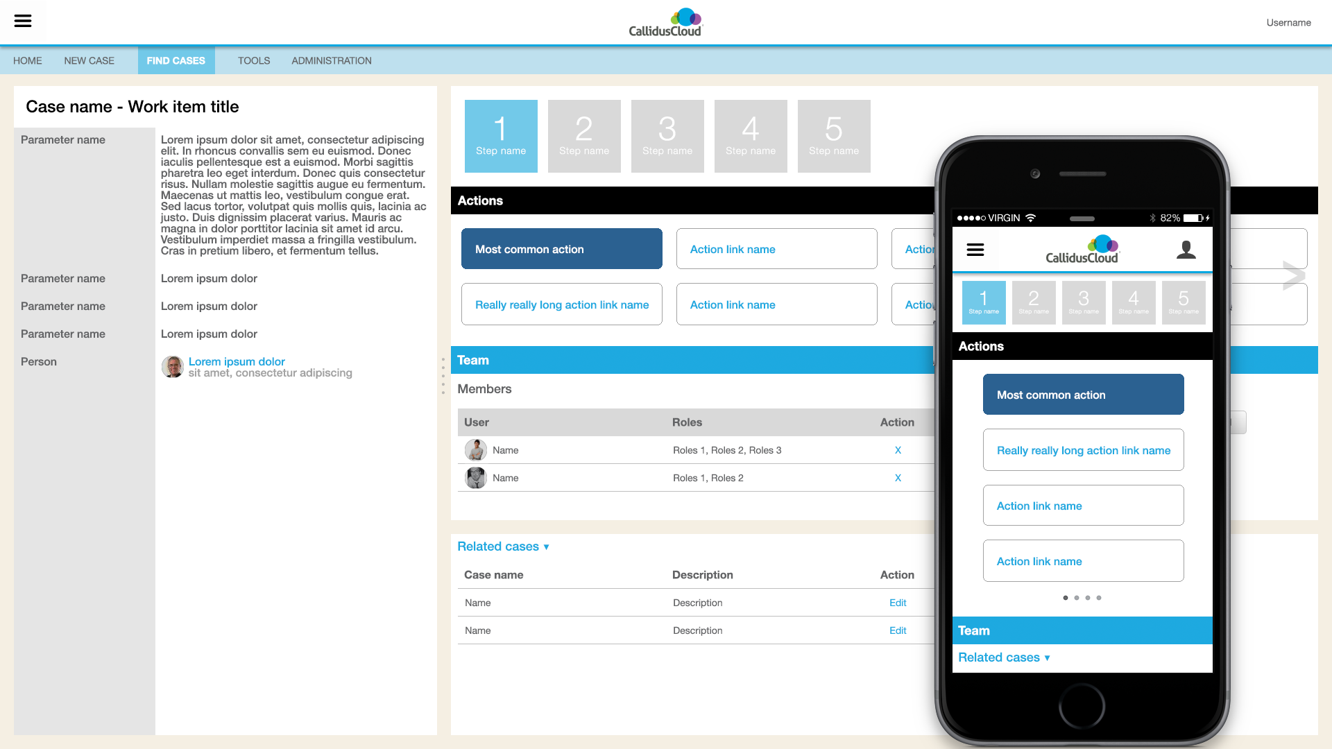
By way of example, let's suppose in the Workflow product UI the most primary thing the user will do is take some kind of action, and the second-most thing the user will do is assign team members or reassign tasks to team members. Armed with that information, we can apply the primary heading style to the Actions section and the Secondary heading style to the Team Members area, and apply Tertiary and alternate section styles to remaining areas of the UI, based on relative priority, as seen in this example.
For more background information to help apply visual styles from the guideline to UI, please review this presentation.
Layout
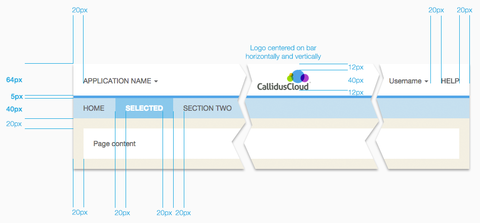
There is a common top header section. The top left navigation is reserved for switching between applications in the Lead To Money suite, and for the main navigation of the current application. The top right is reserved for help contents and profile management of the currently logged in user. The main content area can be subdivided in halves or thirds both horizontally and vertically to accomodate neede panels and display of various content together.
Everything should be laid out on a 5-pixel grid as much as possible. Margins and padding for the page should be 20 pixels, major content areas should be either 10 or 20 pixels to separate sections of text. Margins should 'collapse' between content areas. In other words, avoid having two content areas next to each other with margins resulting in 40 pixels in between them but only 20 pixels around the outside. Margins need to be set so that there is never more than a 20-pixel combined margin around content areas. Content should never be placed in the margin area, it is only to be used for spacing between content sections.
Design Style
All elements are in a flat, borderless style (with some exceptions, e.g. form inputs). Fonts are Helvetica Neue / sans-serif. This is both the state of the art in UI and makes it very easy for applications to appear consistent on multiple target devices and operating systems. There is a detriment that some visual affordances to indicate interaction are compromised with a flat style (3-D makes it obvious what can be pressed, flat requires other ways to distinguish), so opportunities to integrate interaction affordances back in will be identified as the guidelines mature.
The top header section is white, to not pull attention away from the main content/data area of applications. The top left navigation is reserved for switching between applications in the Lead To Money suite, and for the main navigation of the current application. The top right is reserved for help contents and profile management of the currently logged in user. The main content should have a white background and all text by default is a dark gray #636466. Black is reserved only for <H#> headings and <STRONG> elements. Borders and backgrounds behind the default text color should always be lighter, never the same or darker. (Specific colors to use are detailed in the colors section.)
Everything should be laid out on a 5-pixel grid as much as possible. Margins and padding for the page should be 20 pixels, major content areas should be either 10 or 20 pixels to separate sections of text. Margins should 'collapse' between content areas. In other words, avoid having two content areas next to each other with margins resulting in 40 pixels in between them but only 20 pixels around the outside. Margins need to be set so that there is never more than a 20-pixel combined margin around content areas.
Static Content Vs Interactive Content
In mobile, just about everything is interactive. Almost everything can be touched, dragged, swiped, resized. But across devices and platforms, if a decision must be made for the visual style, prefer square corners for static content and round corners for interactive content.
Fonts
Font face is Helvetica Neue. In CSS, the spec including fallback fonts is
font-family: Roboto, "Helvetica Neue", Helvetica, Arial, sans-serif;
Roboto is for Google Android devices and is first because Android at time of writing has larger market share (consider China/Asia). Helvetica Neue is to cover Apple iOS devices. Arial covers Microsoft Windows devices and sans-serif covers everything else.
Font size should start with the browser default, and prefer using relative CSS font sizes to handle setting variations in size. For example, use font-size: smaller; or font-size: larger; only when absolutely necessary to distinguish specific lines of text. Additionally, semantic markup like <strong> rather than <b> should be used. Otherwise, structural markup appropriate for the content (e.g. H1, H2, H3, etc.) should be relied on to provide the size and weight for text.
H1
H2
H3
H4
H5
H6
<h1>H1</h1>
<h2>H2</h2>
<h3>H3</h3>
<h4>H4</h4>
<h5>H5</h5>
<h6>H6</h6>
<div>This sentence has something to be <em>emphasized</em> and stated <strong>strongly</strong>.</div>
<div class="cald_larger">Using font-size: larger;</div>
<div>Default browser font size.</div>
<div class="cald_smaller">Using font-size: smaller;</div>
body {
background-color: white;
color: rgba(99,100,102,1.0);
font-family: Roboto, "Helvetica Neue", Helvetica, Arial, sans-serif;
}
h1, h2, h3, h4, h5, h6, strong {
color: black;
text-decoration: none;
}
.cald_larger {
font-size: larger;
}
.cald_smaller {
font-size: smaller;
}Colors
The color palette is not just a range of colors to be used at will. Each color in the palette was chosen from the mockups where each color has a specific use. The palette was initialized from specific colors found in the Callidus corporate identity and in products of the suite. When two colors are adjacent, e.g. text on a background, it's important that the two colors have sufficient contrast to be perceptible.
Base Palette
#000000
#636466
#FFFFFF
#00A8E3
#fee1a9
The base palette is the designer's reference to evaluate the overall look. See the UI Color Palette below for all the specific colors and their usage.
UI Color Palette
Grayscale
Example H4
Usage: Heading text with no background colorExample of normal page text
Usage: Default page text color, mobile hamburger menu 1st level backgroundand subsection content
Colors
Example Secondary Section Heading
Usage: Secondary headings and grid titles, global header bottom border Done.
Done.
Data Visualization For graphic charts only
Apply the cool series first. Use the warm series only if needed for large number of data series on one visualization. (Do not alternate the cool series on one visualization and the warm series on another visualization.) If there are significant number of data series to be displayed, wrap the series back to the first cool color in the cool series and use hover/highlighting to help the user identify a particular data series. The purple highlight is only to be used for temporal hover or selection of a data series on a visualization. Do not use purple as a fixed color for a data series on any visualization.
Cool Color Series
1
2
3
4
5
6
7
8
9
Warm Color Series
10
11
12
13
14
15
16
17
18
Mixed Color Series
1
2
3
4
5
6
7
8
9
10
11
12
13
14
15
16
Transitional Colors
Examples
Legend
Data series 1Data series 2
Data series 3
Data series 4
Data series 5
Data series 6
Data series 7
Data series 8
Legend
Example of how the color series works with a very dense line chart using the mixed color series. Hover over the line or legend.
Iconography
Iconography should be flat, solid color. It's recommended to start with the Icomoon library. The default Bootstrap icon library is possible as well. (Reference information on the Icomoon web site.) Pay careful attention to file names and only use icons exactly as originally intended by the file names. DO NOT use icons simply because they look like something that might work. If an icon for a feature peculiar to Sales Management cannot be found in the library, based on file name not image, then a custom icon will need to be created with a new, unique visual metaphor for the purpose. AVOID using social media emojis / smileys.
Depending on the context, either 16pt or 32pt are acceptable. Try to avoid 24pt with Icomoon as only multiples of 16 are clear.
<head>
        <link rel="stylesheet" href="css/bootstrap.min.css">
        <link rel="stylesheet" href="fonts/icomoon/style.css">
</head>
<body>

	ICOMOON:
	<span class="icon-name"></span>

	BOOTSTRAP:
	<span class="glyphicon glyphicon-name"></span>

</body>
This is the complete set. Not all icons seen here should be used in products. Icons that have been standardized for particular use are highlighted in this color. Hover over the icon for usage details. Do not use icons marked in red without consulting UX and Legal.
Header Bars
Default Header Bar
Each button/link loads a pageHeader With Submenus
Menu categories instead of page linksTertiary Bar
For contextual search or other page-level capabilitiesNo Submenus
Typically used for mobileEmbedded
Embedded in a 3rd Party Product
No change to the Callidus colors or branding. The three-dot overflow menu handles the user profile and help menu links that would have been in the heading.

3rd-party Product Heading
Embedded in a 3rd Party Product and Co-branded
Basic color changes to match the parent application. Monochrome Callidus logo (if allowed) to keep Callidus brand but not disrupt parent applcation.
3rd-party Product Heading
Embedded in Another Callidus Product
The blue menu system is the embedded product. The white header, including the dark blue line, is the parent application.
<header class="cald_header">
    <div class="cald_header">
        <div class="cald_left cald_app_name">
            Application Name <span class="caret"></span>
        </div>
        <div class="cald_logo" id="cald_logo"></div>
        <!-- this ends up on the far right -->
        <div class="cald_right cald_help_link">Help</div>
        <div class="cald_right">Username <span class="caret"></span></div>
    </div>
</header>
<nav class="cald_header">
    <ul class="nav nav-pills">
      <li role="presentation" class="cald_header_menuitem">HOME</li>
      <li role="presentation" class="cald_header_menuitem_selected">SELECTED PAGE</li>
      <li role="presentation" class="cald_header_menuitem">PAGE TWO</li>
    </ul>
</nav>
header {
text-align: center;
padding: 0px;
height: 64px;
min-height: 60px;
vertical-align: middle;
border-bottom-color: rgba(0,168,227,1.0);
border-bottom-style: solid;
border-bottom-width: 5px;
background-color: white;
z-index: 1000;
width: 100%;
}
header.cald_header {
position: static;
}
div.cald_header {
position: relative;
}
nav.cald_header {
background-color: rgba(190,224,238,1.0);
height: 40px;
min-height: 5px;
width: 100%;
z-index: 1000;
margin: 0px;
padding: 0px;
position: static;
}
.cald_no_menu {
height: 5px !important;
}
.cald_app_name, .cald_help_link {
text-transform: uppercase;
}
.cald_logo {
background-color: transparent;
background-image: url("../img/CallidusCloud_logo_product_dark.png");
background-position: center;
background-repeat: no-repeat;
background-size: contain;
height: 44px;
width: 117px;
display: inline-block;
position: absolute;
top: 50%;
left: 50%;
margin: 10px 10px 10px -58px;
}
.cald_left {
float: left;
padding: 20px 0px 20px 20px;
}
.cald_right {
float: right;
padding: 20px 20px 20px 0px;
}
.cald_header_menuitem {
height: 40px;
margin: 0px;
padding: 10px 20px;
border: none;
text-align: center;
vertical-align: middle;
}
.cald_header_menuitem_selected {
background-color: #72c9e9;
height: 40px;
margin: -1px;
padding: 10px 20px;
border: none;
text-align: center;
vertical-align: middle;
color: white;
font-weight: bold;
}
Headings
Page content needs to be visually prioritized based on frequency of use, or average duration of use per session, or sequence of tasks within a user's workflow. To aid in this, there are primary, secondary, tertiary styles. View an example of all these styles applied.
There should only be one primary section per page. Avoid more than one secondary heading also. There shouldn't be more than 2-3 tertiary headings. Use the alternate heading for any additional sections. The subsection is for callout panels, details, explanations, etc.
Primary Heading
Primary content
Secondary Heading
Secondary content
Tertiary Heading
Tertiary content
Alternate Heading
Additional content
Subsection Heading
Subsection / details
<h1 class="cald_header">Primary Heading</h1>

<h2 class="cald_header">Secondary Heading</h2>

<h3 class="cald_header">Tertiary Heading</h3>

<h4 class="cald_header">Alternate Heading</h4>

<div class="cald_subsection">
    <h5 class="cald_header">Subsection Heading</h5>
</div>
h1.cald_header {
background-color: black;
color: white;
padding: 10px;
font-size: 1em;
margin: -10px -10px 10px -10px;
}
h2.cald_header {
background-color: #00A8E3;
color: white;
padding: 10px;
font-size: 1em;
margin: -10px -10px 10px -10px;
}
h3.cald_header {
background-color: #d9d9d9;
padding: 10px;
font-size: 1em;
margin: -10px -10px 10px -10px;
}
h4.cald_header {
border-bottom: solid 1px #bfbfbf;
padding: 10px;
padding-bottom: 9px;
font-size: 1em;
margin: -10px -10px 10px -10px;
}
h5.cald_header {
background-color: #f3f3f3;
font-size: 1em;
margin: 0px 0px 10px 0px;
font-weight: bold;
}
.cald_subsection {
background-color: #f3f3f3;
padding: 10px;
margin: 0px;
}Grids
Like sections of a page, grids and lists need to be visually prioritized based on frequency of use, or average duration of use per session, or sequence of tasks within a user's workflow. To aid in this, there are primary, secondary, tertiary grid styles.
Primary Grid
Usage: one per page
| Heading | Heading |
|---|---|
| Non-banded row | Data cell |
| Banded row | Data cell |
| Non-banded row | Data cell |
| Banded row | Data cell |
| Non-banded row | Data cell |
| Hover row | Data cell |
| Selected row | Data cell |
| Heading | Heading |
|---|---|
| Data cell | Data cell |
| Data cell | Data cell |
| Data cell | Data cell |
| Data cell | Data cell |
| Data cell | Data cell |
| Hover row | Data cell |
| Selected row | Data cell |
<-- Primary Grid - banded -->
<table class="cald_table cald_primary cald_banded">
    <tr class="cald_tr_heading ">
        <th>Heading</th>
        <th>Heading</th>
    </tr>
    <tr class="cald_tr_cells cald_odd">
        <td>Non-banded row</td>
        <td>Data cell</td>
    </tr>
    <tr class="cald_tr_cells cald_even">
        <td>Banded row</td>
        <td>Data cell</td>
    </tr>
    <tr class="cald_tr_cells cald_odd">
        <td>Non-banded row</td>
        <td>Data cell</td>
    </tr>
    <tr class="cald_tr_cells cald_even">
        <td>Banded row</td>
        <td>Data cell</td>
    </tr>
    <tr class="cald_tr_cells cald_odd">
        <td>Non-banded row</td>
        <td>Data cell</td>
    </tr>
    <tr class="cald_tr_cells cald_hover">
        <td>Hover row</td>
        <td>Data cell</td>
    </tr>
    <tr class="cald_tr_cells cald_selected">
        <td>Selected row</td>
        <td>Data cell</td>
    </tr>
</table>

<-- Primary Grid - bordered -->
<table class="cald_table cald_primary">
    <tr class="cald_tr_heading">
        <th>Heading</th>
        <th>Heading</th>
    </tr>
    <tr class="cald_tr_cells">
        <td>Data cell</td>
        <td>Data cell</td>
    </tr>
    <tr class="cald_tr_cells">
        <td>Data cell</td>
        <td>Data cell</td>
    </tr>
    <tr class="cald_tr_cells">
        <td>Data cell</td>
        <td>Data cell</td>
    </tr>
    <tr class="cald_tr_cells">
        <td>Data cell</td>
        <td>Data cell</td>
    </tr>
    <tr class="cald_tr_cells">
        <td>Data cell</td>
        <td>Data cell</td>
    </tr>
    <tr class="cald_tr_cells cald_hover">
        <td>Hover row</td>
        <td>Data cell</td>
    </tr>
    <tr class="cald_tr_cells cald_selected">
        <td>Selected row</td>
        <td>Data cell</td>
    </tr>
</table>
.cald_table th, .cald_table td {
	padding: 5px 5px 4px 5px;
}

.cald_tr_heading, .cald_tr_cells {
	border-bottom: solid 1px #bfbfbf;
	padding: 5px 5px 4px 5px;
}

.cald_banded .cald_tr_heading, .cald_banded .cald_tr_cells {
	border: none;
}

.cald_banded th, .cald_banded td {
	border: none;
	padding: 5px;
}

.cald_tr_cells.cald_hover {
	background-color: #FDB823;
}

.cald_tr_cells.cald_selected {
	background-color: #fee1a9;
}

.cald_primary .cald_tr_heading {
	background-color: black;
	color: white;
}

.cald_primary.cald_banded .cald_tr_cells.cald_even, .cald_primary_section .cald_alternate.cald_banded .cald_tr_cells.cald_even {
	background-color: #d3eef9;
}
Secondary Grid
Usage: one per page
| Heading | Heading |
|---|---|
| Non-banded row | Data cell |
| Banded row | Data cell |
| Non-banded row | Data cell |
| Banded row | Data cell |
| Non-banded row | Data cell |
| Hover row | Data cell |
| Selected row | Data cell |
| Heading | Heading |
|---|---|
| Data cell | Data cell |
| Data cell | Data cell |
| Data cell | Data cell |
| Data cell | Data cell |
| Data cell | Data cell |
| Hover row | Data cell |
| Selected row | Data cell |
<-- Secondary Grid - banded -->
<table class="cald_table cald_secondary cald_banded">
    <tr class="cald_tr_heading ">
        <th>Heading</th>
        <th>Heading</th>
    </tr>
    <tr class="cald_tr_cells cald_odd">
        <td>Non-banded row</td>
        <td>Data cell</td>
    </tr>
    <tr class="cald_tr_cells cald_even">
        <td>Banded row</td>
        <td>Data cell</td>
    </tr>
    <tr class="cald_tr_cells cald_odd">
        <td>Non-banded row</td>
        <td>Data cell</td>
    </tr>
    <tr class="cald_tr_cells cald_even">
        <td>Banded row</td>
        <td>Data cell</td>
    </tr>
    <tr class="cald_tr_cells cald_odd">
        <td>Non-banded row</td>
        <td>Data cell</td>
    </tr>
    <tr class="cald_tr_cells cald_hover">
        <td>Hover row</td>
        <td>Data cell</td>
    </tr>
    <tr class="cald_tr_cells cald_selected">
        <td>Selected row</td>
        <td>Data cell</td>
    </tr>
</table>

<-- Secondary Grid - bordered -->
<table class="cald_table cald_secondary">
    <tr class="cald_tr_heading">
        <th>Heading</th>
        <th>Heading</th>
    </tr>
    <tr class="cald_tr_cells">
        <td>Data cell</td>
        <td>Data cell</td>
    </tr>
    <tr class="cald_tr_cells">
        <td>Data cell</td>
        <td>Data cell</td>
    </tr>
    <tr class="cald_tr_cells">
        <td>Data cell</td>
        <td>Data cell</td>
    </tr>
    <tr class="cald_tr_cells">
        <td>Data cell</td>
        <td>Data cell</td>
    </tr>
    <tr class="cald_tr_cells">
        <td>Data cell</td>
        <td>Data cell</td>
    </tr>
    <tr class="cald_tr_cells cald_hover">
        <td>Hover row</td>
        <td>Data cell</td>
    </tr>
    <tr class="cald_tr_cells cald_selected">
        <td>Selected row</td>
        <td>Data cell</td>
    </tr>
</table>
.cald_table th, .cald_table td {
	padding: 5px 5px 4px 5px;
}

.cald_tr_heading, .cald_tr_cells {
	border-bottom: solid 1px #bfbfbf;
	padding: 5px 5px 4px 5px;
}

.cald_banded .cald_tr_heading, .cald_banded .cald_tr_cells {
	border: none;
}

.cald_banded th, .cald_banded td {
	border: none;
	padding: 5px;
}

.cald_tr_cells.cald_hover {
	background-color: #FDB823;
}

.cald_tr_cells.cald_selected {
	background-color: #fee1a9;
}

.cald_secondary .cald_tr_heading {
	background-color: #00A8E3;
	color: white;
}

.cald_secondary.cald_banded .cald_tr_cells.cald_even {
	background-color: #ececec;
}
Tertiary Grid
Usage: try to avoid more than 2-3 per page
| Heading | Heading |
|---|---|
| Non-banded row | Data cell |
| Banded row | Data cell |
| Non-banded row | Data cell |
| Banded row | Data cell |
| Non-banded row | Data cell |
| Hover row | Data cell |
| Selected row | Data cell |
| Heading | Heading |
|---|---|
| Data cell | Data cell |
| Data cell | Data cell |
| Data cell | Data cell |
| Data cell | Data cell |
| Data cell | Data cell |
| Hover row | Data cell |
| Selected row | Data cell |
<-- Tertiary Grid - banded -->
<table class="cald_table cald_tertiary cald_banded">
    <tr class="cald_tr_heading ">
        <th>Heading</th>
        <th>Heading</th>
    </tr>
    <tr class="cald_tr_cells cald_odd">
        <td>Non-banded row</td>
        <td>Data cell</td>
    </tr>
    <tr class="cald_tr_cells cald_even">
        <td>Banded row</td>
        <td>Data cell</td>
    </tr>
    <tr class="cald_tr_cells cald_odd">
        <td>Non-banded row</td>
        <td>Data cell</td>
    </tr>
    <tr class="cald_tr_cells cald_even">
        <td>Banded row</td>
        <td>Data cell</td>
    </tr>
    <tr class="cald_tr_cells cald_odd">
        <td>Non-banded row</td>
        <td>Data cell</td>
    </tr>
    <tr class="cald_tr_cells cald_hover">
        <td>Hover row</td>
        <td>Data cell</td>
    </tr>
    <tr class="cald_tr_cells cald_selected">
        <td>Selected row</td>
        <td>Data cell</td>
    </tr>
</table>

<-- Tertiary Grid - bordered -->
<table class="cald_table cald_tertiary">
    <tr class="cald_tr_heading">
        <th>Heading</th>
        <th>Heading</th>
    </tr>
    <tr class="cald_tr_cells">
        <td>Data cell</td>
        <td>Data cell</td>
    </tr>
    <tr class="cald_tr_cells">
        <td>Data cell</td>
        <td>Data cell</td>
    </tr>
    <tr class="cald_tr_cells">
        <td>Data cell</td>
        <td>Data cell</td>
    </tr>
    <tr class="cald_tr_cells">
        <td>Data cell</td>
        <td>Data cell</td>
    </tr>
    <tr class="cald_tr_cells">
        <td>Data cell</td>
        <td>Data cell</td>
    </tr>
    <tr class="cald_tr_cells cald_hover">
        <td>Hover row</td>
        <td>Data cell</td>
    </tr>
    <tr class="cald_tr_cells cald_selected">
        <td>Selected row</td>
        <td>Data cell</td>
    </tr>
</table>
.cald_table th, .cald_table td {
	padding: 5px 5px 4px 5px;
}

.cald_tr_heading, .cald_tr_cells {
	border-bottom: solid 1px #bfbfbf;
	padding: 5px 5px 4px 5px;
}

.cald_banded .cald_tr_heading, .cald_banded .cald_tr_cells {
	border: none;
}

.cald_banded th, .cald_banded td {
	border: none;
	padding: 5px;
}

.cald_tr_cells.cald_hover {
	background-color: #FDB823;
}

.cald_tr_cells.cald_selected {
	background-color: #fee1a9;
}

.cald_tertiary .cald_tr_heading {
	background-color: #d9d9d9;
}

.cald_tertiary.cald_banded .cald_tr_cells.cald_even {
	background-color: #ececec;
}
Alternate Grid
Usage: for all other tables on a page, or combine with an appropriate heading with buttons below the heading to create tables with a toolbar. See example.
| Heading | Heading |
|---|---|
| Non-banded row | Data cell |
| Banded row | Data cell |
| Non-banded row | Data cell |
| Banded row | Data cell |
| Non-banded row | Data cell |
| Hover row | Data cell |
| Selected row | Data cell |
| Heading | Heading |
|---|---|
| Data cell | Data cell |
| Data cell | Data cell |
| Data cell | Data cell |
| Data cell | Data cell |
| Data cell | Data cell |
| Hover row | Data cell |
| Selected row | Data cell |
<-- Alternate Grid - banded -->
<table class="cald_table cald_alternate cald_banded">
    <tr class="cald_tr_heading ">
        <th>Heading</th>
        <th>Heading</th>
    </tr>
    <tr class="cald_tr_cells cald_odd">
        <td>Non-banded row</td>
        <td>Data cell</td>
    </tr>
    <tr class="cald_tr_cells cald_even">
        <td>Banded row</td>
        <td>Data cell</td>
    </tr>
    <tr class="cald_tr_cells cald_odd">
        <td>Non-banded row</td>
        <td>Data cell</td>
    </tr>
    <tr class="cald_tr_cells cald_even">
        <td>Banded row</td>
        <td>Data cell</td>
    </tr>
    <tr class="cald_tr_cells cald_odd">
        <td>Non-banded row</td>
        <td>Data cell</td>
    </tr>
    <tr class="cald_tr_cells cald_hover">
        <td>Hover row</td>
        <td>Data cell</td>
    </tr>
    <tr class="cald_tr_cells cald_selected">
        <td>Selected row</td>
        <td>Data cell</td>
    </tr>
</table>

<-- Alternate Grid - bordered -->
<table class="cald_table cald_alternate">
    <tr class="cald_tr_heading">
        <th>Heading</th>
        <th>Heading</th>
    </tr>
    <tr class="cald_tr_cells">
        <td>Data cell</td>
        <td>Data cell</td>
    </tr>
    <tr class="cald_tr_cells">
        <td>Data cell</td>
        <td>Data cell</td>
    </tr>
    <tr class="cald_tr_cells">
        <td>Data cell</td>
        <td>Data cell</td>
    </tr>
    <tr class="cald_tr_cells">
        <td>Data cell</td>
        <td>Data cell</td>
    </tr>
    <tr class="cald_tr_cells">
        <td>Data cell</td>
        <td>Data cell</td>
    </tr>
    <tr class="cald_tr_cells cald_hover">
        <td>Hover row</td>
        <td>Data cell</td>
    </tr>
    <tr class="cald_tr_cells cald_selected">
        <td>Selected row</td>
        <td>Data cell</td>
    </tr>
</table>
.cald_table th, .cald_table td {
	padding: 5px 5px 4px 5px;
}

.cald_tr_heading, .cald_tr_cells {
	border-bottom: solid 1px #bfbfbf;
	padding: 5px 5px 4px 5px;
}

.cald_banded .cald_tr_heading, .cald_banded .cald_tr_cells {
	border: none;
}

.cald_banded th, .cald_banded td {
	border: none;
	padding: 5px;
}

.cald_tr_cells.cald_hover {
	background-color: #FDB823;
}

.cald_tr_cells.cald_selected {
	background-color: #fee1a9;
}

.cald_alternate .cald_tr_heading {
	border-bottom: solid 1px #bfbfbf;
	padding-bottom: 4px;
}

.cald_alternate.cald_banded .cald_tr_cells.cald_even {
	background-color: #ececec;
}
Grid With A Toolbar
Reserve a row space for toolbar actions and filters. Use text for actions as much as feasible. For very common operations that have a well-known metaphor, an icon button is acceptable. If an action will be used frequently, then it should be a text-based button to make it a larger target, possibly style it as a primary action if that is the case.
Page Heading Used As Grid Heading
Heading
Heading
Heading
Non-banded row
Data cell
Data cell
Banded row
Data cell
Data cell
Non-banded row
Data cell
Data cell
Banded row
Data cell
Data cell
Hover row
Data cell
Data cell
Selected row
Data cell
Data cell
Forms
Inputs and their labels should be lined up on a grid system to make them easier to visually scan and locate a particular field on a page. Inputs should be sized appropriately for the expected value. This further helps visually distinguish specific inputs and avoid errors by users attempting to put the wrong value in the incorrect field simply because all the inputs were the same size. Inputs should be seeded with valid defaults as much as possible so that potentially the user could simply hit submit without having to modify any inputs.
Labels primarily should be oriented above the input they identify to allow for translation text expansion and to maintain a uniform grid pattern, regardless of label length, along the left (or right margin depending on language direction) for easy visual scanning. The rare exception might be a login where there are only 2-3 inputs and whitespace, visual scanning and readability are not at risk. Sufficient whitespace should be used above form labels to ensure the label is only visually associated with the one input it identifies (if there are two inputs equidistant between a label, it can be ambiguous which field the label is identifying).
Button Alignment
This section describes alignment of various buttons in various situations.
Short Form
Buttons aligned bottom right, primary far right.
Long Page (where buttons would have ended up off-screen)
Buttons pinned top right (always visible), primary far right.
Long Page with Search / Filter This is an exception
This is a different pattern as the buttons here are intended as a toolbar for a page and not a form submit mechanism. Buttons pinned top left (always visible), primary far left. Search / filter always top right.
Dialogs and Mobile
Buttons centered (always visible), primary right. This puts the actions in proper proximity on screen for thumb / hand-held usage.
<!-- STANDARD BUTTON BAR - ALIGNED RIGHT -->
<div class="cald_button_bar">
    <button class="btn btn-default cald_3D_button_default" disabled>Disabled</button>
    <button class="btn btn-default cald_3D_button_default">Normal</button>
    <button class="btn btn-primary cald_3D_button_primary">Primary</button>
</div>

<!-- EXCEPTION BUTTON BAR WITH FILTER - ALIGNED LEFT -->
<div class="cald_button_bar_left">
    <button class="btn btn-primary cald_3D_button_primary">Primary</button>
    <button class="btn btn-default cald_3D_button_default">Normal</button>
    <button class="btn btn-default cald_3D_button_default" disabled>Disabled</button>
    <input placeholder="Filter" class="pull-right form-control" size="25" style="width: 15em;">
</div>

<!-- STANDARD DIALOG / MOBILE BUTTON BAR - CENTERED -->
<div class=" cald_dialog_buttonbar">
    <button class="btn btn-default cald_3D_button_default" disabled>Disabled</button>
    <button class="btn btn-default cald_3D_button_default">Normal</button>
    <button class="btn btn-primary cald_3D_button_primary">Primary</button>
</div>
.cald_dialog_buttonbar {
text-align: center;
vertical-align: middle;
width: 100%;
padding: 20px;
padding-bottom: 0px;
}
.cald_button_bar {
margin-top: 2em;
text-align: right;
}
.cald_button_bar_left {
margin-top: 2em;
text-align: left;
}
.btn.btn-primary.cald_interactive {
box-shadow: none;
background:-webkit-linear-gradient(#337ab7,#337ab7);
background:linear-gradient(#337ab7,#337ab7);
}
.btn.btn-default.cald_interactive {
box-shadow: none;
background:-webkit-linear-gradient(#ffffff,#ffffff);
background:linear-gradient(#ffffff,#ffffff);
}
.btn.btn-primary.cald_interactive:hover, .btn.btn-primary.cald_interactive:active {
box-shadow: none;
background:-webkit-linear-gradient(#337ab7,#337ab7);
background:linear-gradient(#337ab7,#337ab7);
}
.btn.btn-default.cald_interactive:hover, .btn.btn-default.cald_interactive:active {
box-shadow: none;
background:-webkit-linear-gradient(#ffffff,#ffffff);
background:linear-gradient(#ffffff,#ffffff);
}
.btn.btn-default.cald_interactive:disabled {
box-shadow: none;
background:-webkit-linear-gradient(#dddddd,#dddddd);
background:linear-gradient(#dddddd,#dddddd);
}
.cald_3D_button_primary {
border-radius: 5px;
box-shadow:0 0 3px 0px;
background:-webkit-linear-gradient(#47a9ff,#337ab7);
background:linear-gradient(#47a9ff,#337ab7);
}
.cald_3D_button_default {
background:-webkit-linear-gradient(#ffffff,#dddddd);
background:linear-gradient(#ffffff,#dddddd);
border-radius: 5px;
}
.cald_3D_button_primary:hover, .cald_3D_button_primary:active {
border-radius: 5px;
box-shadow:0 0 3px 0px;
background:-webkit-linear-gradient(#337ab7,#47a9ff);
background:linear-gradient(#337ab7,#47a9ff);
}
.cald_3D_button_default:hover, .cald_3D_button_default:active {
background:-webkit-linear-gradient(#dddddd,#ffffff);
background:linear-gradient(#dddddd,#ffffff);
border-radius: 5px;
}
.cald_3D_button_default:disabled {
background:-webkit-linear-gradient(#ececec,#dddddd);
background:linear-gradient(#ececec,#dddddd);
color: #636466;
}Input Layout
If a well-known layout pattern for a set inputs is known (e.g. addresses) it should be used.
Required Fields
The 'required' attribute should be set and the word 'Required' should be parenthetically suffixed to the label for the field. If all inputs in a form or page are required, there only needs to be a note to that effect at the start of the form. If only a few inputs are required, those inputs should be marked as required individually. If the majority of the inputs are required with only a few inputs optional, there should be a note at the start of the form that all inputs are required except as noted, and the optional fields marked accordingly.