Kevin Lynn Brown

User Experience and Product Design Leader

Resume

My Mission

Enterprise work can be complex and difficult.
Enterprise software should be simpler and easier.
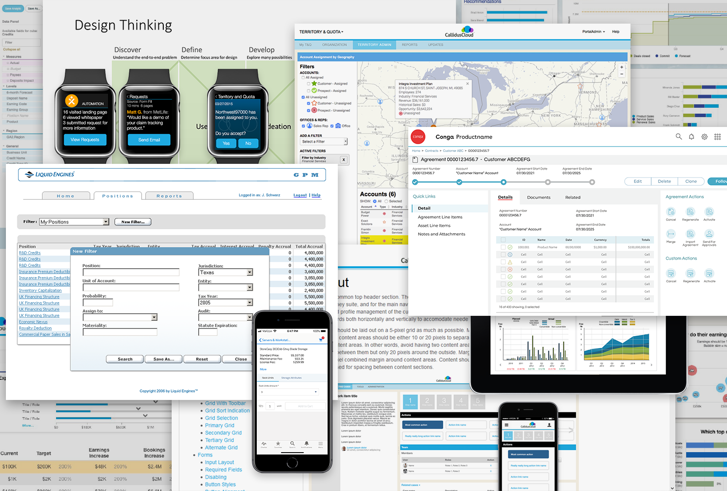
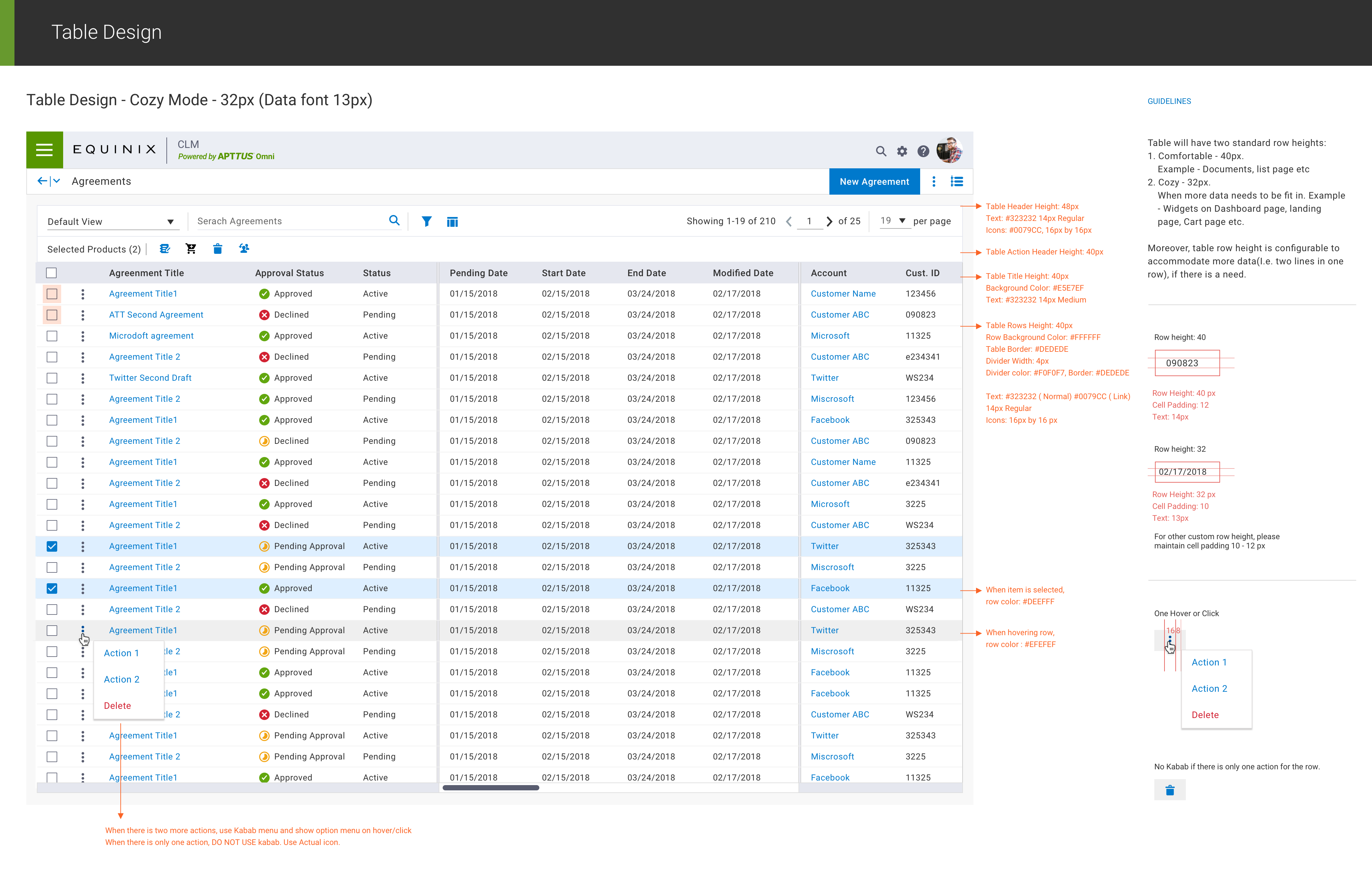
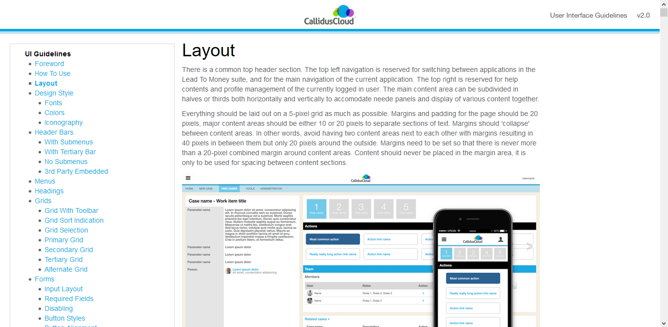
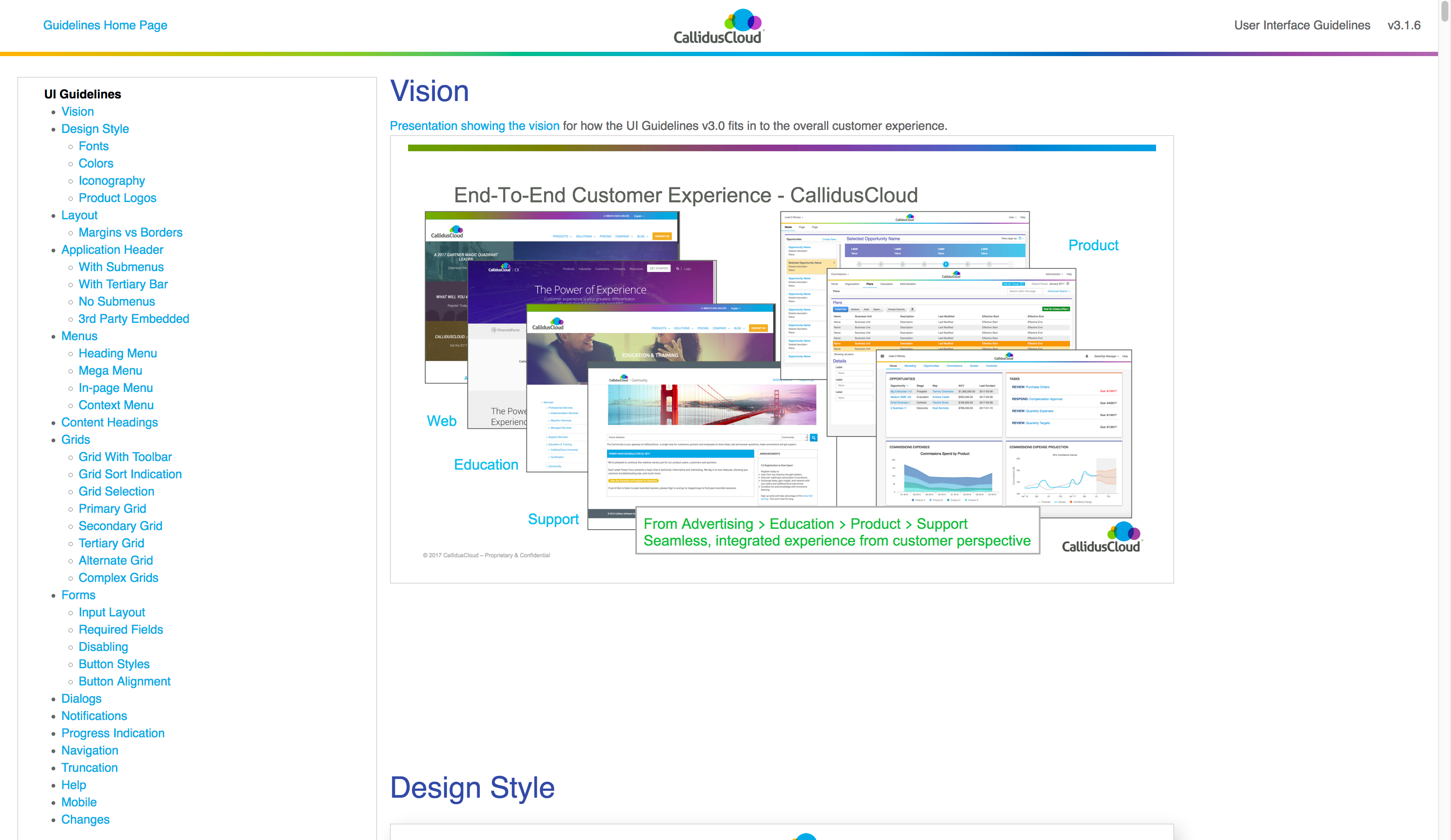
Collage of screens I have designed or worked on.  Shows the design for Liquid Engines GPM product, a screen showing Conga branding applied to a mockup screen for Conga Design System, home screen of the CallidusCloud UI Guidelines, a code prototype of the Territory And Quota product, and an infographic of Double Diamond Design Thinking,

Strengths / Expertise

  • Defined the UX strategy and plans for several $1B+ startups.
  • More than 10 years experience hiring, training, leading and managing enterprise UX teams
  • Design Thinking instructor and practitioner
  • Lead usability research, rapid prototype and testing techniques
  • More than 10 years experience in graphical user interface design for enterprise web applications
  • Repeatedly led the unification of dozens of products, most acquisitions, under common corporate brand.
  • Coached multiple teams across several companies in creating branded Design Systems for products.
  • More than 10 years experience in web design and graphic design
  • Agile/iterative development practitioner since the inception of Agile
  • Accessibility representative for almost 10 years with hundreds of hours testing users with disabilities
  • Experienced and skilled developer with expertise in cross-platform HTML, CSS, JavaScript

I am a leader in Product Design and User Experience with a background in art and graphic design, experience as an Interaction Designer, with skills in responsive web design using HTML, CSS and JavaScript. I lead user research and lead UX teams across the product portfolio. I have 7 experience as a UI Engineer with skills in Java development as well.

My primary goal is to always play a vital role, whether individually or within a team, in the design and development of best-in-class graphical user interfaces, with regard to aesthetics, functionality, usability and end-user satisfaction.

Work Experience

CCC Intelligent Solutions(Leader in insurance claims processing software)

Director of Product DesignJul 2022 – Jan 2023
  • Co-led design organization
  • Established and launched Design Center of Excellence
  • Evangelized Design Thinking as new design process for the organization
  • Collaborated with designers across CCC to drive progress on a CCC Design System
  • Led design team to collaborate with Product Management, Development, Marketing and other stakeholders to deliver early research and product designs
More details...
Accomplishments
  • Established and launched Design Center of Excellence
  • Established use of JIRA for design project tracking
  • Evangelized Design Thinking as new design process for the organization
  • Collaborated with designers across CCC to drive progress on a CCC Design System
Responsibilities
  • Co-lead design team at large to collaborate with product management, development and all stakeholders
  • Lead 'early reseasrch' design team in vetting product ideas, design proposals for funding
Customers
  • State Farm Insurance
  • Travelers Insurance
  • Liberty Mutual Insurance
  • Nationwide Insurance
  • Farmers Insurance
  • ...numerous auto repair shops across the nation
Less details...

ZS Associates(Design consulting for Big Pharma)

User Experience Design Lead (Consultant)Nov 2021 – March 2022
  • Contract design consulting for Pharma industry. Led and collaborated with 7 designers across the U.S. and India to design dashboards, analytics and reporting for large pharma companies like McKesson, Pfizer, Amgen, Gilead/Kite, Blueprint Medicines. Also designed the same for other clients like Microsoft Corporation.
More details...
Accomplishments
  • Designed a rather complicated and large analytics application for McKesson. McKesson has data on all their customers' transactions and wanted to leverage it to provide insights back to their customers to improve management of the treatment cycle for patients, reduce waste of medicines which will expire, and avoid loss of opportunities against competing products and to improve the adherance of patients to treatments.
Responsibilities
  • Lead and collaborate with 7 designers across the U.S. and India to design dashboards, analytics and reporting for large pharma companies.
Customers
  • McKesson
  • Roche
  • Jansson
  • Gilead
  • Kite
  • Amgen
Less details...

Conga(Contracts, Documents, eSign)

Vice President of User Experience and DesignMay 2020 – Oct 2021
  • Hire and lead worldwide UX design team for entire product portfolio
  • Set UX strategy enterprise-wide
More details...
Accomplishments
  • Led merging and integration of UX teams, processes and tools from Conga and Apttus
  • Initiated and led corporate-wide rebrand of former Apttus products to the new Conga brand
  • Saved the company about $85,000.00 on their software/tools spend during the merger by revamping/renegotiating the UX team toolset and working with I.T., Marketing, Product Marketing and other collaborating teams to track down and retire obsolete shared licenses.
  • Leader, mentor and contributor to new Conga design system
Responsibilities
  • Determine UX strategy to align with product and corporate strategy
  • Participate in and provide input to Product Team release planning and quality measures around usability of products
  • Work closely with Product Management to understand customer requirements, interview actual users to understand their pain points, and leverage all the research into creating user-friendly designs
  • Hire and lead worldwide UX team
  • Conduct User Research and User Testing
Products
  • Configure, Price and Quote (CPQ)
  • Deal Management
  • Order Management
  • Contract Lifecycle Management (CLM)
  • Task Management
  • Intelligent Workflow
  • E-Commerce
  • Billing
  • Revenue Recognition
  • Rebates
  • Promotions
  • Incentives
  • Analytics and Reporting
  • AI / Machine Learning
Less details...

Apttus Corporation(Middle Office, Quote To Cash)

Vice President of User Experience and DesignJul 2018 – Apr 2020
  • Transformed individual product UX designers into a functioning full-stack UX team
  • Established user research & testing program with 110 participants from 30 customers
  • Defined UX strategy, process and metrics for success
  • Hire and lead UX team worldwide
More details...
Accomplishments
  • Oversaw user experience design process for corporation at large
  • Led global UX team of full-time staff and contractors, located in multiple sites in US and India
  • Team lead and contributor to design language and design system
Responsibilities
  • Determine corporate-wide UX plans for enterprise SAAS company
  • Participate in and provide input to Product Team release planning and quality measures around usability of products
  • Work closely with Product Management to understand customer requirements, interview actual users to understand their pain points, and leverage all the research into creating user-friendly designs
  • Hire and lead worldwide UX team
  • Conduct User Research and User Testing
Products
  • Configure, Price and Quote (CPQ)
  • Deal Management
  • Order Management
  • Contract Lifecycle Management (CLM)
  • Task Management
  • Intelligent Workflow
  • E-Commerce
  • Billing
  • Revenue Recognition
  • Rebates
  • Promotions
  • Incentives
  • Analytics and Reporting
  • AI / Machine Learning
Less details...

SAP(Middle Office, Sales Performance Management)

Director of User ExperienceApr 2018 – Jun 2018
  • Led design of up to 16+ products in the product portfolio
  • Led UX team across North America, Europe, Asia/India
More details...
Accomplishments
  • Crafted CallidusCloud's conversion to SAP's design language and design system
  • Collaborated with corporate Böblingen design team and Palo Alto site designers on keynote product materials for annual conference.
Responsibilities
  • Led design of 16+ products in the product portfolio
  • Hire and lead worldwide UX team of contractors and full-time staff, located in US and Serbia
  • Participate in and provide input to release planning and quality measures around usability of products
  • Work closely with Product Management to understand customer requirements, interview actual users to understand their pain points, and leverage all the research into creating user-friendly designs
  • Interaction Design
  • User Research
  • Front End Development
Products
  • Sales Performance Management (SPM)
  • Commissions/Incentive Management
  • Producer/Insurance Compensation Manager (ICM)
  • Territory & Quota Management (T&Q)
  • Configure, Price and Quote (CPQ)
  • Contract Lifecycle Management (CLM)
  • Analytics and Reporting
  • Sales Enablement
  • Marketing Automation
  • Workflow
  • User Management (SSO, 2-factor auth)
  • Connect (integration API and administration)
Less details...

CallidusCloud(Sales Performance Management)

Director of User ExperienceJan 2015 – Apr 2018
  • Define corporate UI guidelines for a $1B SAAS company
  • Led design of up to 15+ products in the product portfolio
  • Hired and led UX team across North America, Europe, Asia/India
  • Trained and led cross-discipline development teams in Design Thinking
More details...
Accomplishments
  • I educated company for the first time about UX, development teams that never had UX engagement before,
  • Drove unification of UI for more than 13 different products (a majority were acquisitions) into a unified suite of applications with improved usability and responsive design where possible, collaborating with 10 different development organizations to complete. Major impact to the company – every screen for every product at the 2015 conference demonstrated my work
  • I authored CallidusCloud's design language and design system
  • I formed and led cross-discipline mobile UI team of UXers and UI developers in India, Serbia, UK and US
Responsibilities
  • Determine corporate-wide UX plans for a $1B SAAS company
  • Led design of 13+ products in the product portfolio
  • Hire and lead worldwide UX team of contractors and full-time staff, located in US, Serbia and India
  • Participate in and provide input to release planning and quality measures around usability of products
  • Work closely with Product Management to understand customer requirements, interview actual users to understand their pain points, and leverage all the research into creating user-friendly designs
  • Interaction Design, User Research, Front End Development
Products
  • Sales Performance Management (SPM)
  • Commissions/Incentive Management
  • Producer/Insurance Compensation Manager (ICM)
  • Territory & Quota Management (T&Q)
  • Configure, Price and Quote (CPQ)
  • Contract Lifecycle Management (CLM)
  • Analytics and Reporting
  • Sales Enablement
  • Marketing Automation
  • Workflow
  • User Management (SSO, 2-factor auth)
  • Connect (integration API and administration)
Less details...

IBM(B2B and Commerce)

UX LeadApr 2013 – Jan 2015
  • Led B2B/Commerce UX team. Design graphical user interfaces for web-based enterprise software products (interaction design, usability engineering, user-centered design practices, user testing with thousands of hours of user test experience in the usability lab, accessibility focal point, trained stakeholder teams in Design Thinking)
More details...
Accomplishments
  • Led a team of 5 UX people in 4 locations across 3 countries who had never worked together before and developed a synergy and working rapport across the team, trained all in Design Thinking
  • Worked with a development team that never had UX engagement before. Trained the development team about UX, the activities and deliverables to expect and how we could work together
  • Worked with development to oversee a complete overhaul of a product dashboard with all new visualizations in a short 4-iteration development cycle with great fidelity to the original UX design
Responsibilities
  • Led a team of five UX; 2 User Researchers, 1 Visual Designer, 1 Interaction Designer/Visual Designer, 1 Front End Developer, as well as contributing as UX Designer and Front End Developer
  • Train wider team (development QA, documentation teams, along with UX team) in Design Thinking
  • Led wider team (development QA, documentation teams along with UX team) in Design Thinking practices to design the user experience of product releases
  • Participate in and provide input to release planning and quality measures around usability of products. Set the release schedule for UX, resource allocation and work estimates for release planning
  • Work closely with Product Management to understand the business space, customer requirements and needs and turn them into a user-friendly design
  • Provide playbacks to Executive team and management on design status and strategy and work with teams across the portfolio for consistency in branding and user experience patterns
Products
  • B2B Commerce Multi-Enterprise Gateway
Less details...

Liquid Engines(Corporate Tax Compliance)

UI Designer (Contractor)Nov 2006 – Jan 2008
  • UI design / interaction design of corporate tax software. Create all graphics. Interactive prototypes in DHTML / JavaScript, used as basis of actual product UI.
More details...
Accomplishments
  • Established the look and feel of the GPM product
  • My HTML/CSS/JavaScript prototype code was used as the basis for the actual product UI (at that time, no UX person directly bridged the gap between design and development like that)
  • Worked with product management and development team to design entire graphical user interface for GPM and AMx products
Responsibilities
  • Visual Design and Interaction Design of corporate tax software product
  • Create all graphics
  • Interactive prototypes in DHTML / JavaScript, which were used as the foundation of the actual product UI
Products
  • FIN 48 Corporate Tax Compliance
Less details...

IBM(Enterprise Content Management)

Human Factors EngineerJune 2006 – Apr 2013
  • Collaborated with multiple UX designers to design graphical user interfaces for more than half a dozen web-based enterprise software products.
  • Sole UX designer for all install programs across the Content Management division.
  • Trained in Design Thinking.
  • Accessibility representative for Information Management division.
More details...
Accomplishments
  • Worked with UX/Development team to design a new case management software UI from the ground up (well received, product awarded internally for UI)
  • Instrumental in making inroads for UX processes into development, getting buy-in with developers and managers, evangelizing user-centered design practices
  • Took over role as usability lead for OmniFind Yahoo! Edition search product which was released Dec. 2006 and widely regarded as very easy to use and a strong competitor to the Google Mini offering
  • Logged thousands of hours in usability testing sessions, including hundreds in a one month span, more than the rest of the department collectively.
  • Performed role as accessibility focal point for Information Management. Reviewed and helped bring several products to accessibility compliance for sale to customers, including government contracts. Logged hundreds of hours in lab user testing with persons with disabilities.
Responsibilities
  • Design graphical user interfaces for enterprise software products (interaction design, usability engineering, user-centered design practices)
  • Create interaction specifications with annotated wireframes
  • Heuristic evaluation of existing UI
  • Create low-fidelity wireframes and interactive prototypes
  • Led cognitive walkthroughs with partners/customers
  • Organize, schedule and run user tests with implemented product
  • Deliver test reports with recommendations for usability improvements based on user tests
  • Collect ease of use, task completion, time on task and other usability metrics
  • Served as Usability Engineer for Enterprise Content Management installs (7 products)
  • Served as point person for accessibility for the Enterprise Content Management UX department
Products
  • Enterprise Case Management (ECM)
  • Business Process Management (BPM)
  • eDiscovery Legal Compliance
  • Enterprise Search
  • Text and Content Analytics
  • Document Classification
  • Document Management
  • Records Management
Less details...

IBM(Business Intelligence, Business Analytics)

Staff Software Engineer, UI EngineerAug 2004 – May 2006
  • Design, code and test GUI for web-based multi-dimensional OLAP / Business Intelligence application using Java, JSP, DHTML and AJAX.
  • Oversaw the rebranding from Alphablox to IBM after acquisition.
  • Contributing developer adding 13 supported languages for internationalization.
  • Trained in globalization, internationalization and localization.
  • Trained in Agile/Scrum methodology.
More details...
Accomplishments
  • Oversaw the migration of product branding from Alphablox corporate identity to the new IBM DB2 identity
  • Designed and implemented administration GUI for creating multi-dimensional data cubes from relational data sources
  • Developer on team to enable tier-1 localized language support for the product. (13 new languages added)
  • Organized and conducted usability tests for product-wide icon and image replacement, in concert with the branding change
Responsibilities
  • Enterprise web application GUI design and implementation using Java, DHTML and XML
  • Usability testing of rapid prototypes using various techniques (cognitive walkthrough, feature inspection, etc.)
  • Server-side component design and code in Java, client-side view created in DHTML
  • Technical spec and design documentation
  • Unit test authoring
Products
  • Multi-dimensional OLAP (MOLAP)
  • Business Intelligence (BI)
  • Relational Database Reporting
  • Relational Cubing Administration
Less details...

AlphaBlox(Business Intelligence, Business Analytics)

Software Engineer, UI EngineerNov 1999 - Aug 2004
  • Design, code and test GUI for web-based multi-dimensional OLAP / Business Intelligence application using Java, JSP, DHTML and AJAX. Conducted numerous usability studies. Practiced eXtreme Programming, Test-Driven Development and pair programming, pre-dating the Agile Manifesto.
More details...
Accomplishments
  • Authored the view layer and unit tests in Java for almost all Alphablox core DHTML client components
  • Added DHTML components to the web-based interface of the product to match the Java applet versions. This solved a 2-year long problem that kept customers from being able to deploy our software across extranets where Java applets were not permitted, either for security or download reasons, yet a consistent interface was needed on every desktop.
  • Conducted nearly 50 usability studies with profiled users from among customers, partners and internal resources, using various rapid prototyping techniques (paper mockup, DHTML mockup) and testing techniques (cognitive walkthough, interview, feature inspection) covering some 14 areas of the Alphablox GUI, resulting in well over 80 recommendations for improvements to the GUI, including layout, types of controls, iconography, labels and naming conventions, and also identifying areas meriting further study
  • Usability research, design and implementation of a suite of customization GUIs for the end-user to control the look-and-feel of visual data charts
  • Implemented a GUI using Java on the server and HTML on the client to navigate a dimension of data within a multi-dimensional cube
  • Other: designed the installer splash screens for the product
Responsibilities
  • Enterprise web application GUI design and implementation using Java, DHTML and XML
  • Usability testing of rapid prototypes using various techniques (cognitive walkthrough, feature inspection, etc.)
  • Server-side components coded in Java, client-side view implemented in DHTML
  • Technical spec and design documentation
  • Unit test authoring
  • Engineering support for customer issues
  • Icon and graphic development
Products
  • Multi-dimensional OLAP (MOLAP)
  • Business Intelligence (BI)
  • Relational Database Reporting
  • Relational Cubing Administration
Less details...

Myers Internet Services(Internet Service Provider for the Mortgage Industry)

Manager of Design DepartmentJan 1997 - Nov 1999
  • Oversee all web site and web application design for the company.
  • Design web sites for larger accounts.
  • Designed over 150 custom financial web sites in 3 years.
More details...
Accomplishments
  • Re-engineered our web-site-template product line to decrease setup/installation time from 6 hours down to 40 minutes. These templates had an 80% profitability rate and made up a large portion of Myers' monthly new sales after my efforts.
  • Personally designed over 150 custom web sites in 3 years. (HTML/Graphics)
  • Managed 5 web designers that produced 700 financial web sites within 3 years
  • Wrote over 50 custom JavaScripts including 3 HTML editors and form validation libraries used by customer web sites. Authored all custom JavaScripts for online form validation and web UI.
  • Created searchable database using ColdFusion as an interface; first database application Myers developed
Responsibilities
  • Oversee all web site and web application design for the company
  • Manage development teams for custom web applications
  • Design all web sites for larger customers (sites over $10,000.00 in value)
  • Interview, train and manage Design Department, task assignment and order tracking
Less details...

Product Domains

Vice President of UX

  • Configure, Price and Quote (CPQ)
  • Deal Management
  • Order Management
  • Contract Lifecycle Management (CLM)
  • Task Management
  • Intelligent Workflow
  • E-Commerce
  • Billing
  • Revenue Recognition
  • Rebates
  • Promotions
  • Incentives
  • Analytics and Reporting
  • AI / Machine Learning

Director of UX, Product Design

  • Auto Insurance Claims Processing
  • Sales Performance Management (SPM)
  • Commissions/Incentive Management
  • Producer/Insurance Compensation Manager (ICM)
  • Territory & Quota Management (T&Q)
  • Configure, Price and Quote (CPQ)
  • Contract Lifecycle Management (CLM)
  • Analytics and Reporting
  • Sales Enablement
  • Marketing Automation
  • Workflow
  • User Management (SSO, 2-factor)
  • Connect (integration API and administration)

UX Team Lead

  • B2B Commerce Managed File Transfer (MFT)
  • Pharma Industry Reporting Applications

Full-Stack UX Design

  • Corporate Tax Compliance

UX Design, User Research

  • B2B Commerce Multi-Enterprise Gateway
  • Enterprise Case Management (ECM)
  • Business Process Management (BPM)
  • eDiscovery Legal Compliance
  • Enterprise Search
  • Text and Content Analytics
  • Document Classification
  • Document Management
  • Records Management

UI Engineer

  • Multi-dimensional OLAP (MOLAP)
  • Business Intelligence (BI)

Web Design

  • Mortgage Brokers
  • Banking and Financial
  • Commercial and Personal

Design Process

I promote Design Thinking with product teams. Currently I favor the Double Diamond representation of this process. I find the diamond symbol and 4 stages easier to communicate to non-UX colleagues and get buy-in with product teams for the Design Thinking process.
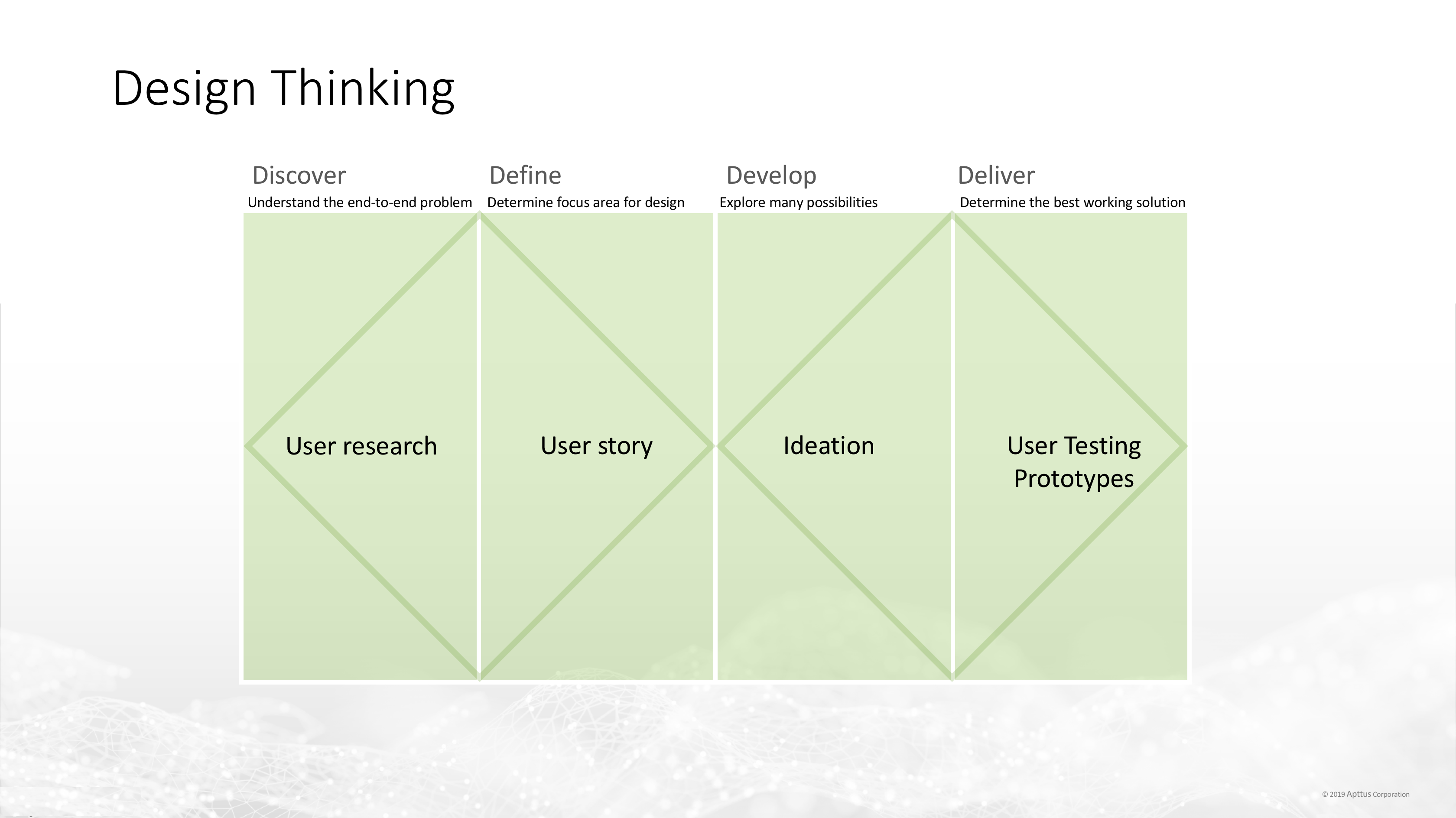
Infographic of Double Diamond Design Thinking.
More details...

Discover

1. Contextual Inquiry
Interview end users. As a format to keep interviews meaningful but brief enough to get adequate participation, I ask for
  1. Role (not just job title)
  2. A Day in the Life
  3. Tools / Environment
  4. Goals, Tasks and Steps
  5. Pain Points
2. Empathy Map / Persona
Based directly on quotes from the user interviews. The goal here is the 80/20 rule. If we design for this persona, 80% of our users will be satisfied and the other 20% can live with it and are ok with it.

Define

3. User Story
Extract high-level, over-arching User Story from interview/empathy information, formatted as 'Who' does 'What' and 'Why' - the latter being the specific measurable value a customer would derive from the experience. This story is the framework for design, the test case to validate success, and the storyboard script for the Super Bowl ad that must resonate with the customer. I should be able to go to a customer and ask, "If we deliver [User Story] in this release, would you buy it?" and the answer always should be, "Yes!"
4. User Experience Map / User Journey
Decompose the User Story into the steps that make up the User Experience Map / User Journey

Develop

5. Ideation
Generate ideas for the solution through Ideation. If it's improving an existing product, find the pain points in the journey and ideate on improvement ideas.
6. Prototype
Prototype the ideas we will pursue. Depending on how far along we are in the product release, may be paper sketch, wireframe walkthrough, clickable mid-fidelity prototype, high-fidelity interactive mockup or even HTML/code prototype.

Deliver

7. User Test
Test the prototypes with end users to vet the ideas and discover new ideas. I use small samples sizes of participants with more iterations/versions of a design. (Prefer minimum of ~5 users per test run).
8. Iteration
Repeat prior steps as needed, ever bringing the design and prototypes to higher fidelity.
9. Deliver
Deliver the final design. May be a blend of prototypes for behavior and visual specs for the visual design.
Less details...

Publications & Patents

Book: 97 Things Every UX Practitioner Should Know - Chapter: "Use Visual Design to Create an Eye Track"

May 11, 2021, 97 Things Every UX Practitioner Should Know ISBN: 9781492085171, O'Reilly Media, Inc.

Abstract: One of the biggest dilemmas users face when interacting with software is discerning where to start and where to go next. The visual design of an interface is pivotal to helping users answer these two questions, not only at an application level, but at a page or individual interaction level. UX Designers can assist users through visual cues to identify key elements of the interface. But taken a step further, through the use of visual design techniques, it’s possible to create an effective eye track or path for users to follow, leading them through the user experience.

See book on O'Reilly Media, Inc.
Buy on Amazon (all profits to charities)

Podcast: Change Wave by Treehouse

Aug 28, 2019, Change Wave - Apttus: Kevin Lynn Brown

Abstract: Change Wave is an exclusive look at the real, first-hand stories of how cutting-edge leaders rose to the top, smashed through barriers and created lasting impact. Brought to you by Treehouse, the company that has taught 850,000 people to code and helps companies like Nike, MailChimp, Airbnb and more hit their hiring plans and create diverse teams.

Listen on Spotify
Listen on Tune In
Listen on iHeart Radio
Listen on Libsyn

Article: The UX Blog - "Visual Design is all about Fight or Flight"

Apr 23, 2017, The UX Blog

Abstract: Visual Design preys upon the base human instinct of “fight or flight”  —  the instinct we have to constantly evaluate our surroundings and assess if there is a threat and determine whether we can overcome the threat or should escape from it. The way Visual Design employs “fight or flight” is by leveraging the natural visual cues of size, contrast, color and line that help us determine what is near and far and set the order in which we will inspect our environment.

View article

Patent: Displaying Large List Data In Limited Visual Space

US Patent US 9652117 B2 - US 9652117 B2
(Search using only the number 9652117).
Issued May 16, 2017

Japan Patent JP 5528134 B - English search
(Search using only the number 5528134).
Issued Apr 25, 2014

Education

Academy of Art University (Illustration)

Bachelor of Fine Arts, Illustration, Graduated 1999

UC Berkeley (Extension Courses)

Object Oriented Design in Java, 2002
Portfolio

UX Leadership Enterprise-Wide

Unifying the Brand (CallidusCloud)

Contribution:
Principle UX Designer, Visual Design
Customers:
Atlas Copco, Verizon, DirectTV, Wells Fargo, Comcast, Allstate, Kimberly-Clark, Gilead, SAP, Oracle, Lenovo, Standard and Poor's, Yamaha, BNY Mellon, Plantronics, Rolls Royce, Maserati, YouTube, Samsung, Box, Medtronic, Henkel, Novartis, Kaiser Hospitals, Medtronic, Lexus Nexus, Sunrun, Vivint, and more than 1500 others
Products:
Enterprise-wide (see details)
Outcome:
Contributed to increased sales in Q3/Q4 for the year and onward by instilling customer confidence in the company and the brand.

Led the unification of 13 products in 5 months, in time for global conference. Worked with dozens of PMs, development teams and marketing across the enterprise, and across the globe, in the US, UK, EU and IN to drive to successful completion.

Being web-based applications, the initial unification was done using CSS to reskin the apps to be aligned. This was quite a feat given the wide variation in HTML implementations, due to the fact that about half the product line were acquisition products developed separately from one another.

Before
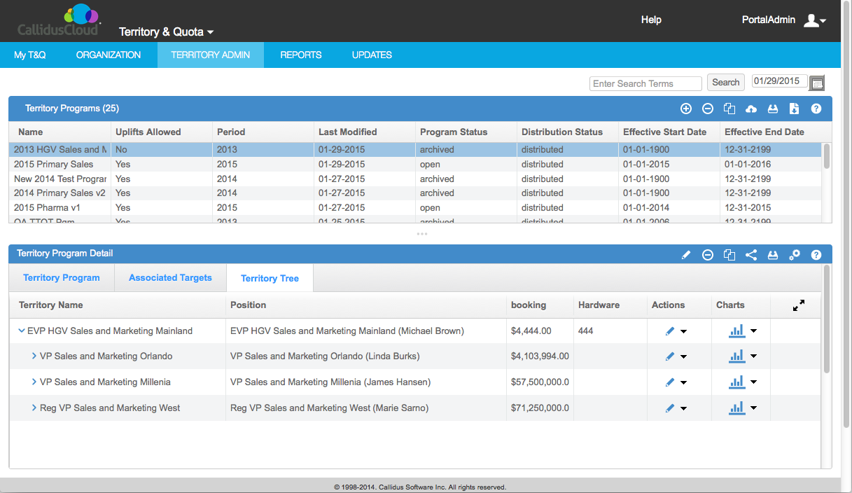
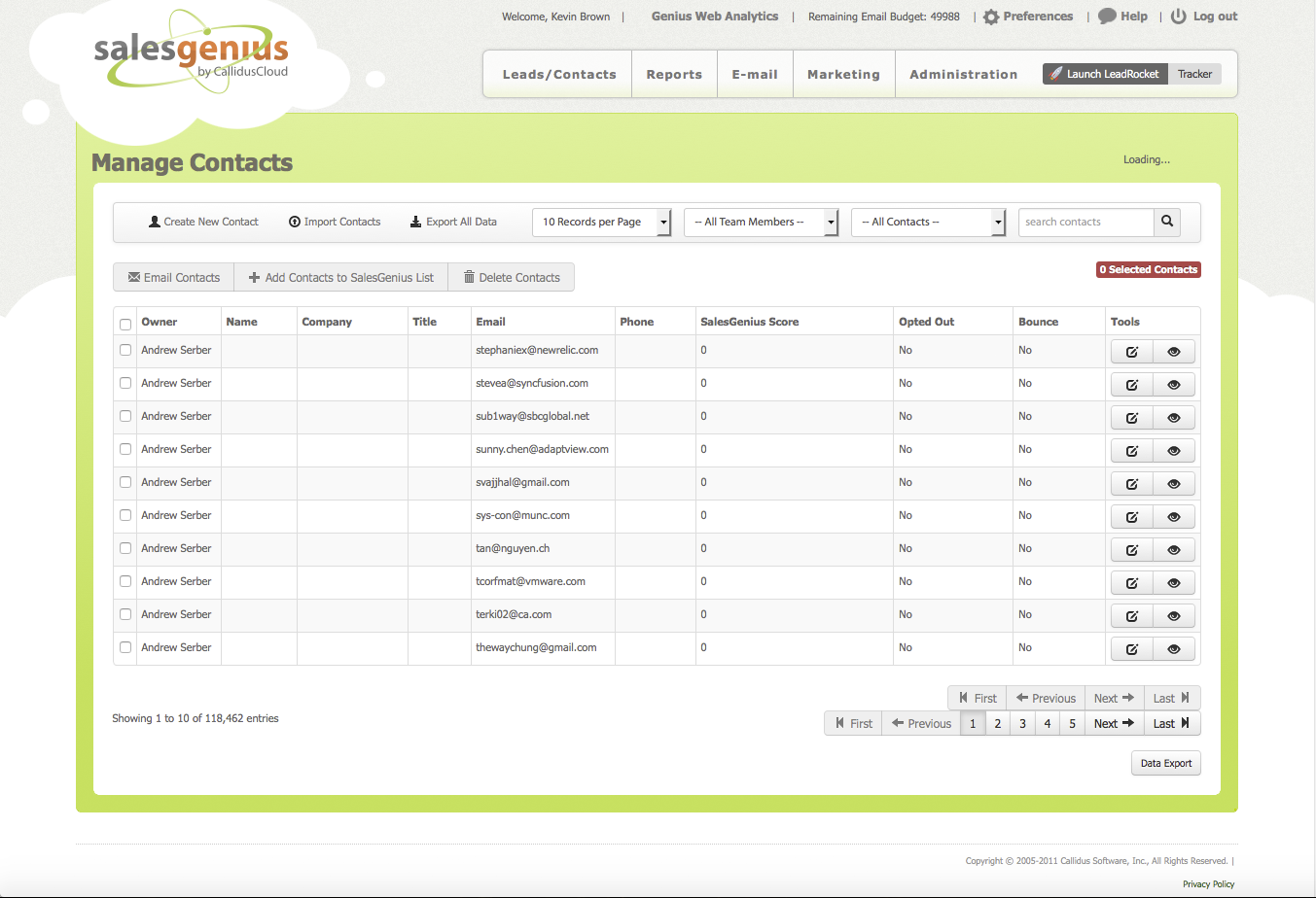
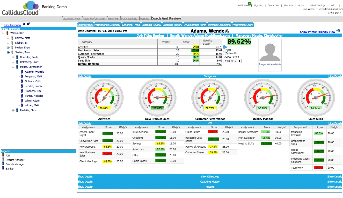
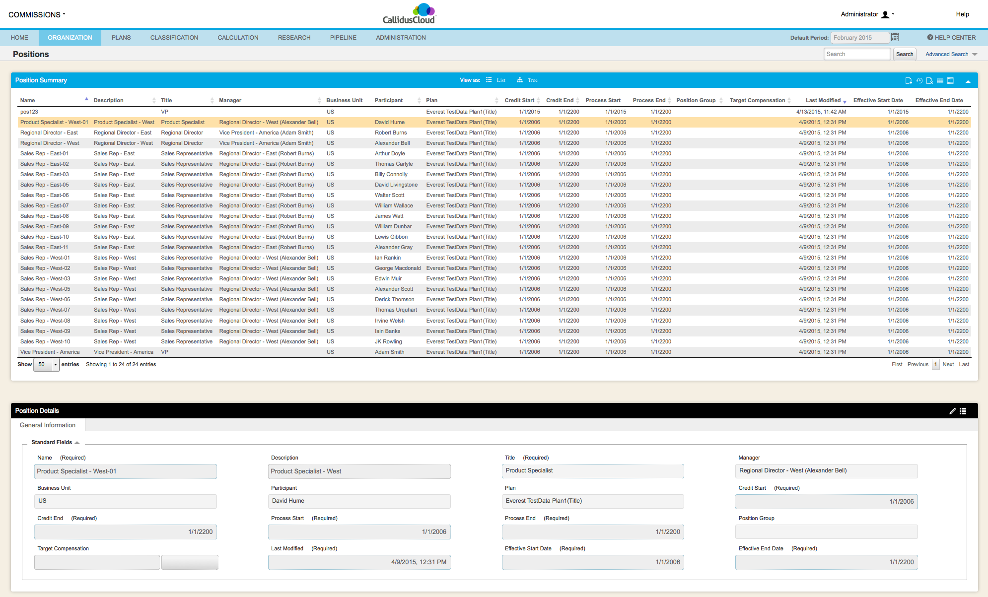
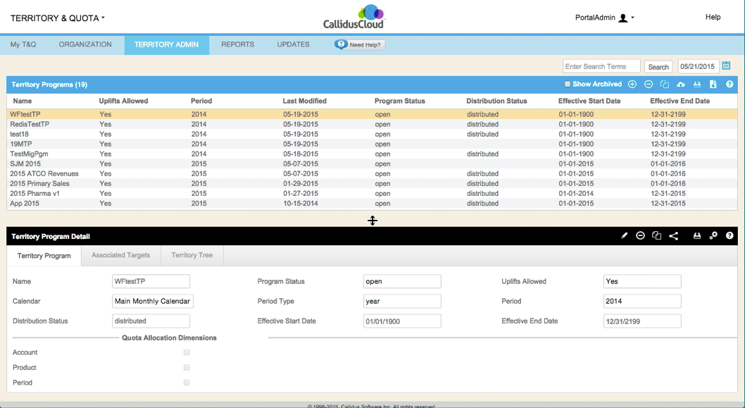
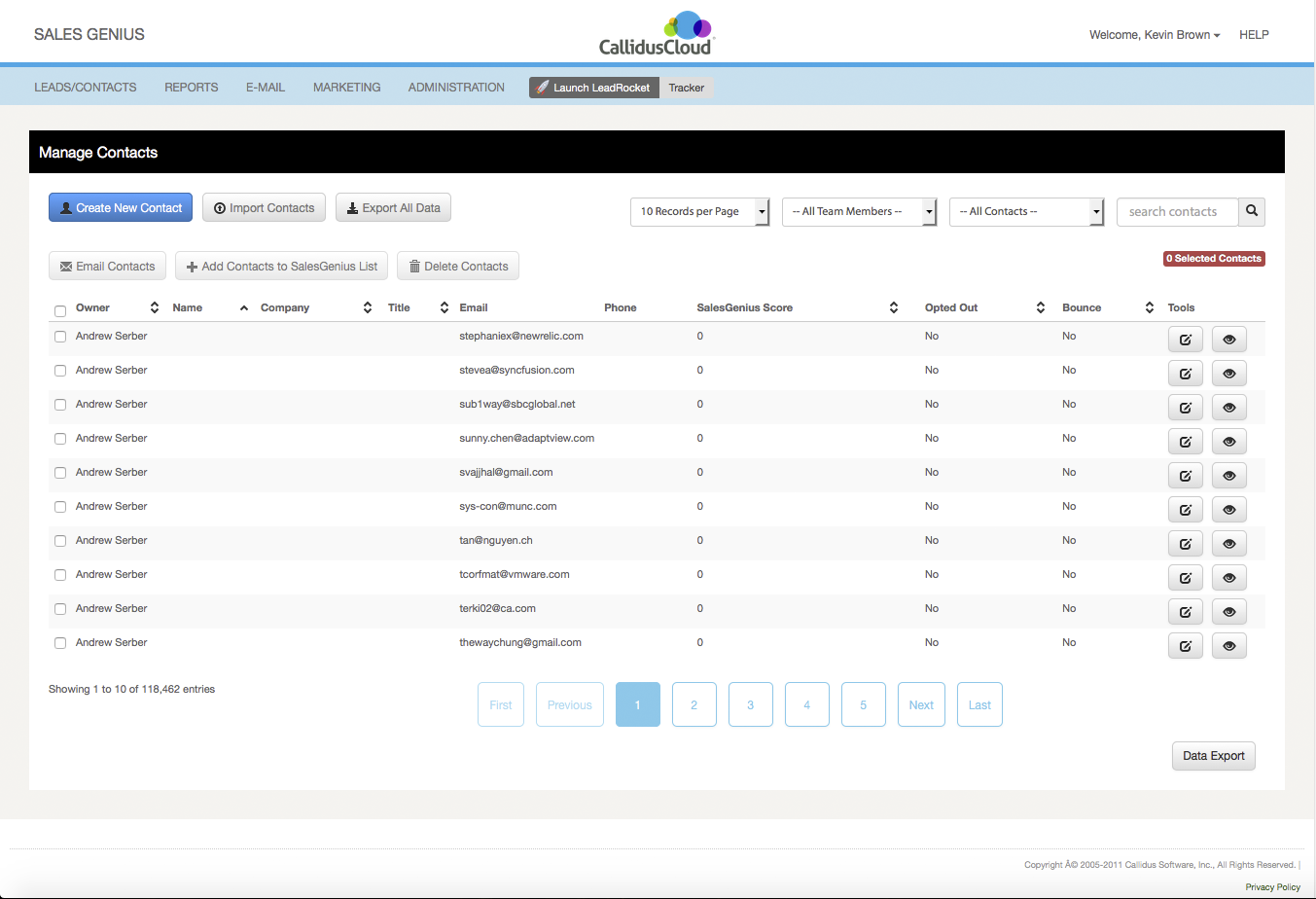
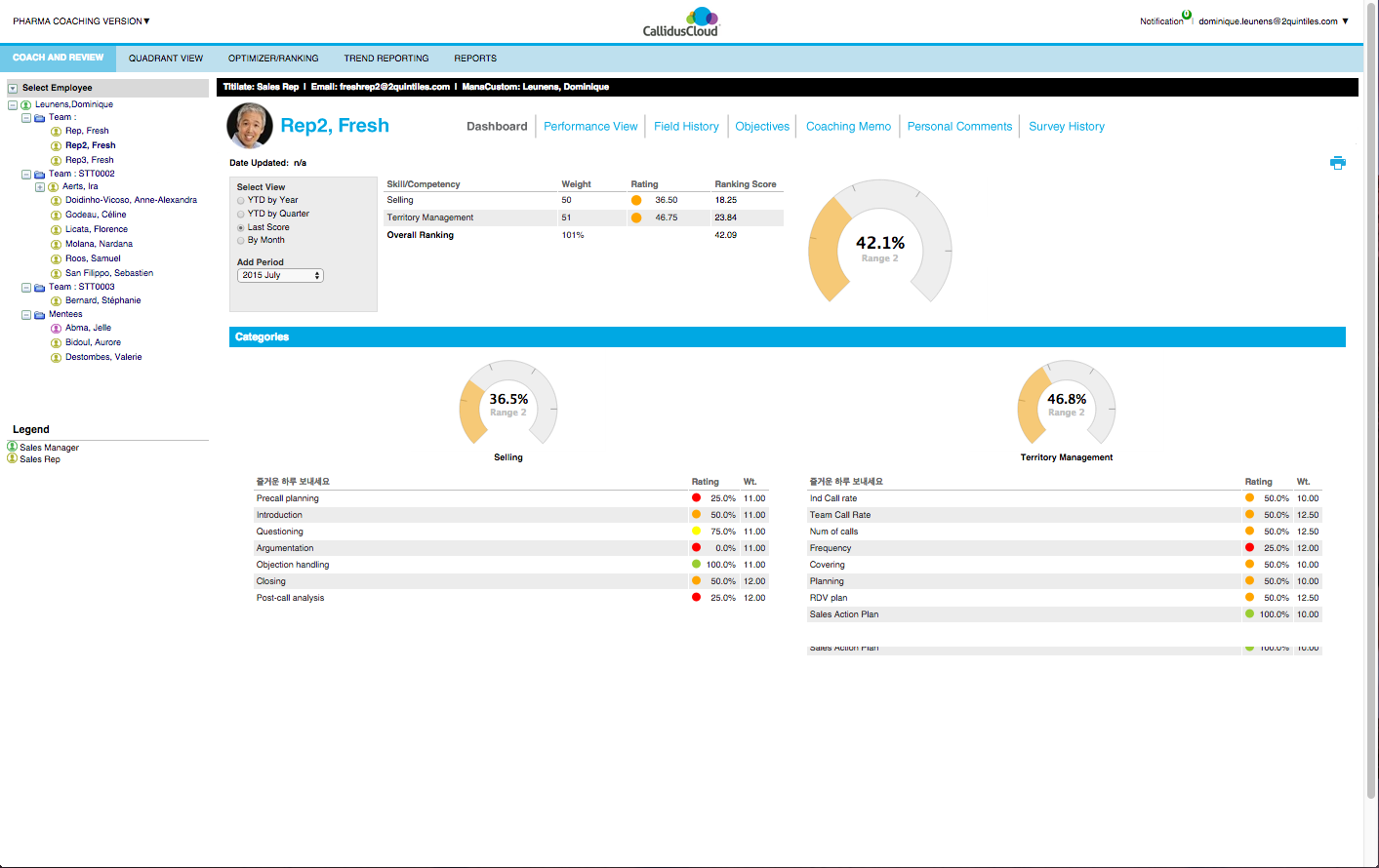
Screen capture of 'classic/legacy' Commissions UI. Screen capture of 'classic/legacy' Territory and Quota UI. Screen capture of 'classic/legacy' Sales Genius UI. Screen capture of 'classic/legacy' Sales Performance Manager UI.
After
Screen capture of CSS reskinned Commissions UI. Screen capture of CSS reskinned Territory and Quota UI. Screen capture of CSS reskinned Sales Genius UI. Screen capture of CSS reskinned Sales Performance Manager UI.

Products covered:

  1. Commissions/Incentive Management (IM)
  2. Sales Performance Management (SPM)
  3. Territory & Quota Management (T&Q)
  4. Producer/Insurance Compensation Manager (ICM)
  5. Configure, Price and Quote (CPQ)
  6. Workflow
  7. Contract Lifecycle Management (CLM)
  8. Sales Enablement
  9. Marketing Automation
  10. Analytics and Reporting
  11. Connect (integration API and administration)
  12. Reporting
  13. Litmos (Learning Management System)

Cross-functional Team Leadership Dashboards with AI (Callidus)

Contribution:
Team Lead, Front End Development, Interaction Design, Visual Design, User Research
Audience:
Sales Ops, C-Suite Executives, Buyers/Decision-Makers (Prototype for conference presentation)
Products:
CPQ, CLM, DataHug, Litmos, Reporting/AI
Outcome:
Stand-alone code prototype used as part of the keynote presentation of our largest annual conference. Very well-received and directly influential in increasing the sales pipeline for the year.

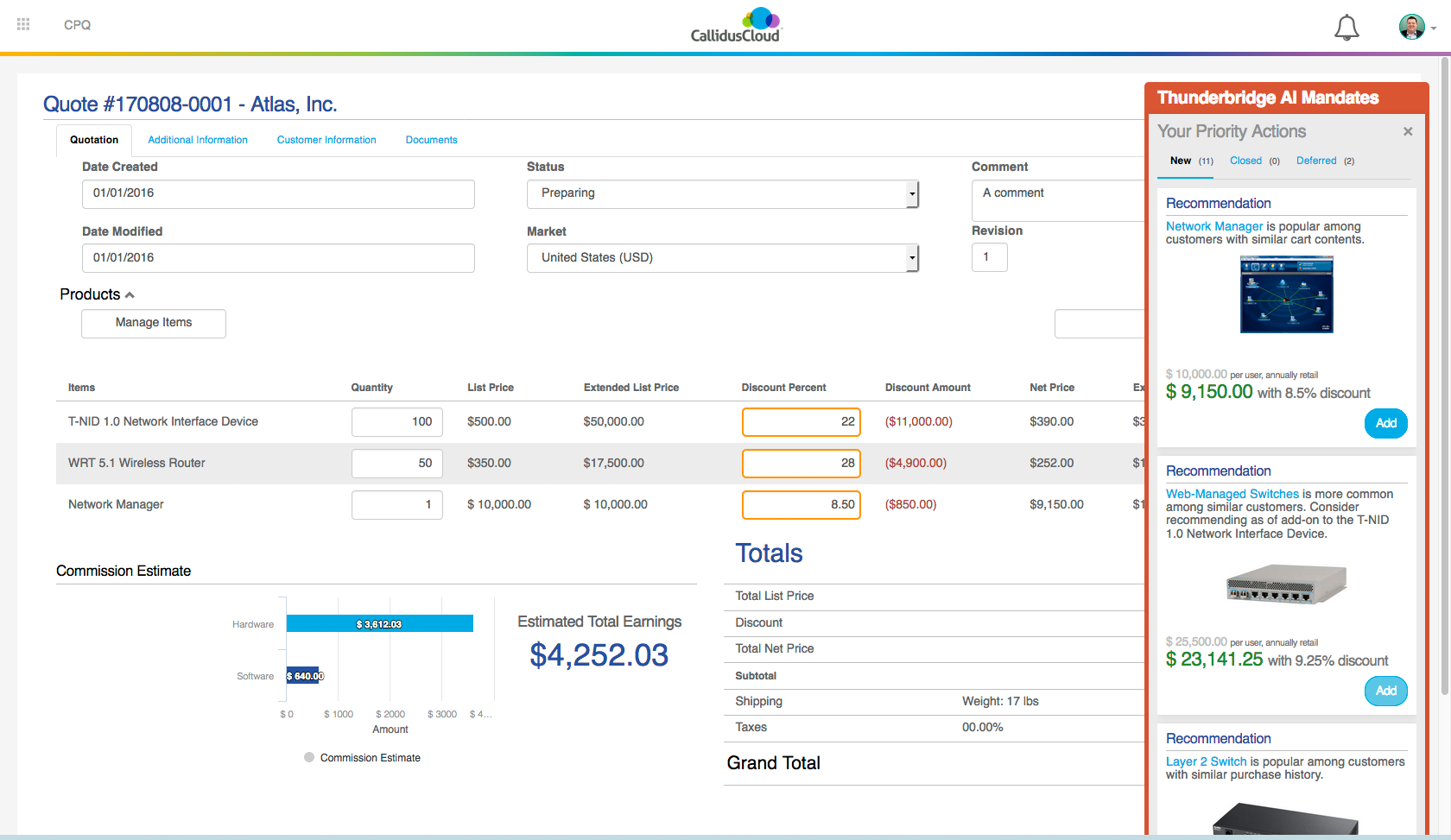
UX designer and team lead for HTML prototype of complex demo of integrated suite of products, demonstrating 7 products specifically, which coupled AI recommendations based on data collected from the suite of products.

Timeline was about 12 weeks from initial authoring of the script to presenting the HTML prototype at a conference in Las Vegas.
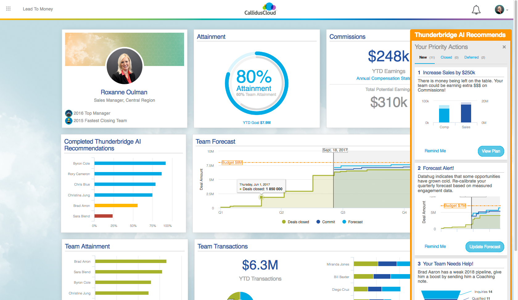
Screen capture of stand-alone interactive HTML/CSS/JS application used for the keynote demonstration at CallidusCloud's annual Las Vegas conference.  This shows the main dashboard.

Led and collaborated with stakeholder team of

  • 1 Data Scientist
  • 5 Product Managers
  • Chief Product Officer
  • 1 UX Designer
  • 3 Front End Developers

...with additional review input from internal representative users, executive team (CEO, CFO, CMO, EVP Product), and Marketing on brand and visual design.

Design process was Design Thinking with user interviews, empathy maps, user journeys, paper prototypes, wireframes, interactive mockups that were end-user tested (internally), then moving to the final HTML prototype.

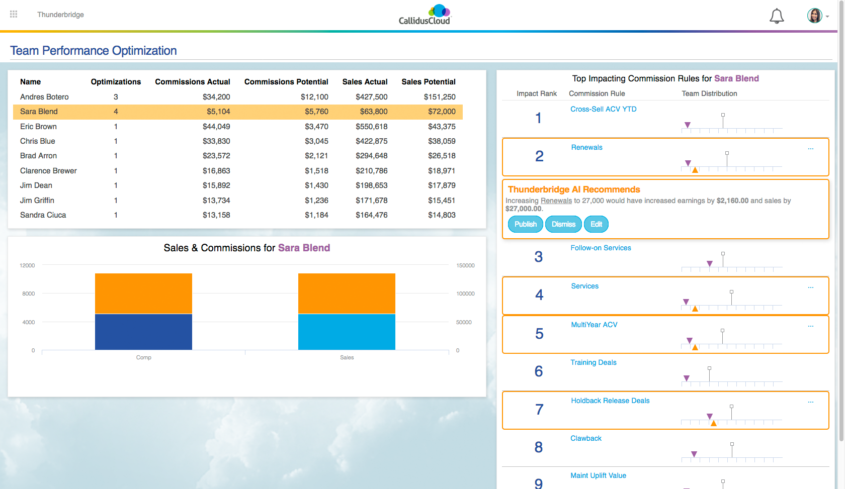
Screen capture of stand-alone interactive HTML/CSS/JS application used for the keynote demonstration at CallidusCloud's annual Las Vegas conference.  This shows the CPQ Quote page with recommendations to improve closing the sale and increasing commissions. Screen capture of stand-alone interactive HTML/CSS/JS application used for the keynote demonstration at CallidusCloud's annual Las Vegas conference.  This shows an AI analytic page for reviewing team sales performance and turning B-players into A-players.

Since the prototype was a controlled demo that was video recorded for the Salesforce Dreamforce conference, it was only targeted to work in Firefox and to be run at 1700px wide (per a video display requirement of the conference). If you have Firefox...

Run the demo prototype (Requires Firefox, resized to 1700px wide).

Click here for details / script for 'logging in' and trying the prototype...
'Rory' scenario
  1. Log in as 'rory', no password required (the demo presenter just typed in anything to simulate a password).
  2. Click the bell to get notifications / recommendations.
  3. Click the 'Update Quote' action button for the first recommendation.
  4. Click the bell again to get notifications / recommendations. (This was automatic onload at one point, but stakeholders decided to make it manual for the demo as it covered the totals on the quote).
  5. Click 'Add' for the three product recommendations.
  6. Use the top left menu to go back to the dashboard.
  7. Click the 'Launch Campaign' recommendation.
  8. Click the top checkbox to select all contacts.
  9. Drop down the selected contacts button and select 'Email...'.
  10. Hover over the first Gartner email template and click 'New Email'.
  11. Click 'Next' then click 'Send'.
  12. Click 'the tracker page' link in the success message to view 'results' of the email send.
  13. Use the top left menu to go back to the dashboard.
  14. Click the 'Take Course' button.
  15. Click 'Start this course' and arrow through the slides.
  16. Close the specific course tab after the last slide.
  17. Click the photo avatar in the top right and select 'Log Out' to log out as 'rory'.
'Christine' scenario
  1. Log in as 'christine', no password required.
  2. Click the bell to get notifications / recommendations.
  3. Click the 'Review Payout' action button for the first recommendation. (This was integrated with live code in the original demo, which is offline now, so a 404 error will be displayed).
  4. Use the top left menu to go back to the dashboard.
  5. Click the 'Team Optimization Matrix' link in the top recommendation.
  6. Select 'Sara Blend' in the table to view her sales performance.
  7. Click the 'Renewals' link on the right-hand chart.
  8. Click the photo avatar in the top right and select 'Log Out' to log out as 'christine'.
'Roxanne' scenario
  1. Log in as 'roxanne', no password required.
  2. Click the bell to get notifications / recommendations.
  3. Click the 'View Plan' action button for the first recommendation.
  4. Select any of the first three named team members in the top left table to view their sales performance.
  5. Use the top left menu to go back to the dashboard.
  6. Click the 'Update Forecast' recommendation.
  7. Scroll down to the 'Live Deals' table and and toggle on 'Stratus LLC', and 'Swift Iron'.
  8. Click 'Submit Forecast' on the top right and click the 'Submit Forecast' button in the dialog after that.
  9. Click the photo avatar in the top right and select 'Log Out' to log out as 'roxanne'.

Design Thinking Instructor Instructor, Education Developer

Instituting UX Process with Design ThinkingTraining product teams with Double Diamond version (at Apttus)

Contribution:
Instructor, Education Developer
Target Users:
Sales Ops, Contract Managers
Customers:
Boston Scientific, Apttus (Professional Services)
Products:
Rebates, CLM, CPQ
Outcome:
For Rebates, user tests of the new design show 100% task success in less than 10 minutes (the original product tests resulted in 50% task failure and at least 30 minutes to complete when successful). CPQ tests are garnering above passing for ease of use.
Infographic of Double Diamond Design Thinking.

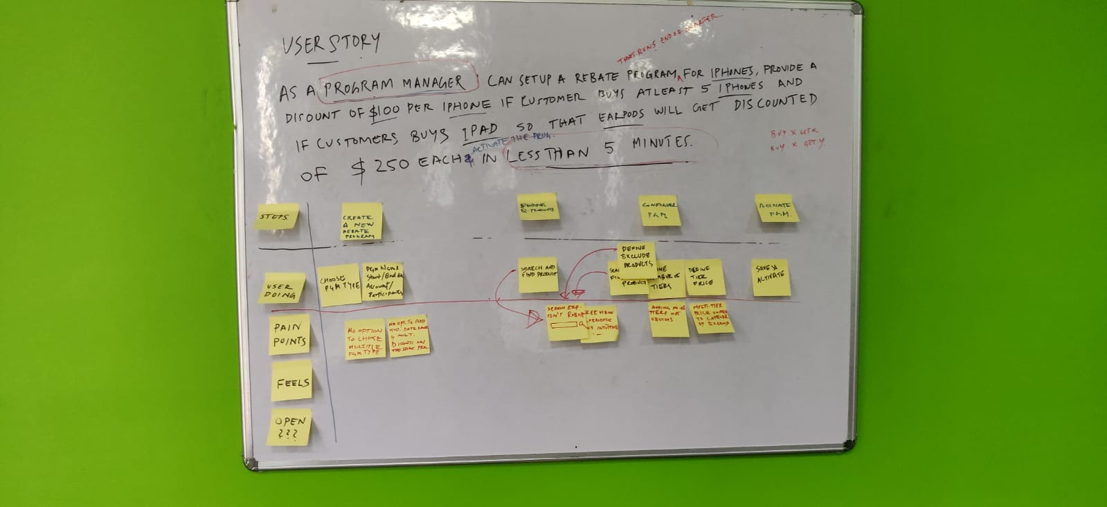
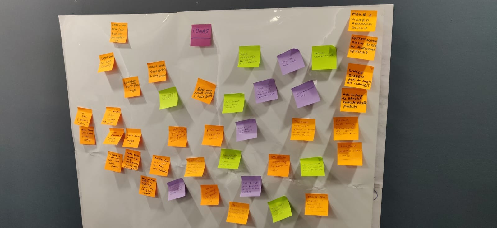
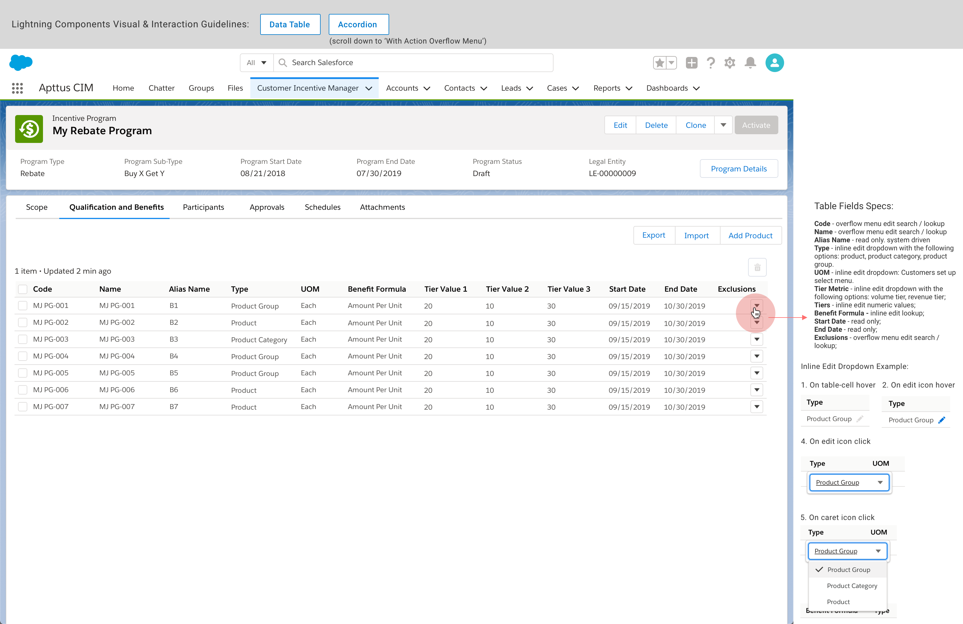
I instituted Design Thinking as the design methodology at Apttus. I trained the UX team, and for key product teams, I trained and led stakeholder teams of UX, Product Managers and Software Architects, largely using the Design Council's Double Diamond process with remaining cirriculum developed myself, based on years of experience teaching and practicing Design Thinking with a variety of development teams. CPQ (Configure, Price, Quote), CLM (Contract Lifecycle Management) and Revenue teams have gone through this process also. The example here is from the Rebates team.

User Story, User Experience Map
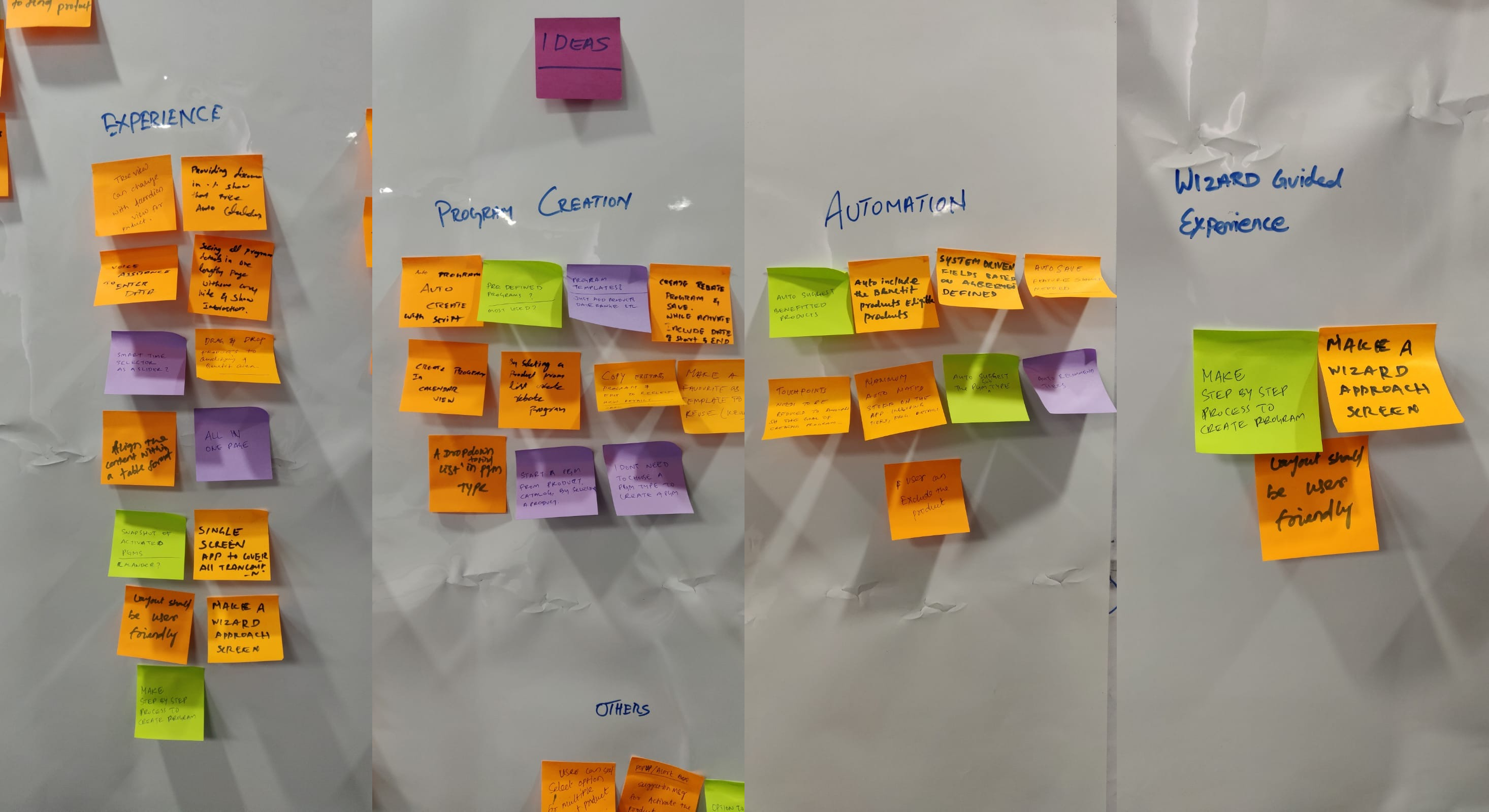
Apttus Rebates main user story and user experience map on a whiteboard.
Ideation
Whiteboard filled with post-its with ideas for the next version of Rebates.
Affinity Map
Whiteboard with the same post-its reorganized by topical areas, better known as an Affinity Map.
Resulting Product
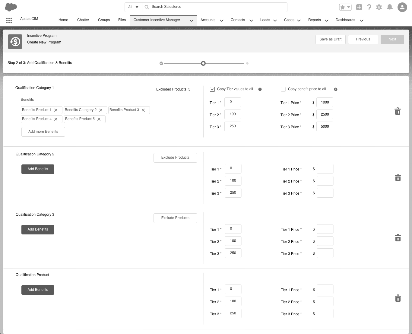
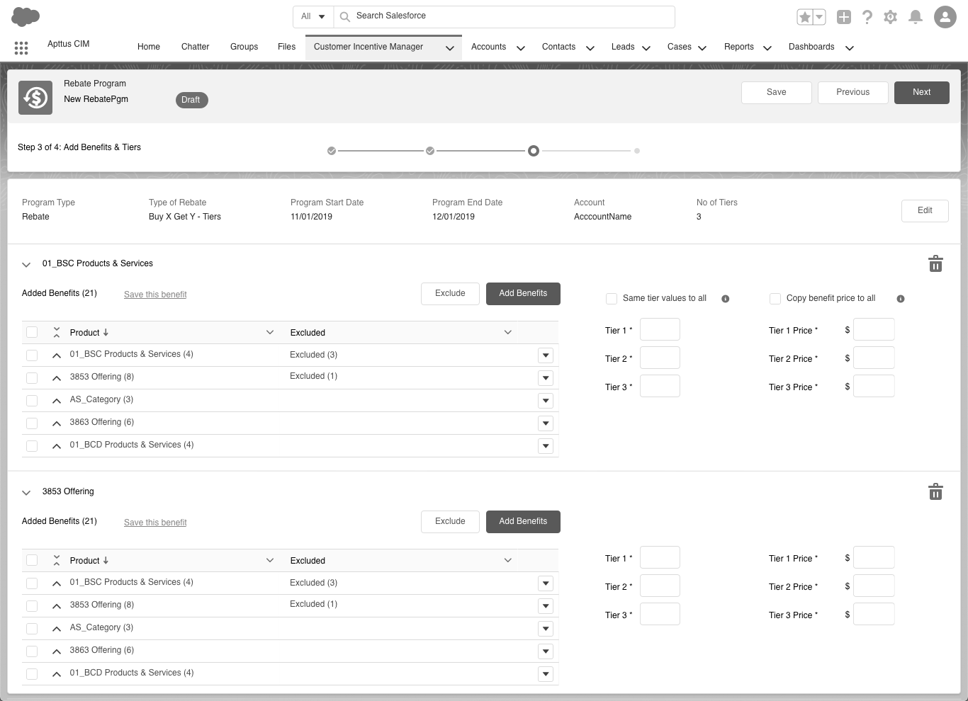
Wireframe of ideas from whiteboard sessions. Wireframe of ideas from whiteboard sessions. Mockup of future UI to be implemented. Mockup of future UI to be implemented.
UX India Team

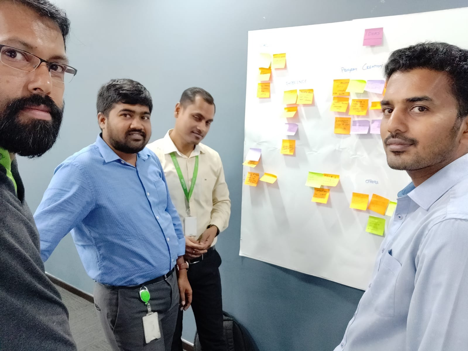
I led the sessions remotely with our overseas team members via web conference

Photo of the Apttus India UX team gathered around the whiteboard.

Instituting UX Process with Design Thinking Training product teams with Stanford D.School version (at Callidus)

Contribution:
Instructor, Education Developer, Design Leader
Target Users:
Sales Ops
Customers:
Active Network, Lenovo, IHS
Product:
Territory & Quota
Outcome:
Design tested above passing for ease of use. Resulted in immediate conversion from opportunity to orders at a conference for 3 open T&Q prospects.
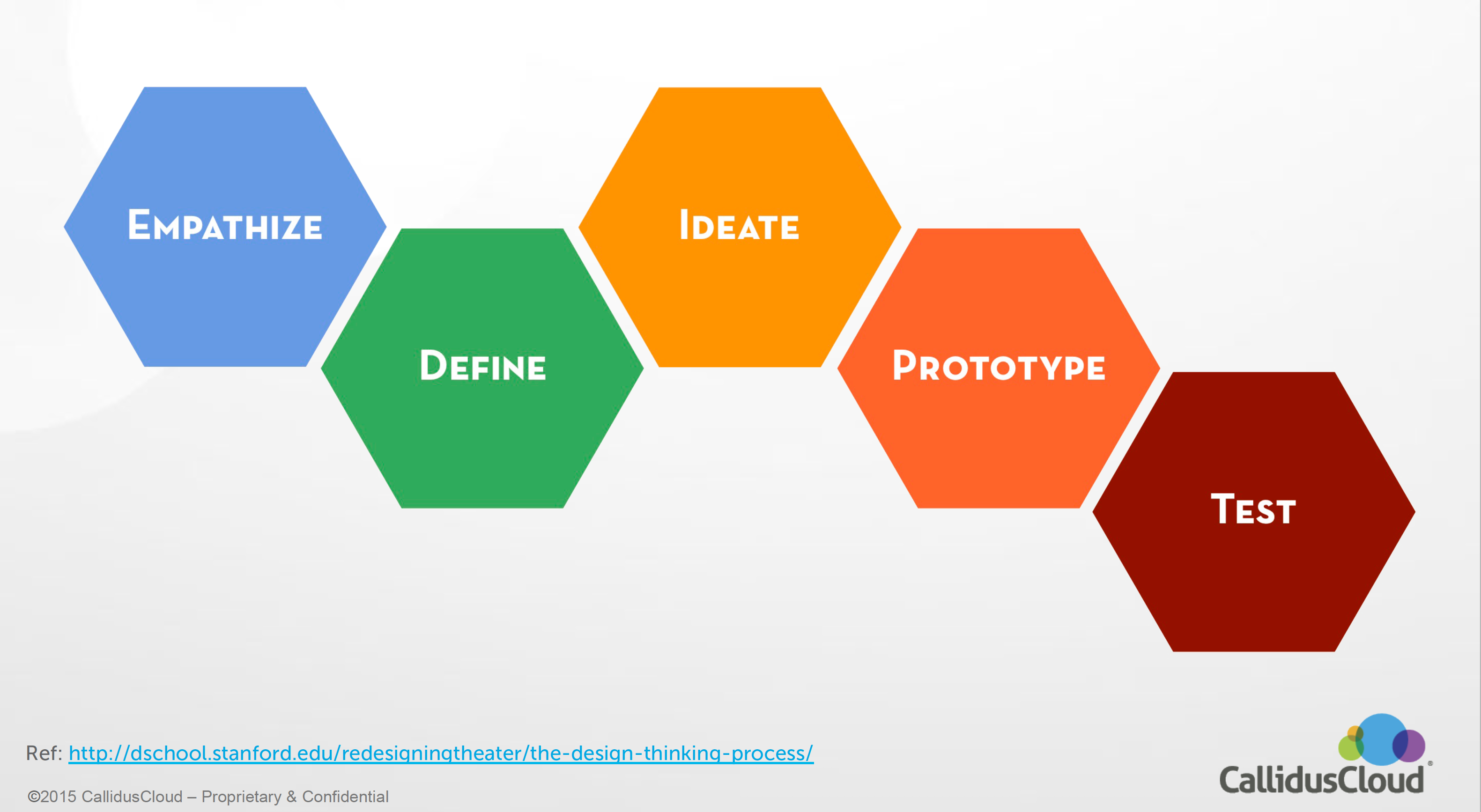
Infographic of Stanford d.school variant of Design Thinking.

Callidus had no UX employees or UX process before I was hired. I instituted Design Thinking as the design methodology at Callidus. For each product team, I trained and led a stakeholder team of UX, Product Manager, Software Architects, Developers and QA in a hybrid of the Stanford D.School and IBM versions of Design Thinking and instituted Design Thinking as the UX process for designing Callidus products. Multiple product teams across the portfolio were trained. The example here is from Territory & Quota. (Final high-fidelity mockup was created by a contract UX Designer on the team).

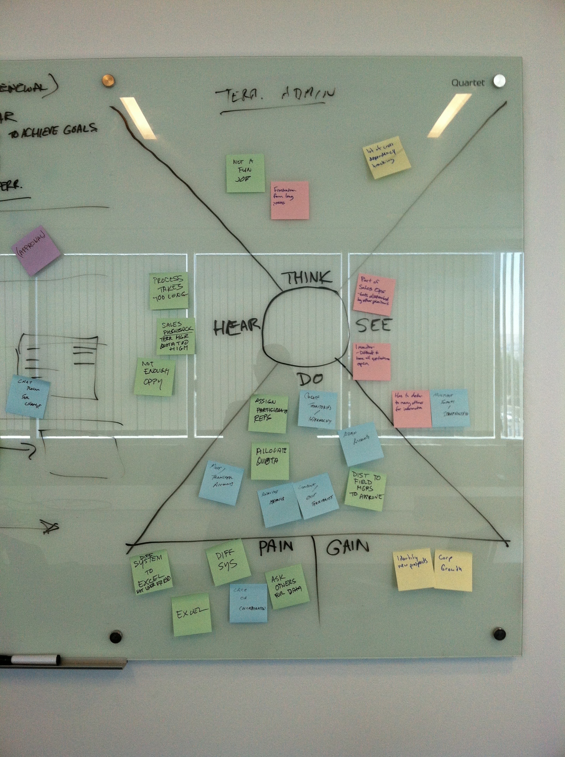
User Research, Empathy Map (Persona)
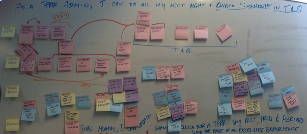
Whiteboard showing empathy map for a territory manager.
User Journey, Ideation
Whiteboard filled with post-its outlining the user experience map for sales territory management.
Paper Prototype
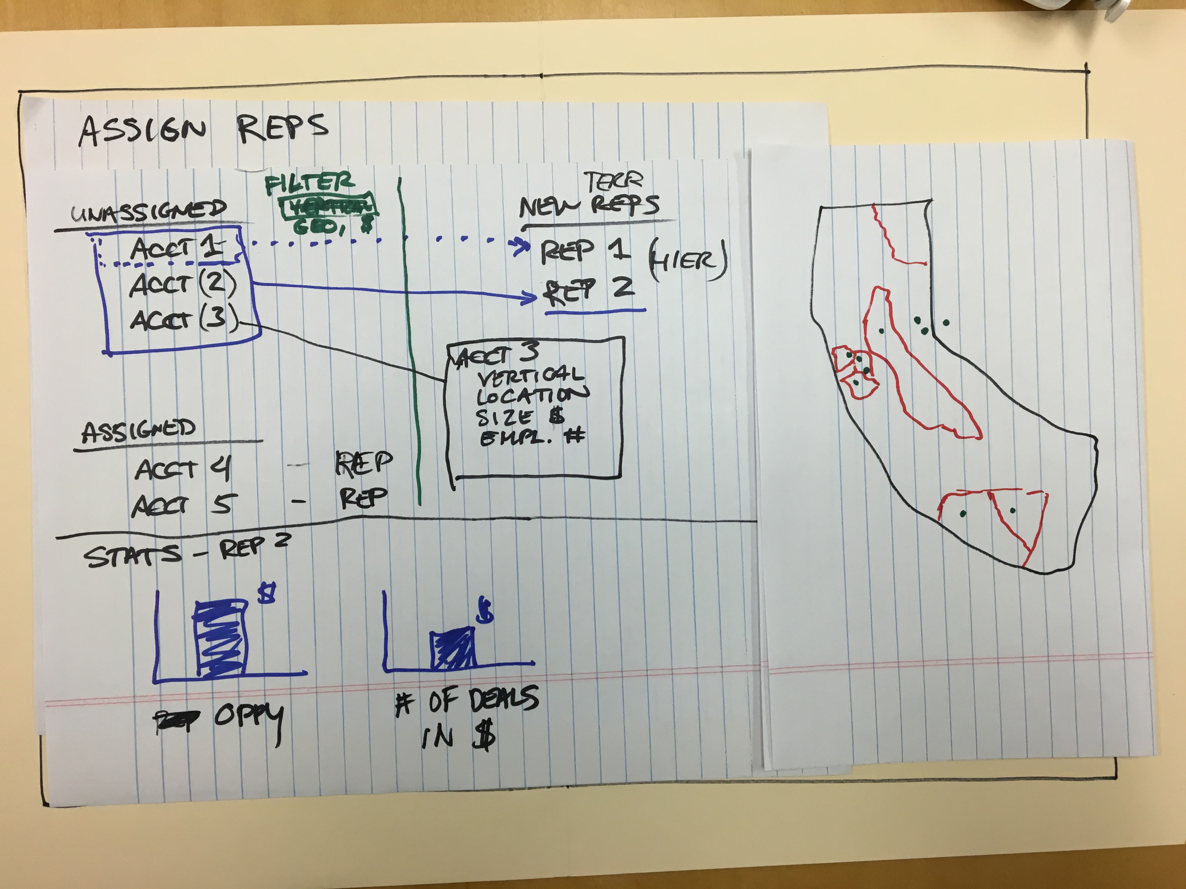
Photo of initial hand-drawn wireframe prototype for discussion.
User Test and Refine
Photo of more mature paper prototype of territory mapping design that was used for initial user testing.
Interactive Clickable Wireframing
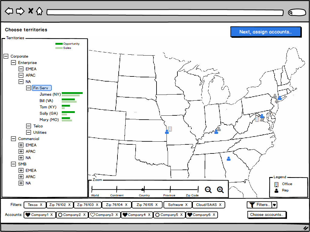
One screen out of a series of wireframe screens used in an interactive clickthrough prototype for user testing of a territory management design.
Drive to High Fidelity, Implemented in Product
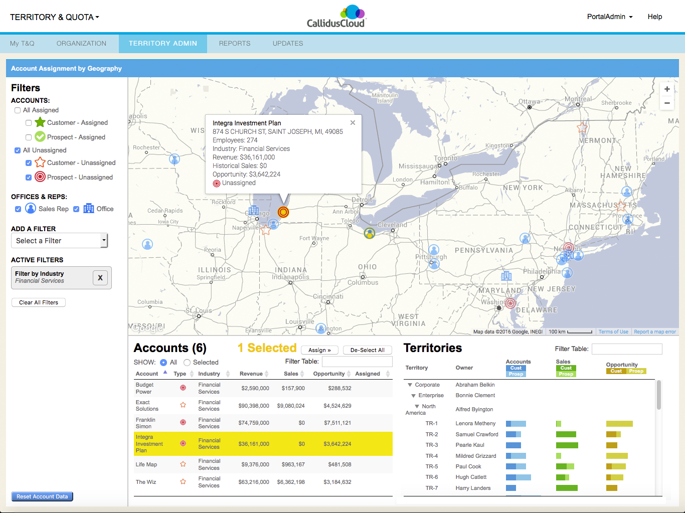
Screen capture of the final interactive prototype used for user testing and used as the initial UI code in the product.
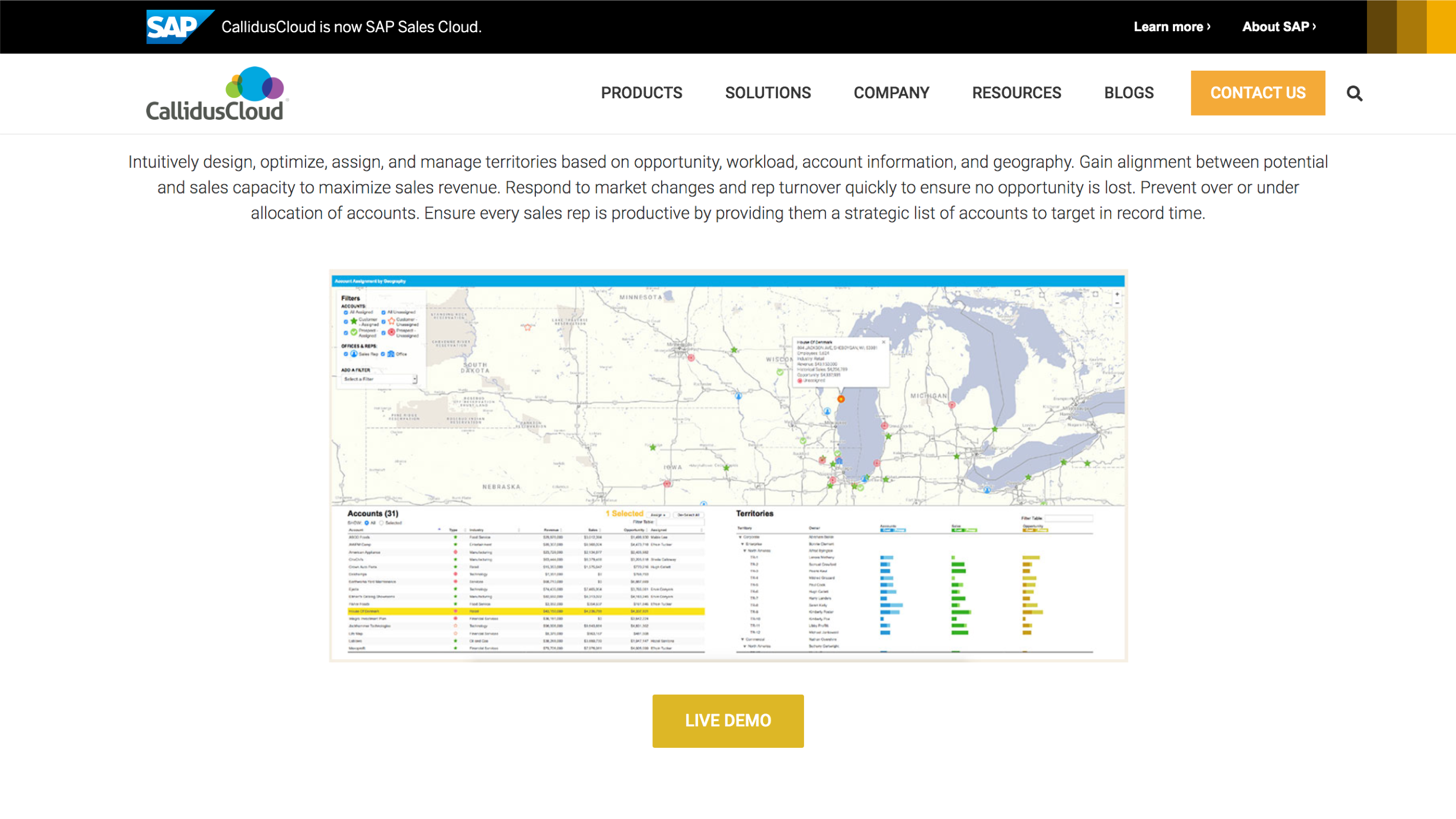
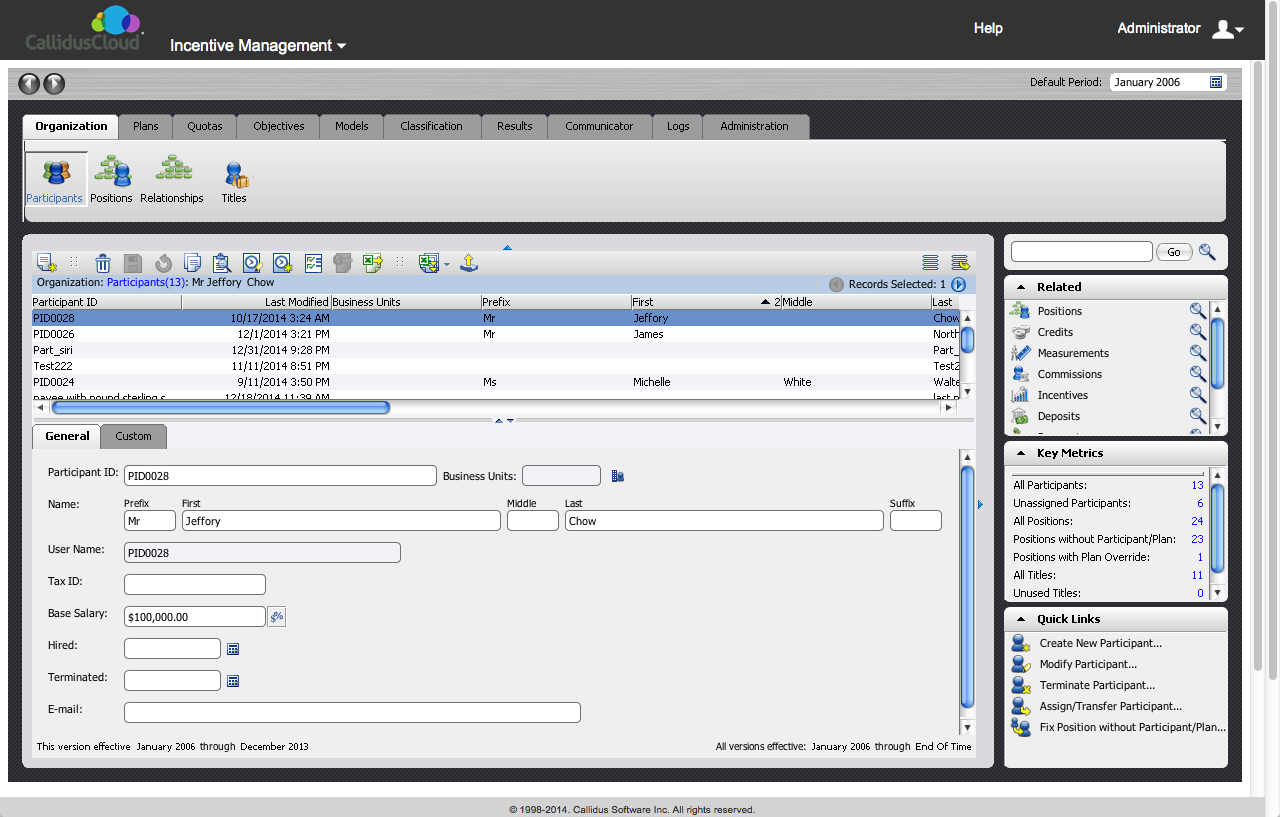
Running product now used as live demo on corporate web site
Screen capture of the current CallidusCloud/SAP web site showing this same product UI used as the main call to action image on the site.

Introducing Design Thinking to IBM Training product teams with IBM version (at IBM)

Contribution:
Design Thinking Instructor, UX Design Lead
Target Users:
I.T. Ops Administrators
Customers:
Federal Reserve of the United States, Pfizer, JP Morgan Chase, BNY Mellon, Discover Card, BB&T Bank, Wells Fargo, US Bank, Barclays Bank, Bank of China, Russell Investments, Lightwell Inc., BP, Suntrust, Target
Product:
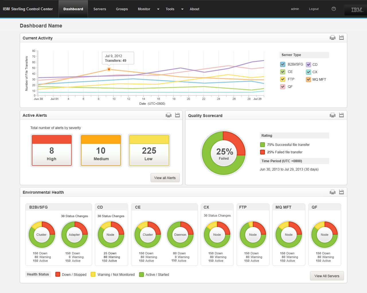
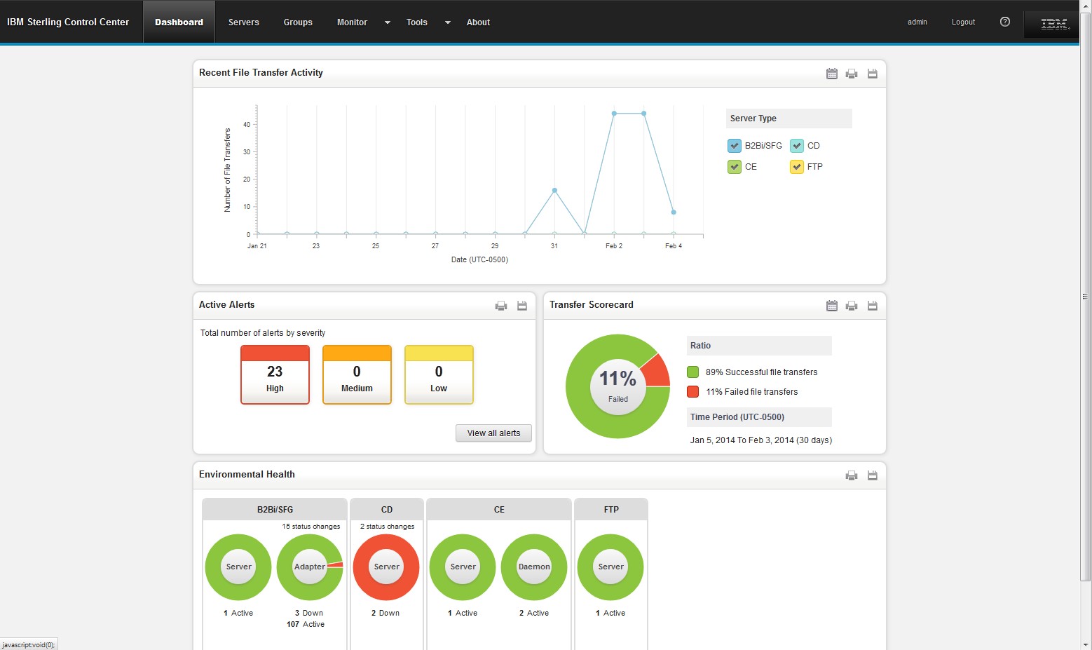
IBM Control Center
Outcomes:
Completely changed how UX, PM, dev and all stakeholders collaborate to develop product. Took a product line that was almost completely unusable and transformed it into an appealing and usable product based on customer feedback.

I was sent to IBM's Austin Design Studio for training in Design Thinking. The leads (UX, PM, Dev) for our product were given Design Thinking training at a bootcamp. From that experience, I came back and trained the rest of the UX team and other engineering stakeholders and led the IBM Control Center product team in Design Thinking, conducting user research, ideation, design, interactive prototypes and reviewing implementation.

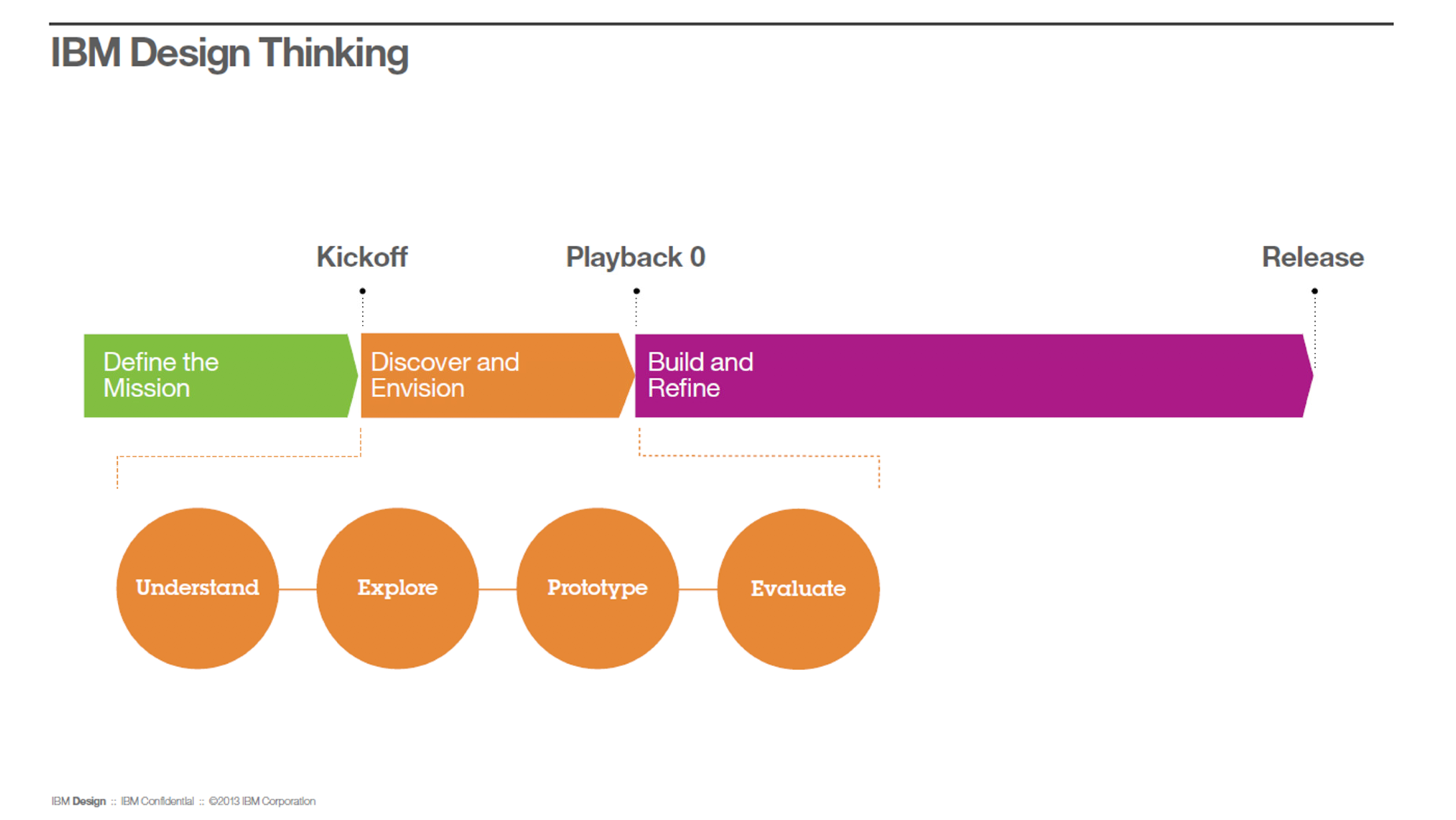
One slide out of the IBM Design Thinking deck showing the phases of Design Thinking and the linear timeline of how a product is developed with Design Thinking at IBM.
Before

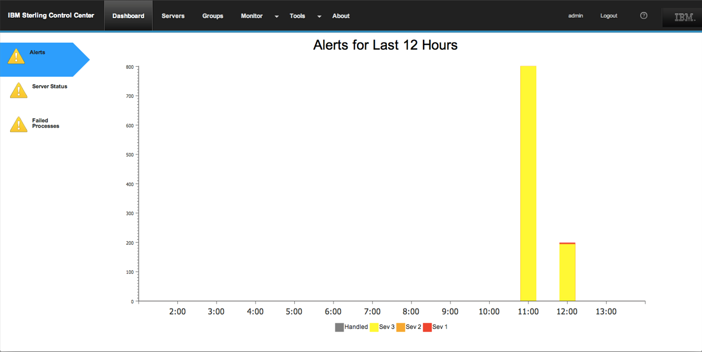
Developers were unable to figure out how to implement a dashboard. They implemented it as a page for each chart. Impossible for customers to use, compare data or get any overview.

Screen capture of initial build of IBM Control Center showing a single bar chart and a separate tab for each chart for each aspect an admin might be monitoring simultaneously.
After

I trained and led the stakeholder team in Design Thinking to do user research, ideation, design, interactive prototypes and review implementation. Note how close the final product looks like the UX design. (Visual design by a UX team colleague).

User Research, Empathy Map (Persona)
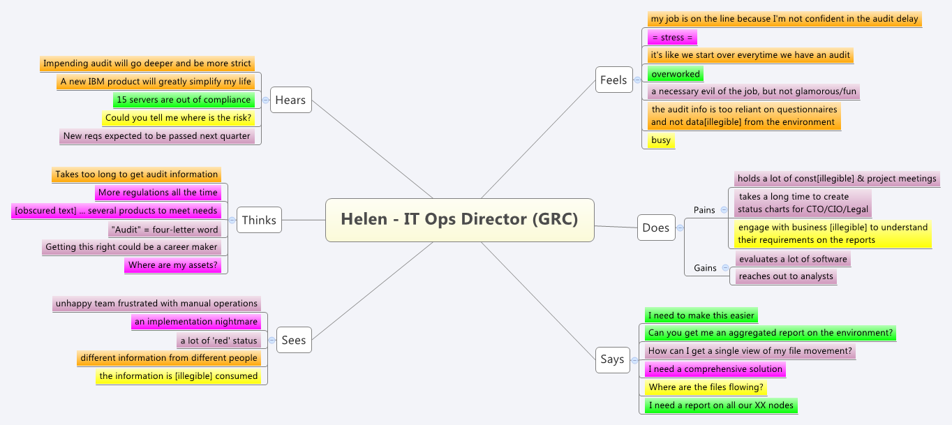
Mind map image used as the Empathy Map for one of the IBM Control Center personas.
User Journey
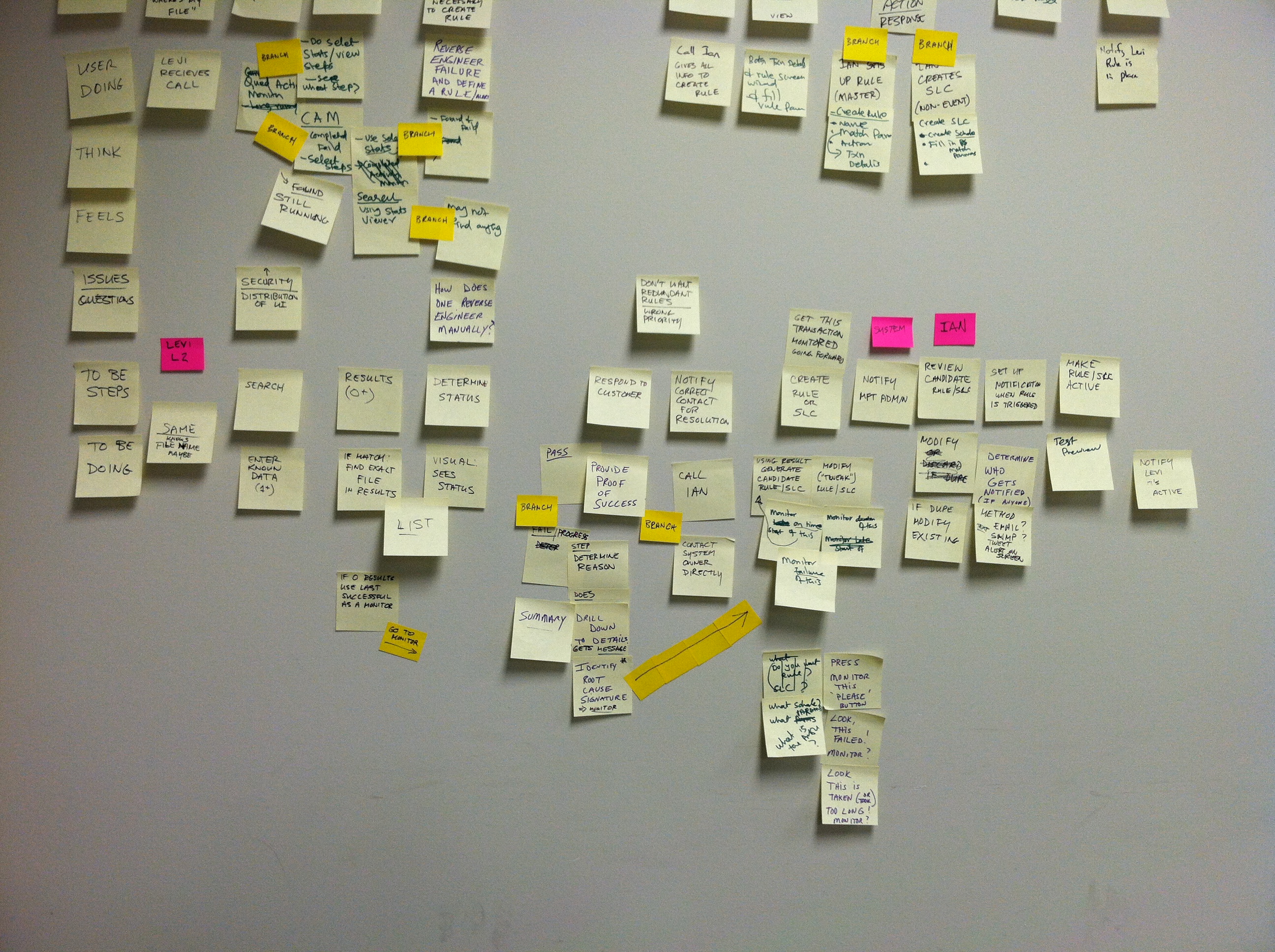
Whiteboard showing the user experience map for the main user story of IBM Control Center.
Ideation
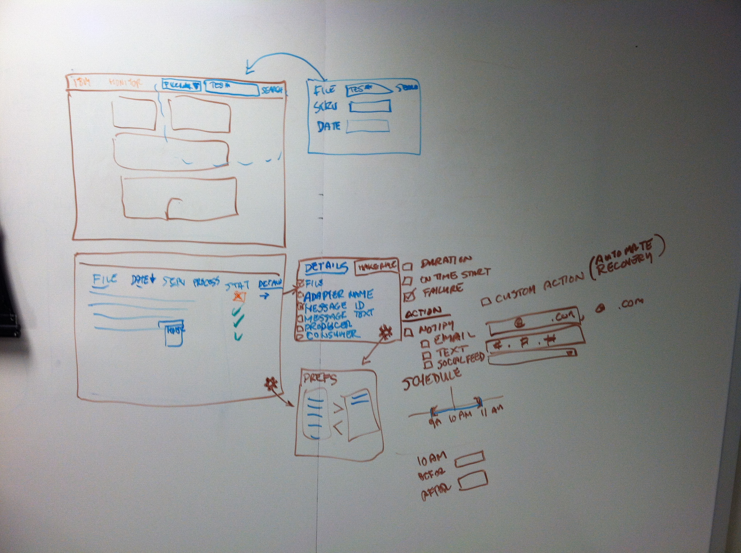
Another whiteboard showing some rough hand-drawn sketches the whole team was collaborating on.
Paper Prototyping (User Tested)
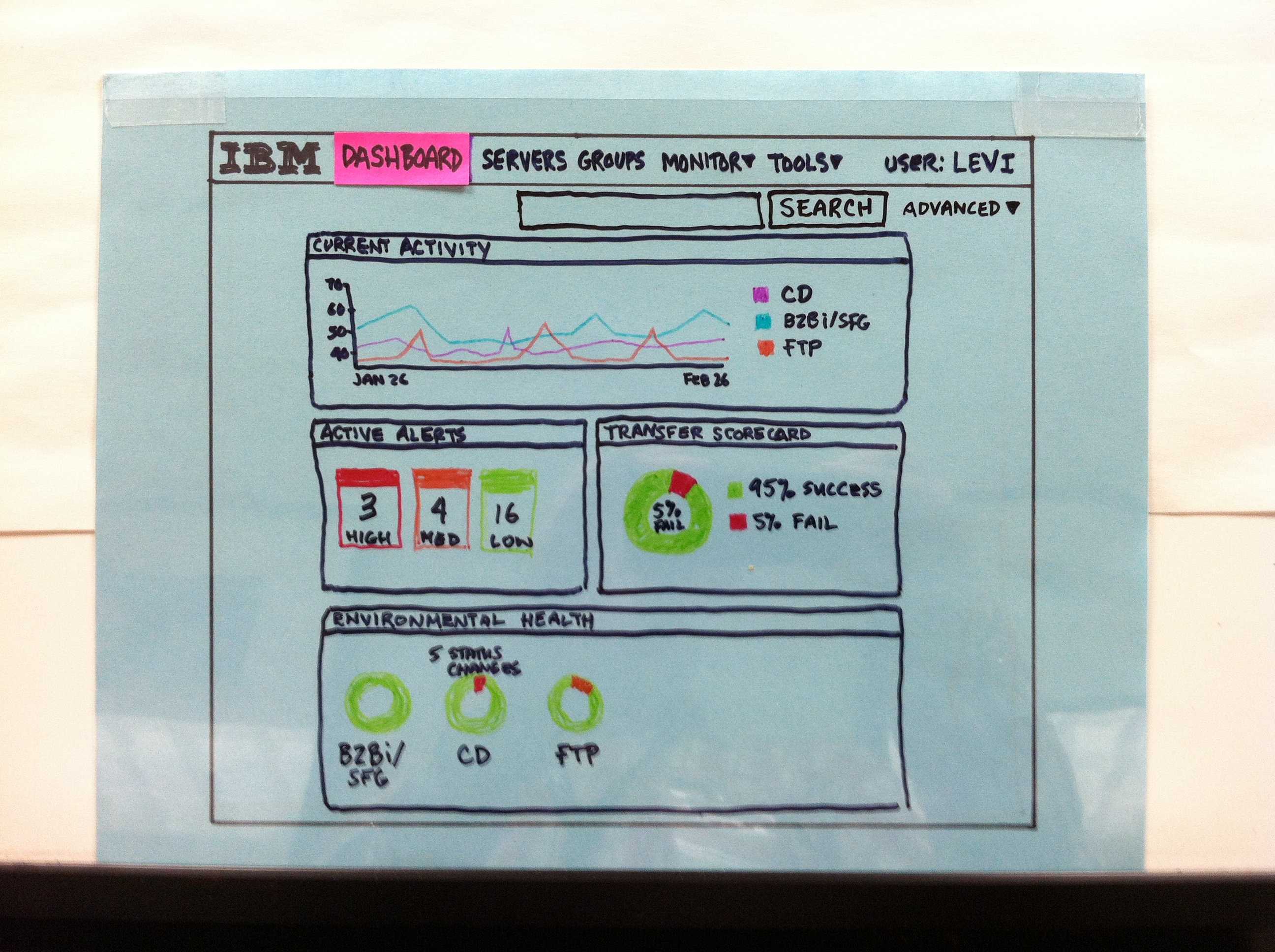
Paper prototype assembled with the development manager, the PM and UX collaborating on various parts and taping the paper screen design together for user testing.
UX Design
This application is used by the Federal Reserve to monitor inventory transactions (1000's per minute) across the internet between banks and the Fed.
Actual Product Implementation
This application is used by the Federal Reserve to monitor inventory transactions (1000's per minute) across the internet between banks and the Fed.

Corporate Design Systems Leader, Author and Contributor

UX Team Lead, Contributor Luau Design System (Conga)

Contribution:
UX Team Lead, Contributor
Target Users:
UX Designers, UI Developers, Product Managers
Products:
Enterprise-wide
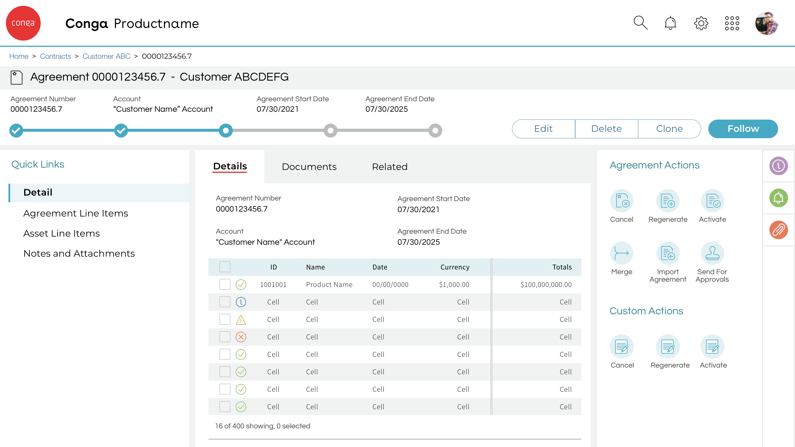
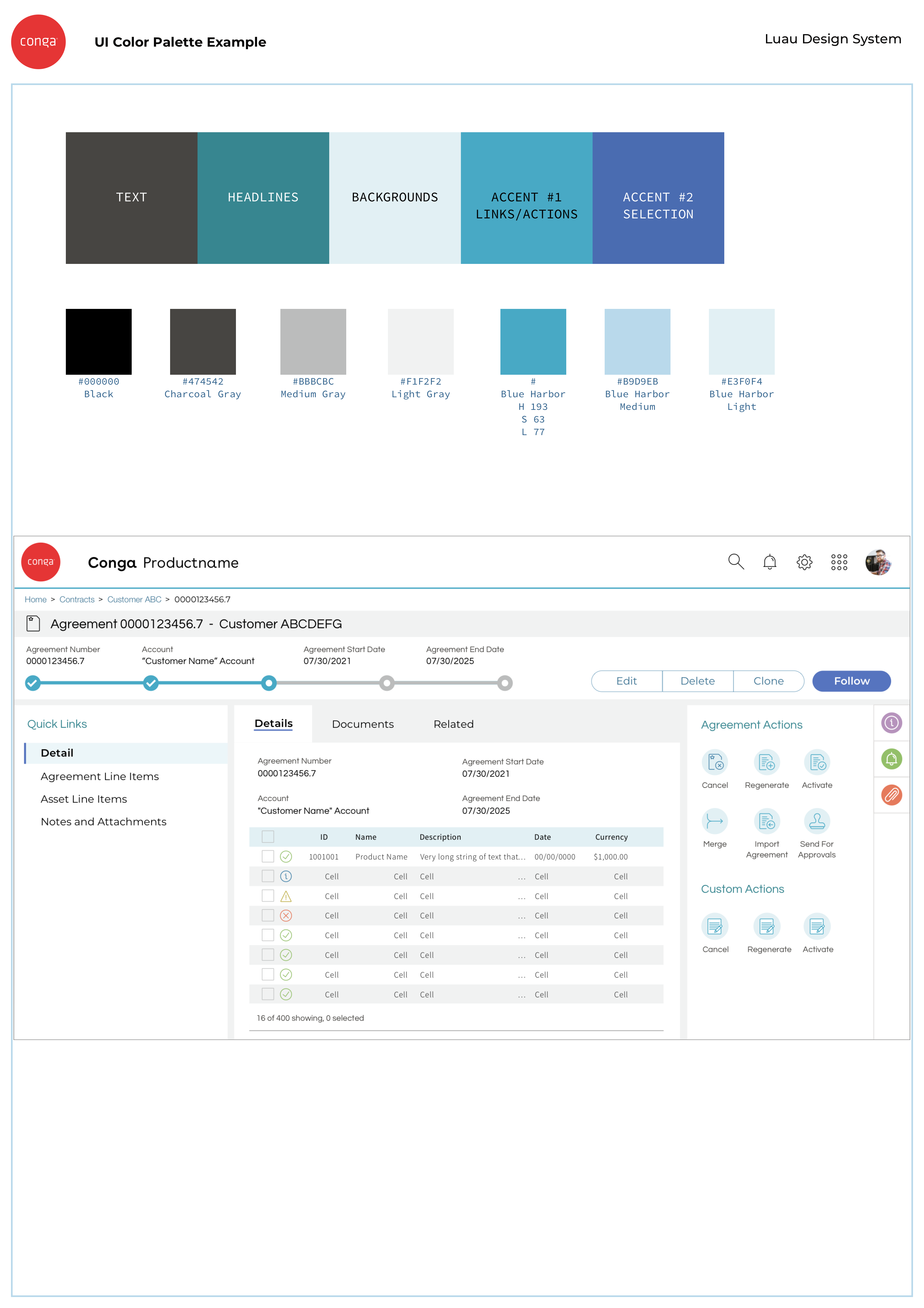
Example screen showing how UI colors might be applied to a typical UI using the Conga Luau Design System.

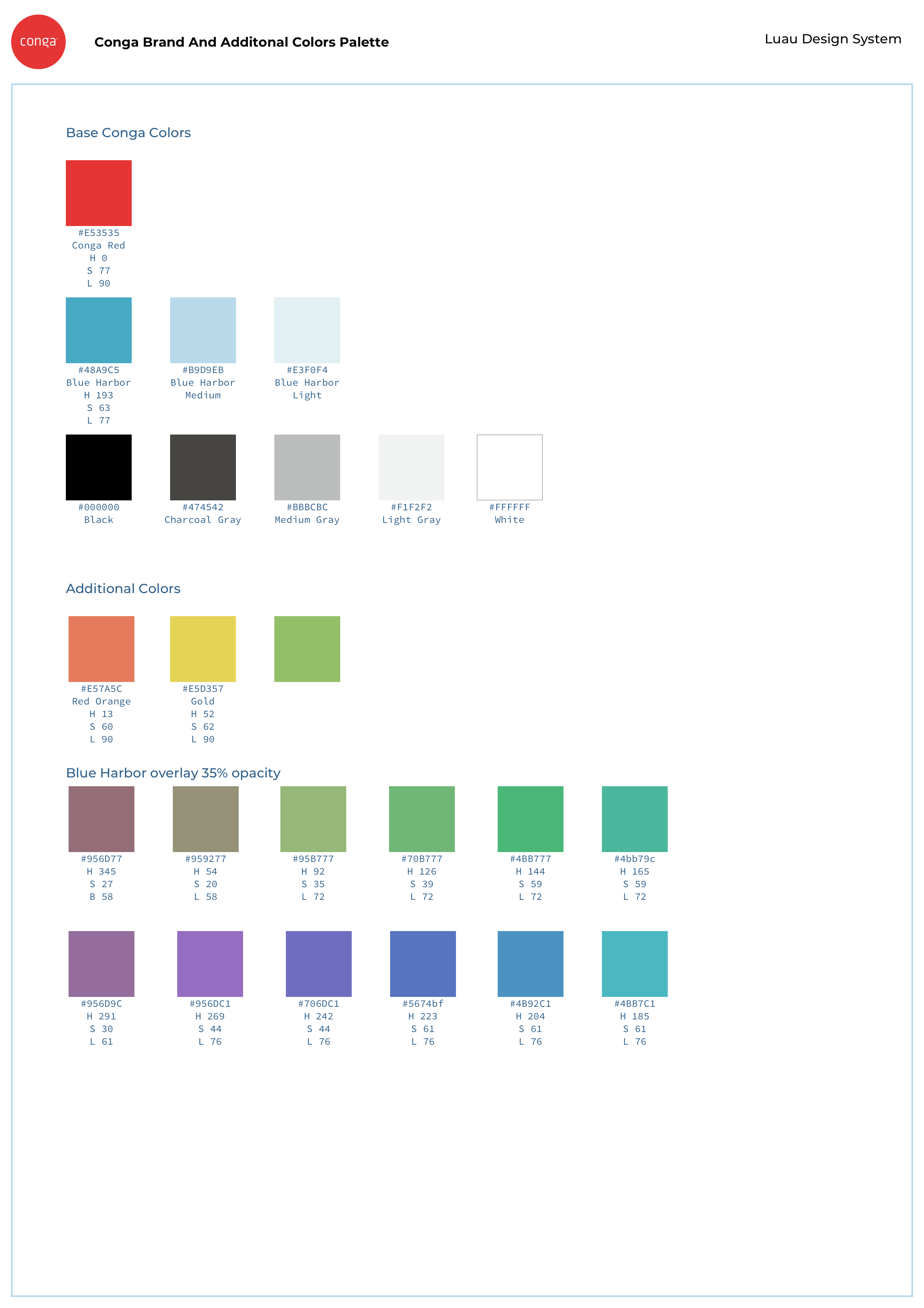
I led the UX team creating the Conga "Luau" Design System version 3.0, a design system and (future) library of components. Worked with Marketing to extend the brand guidelines to support product needs. Contributor on initial interaction design for common UX patterns, based on prior user testing experience.

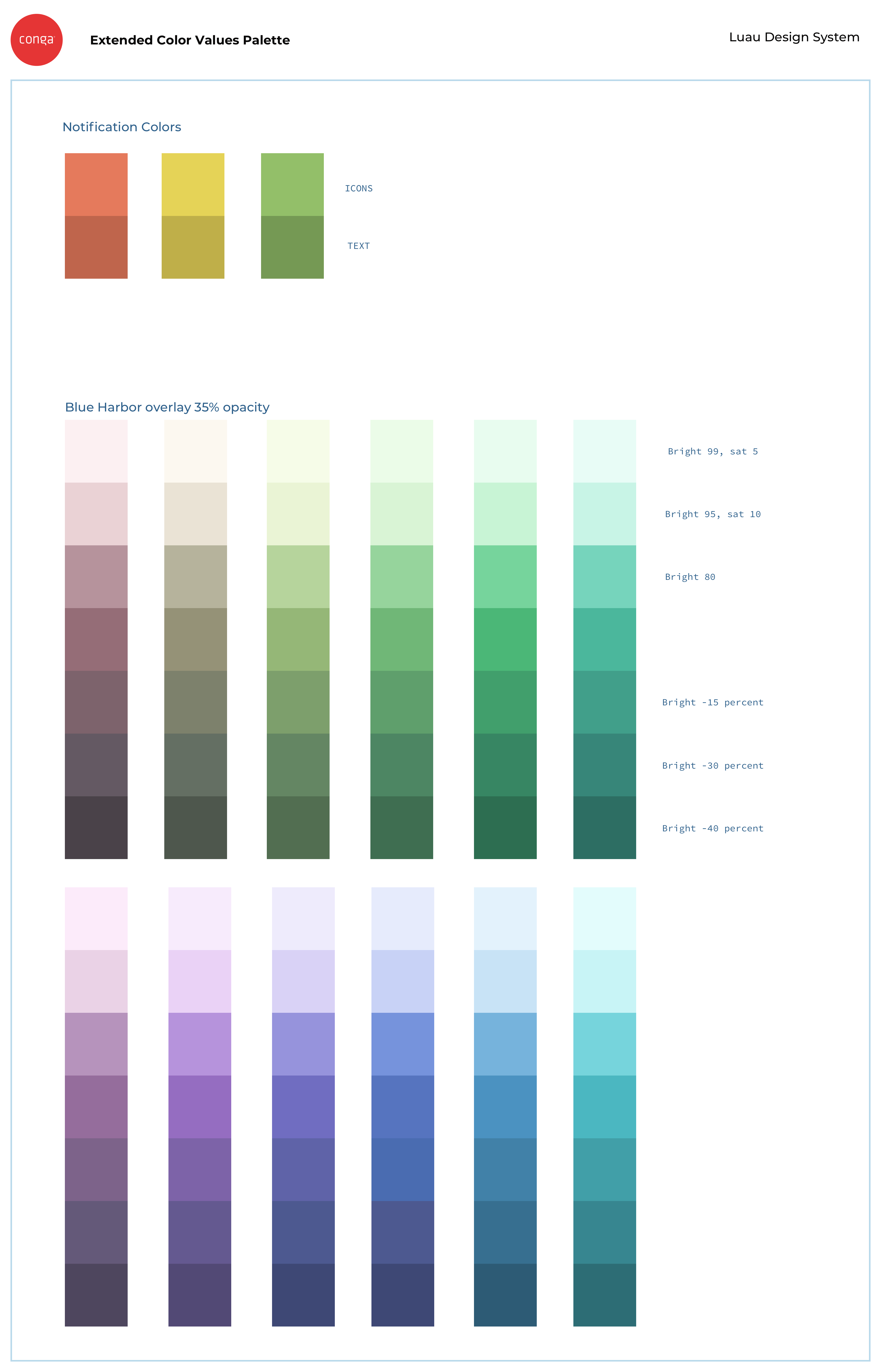
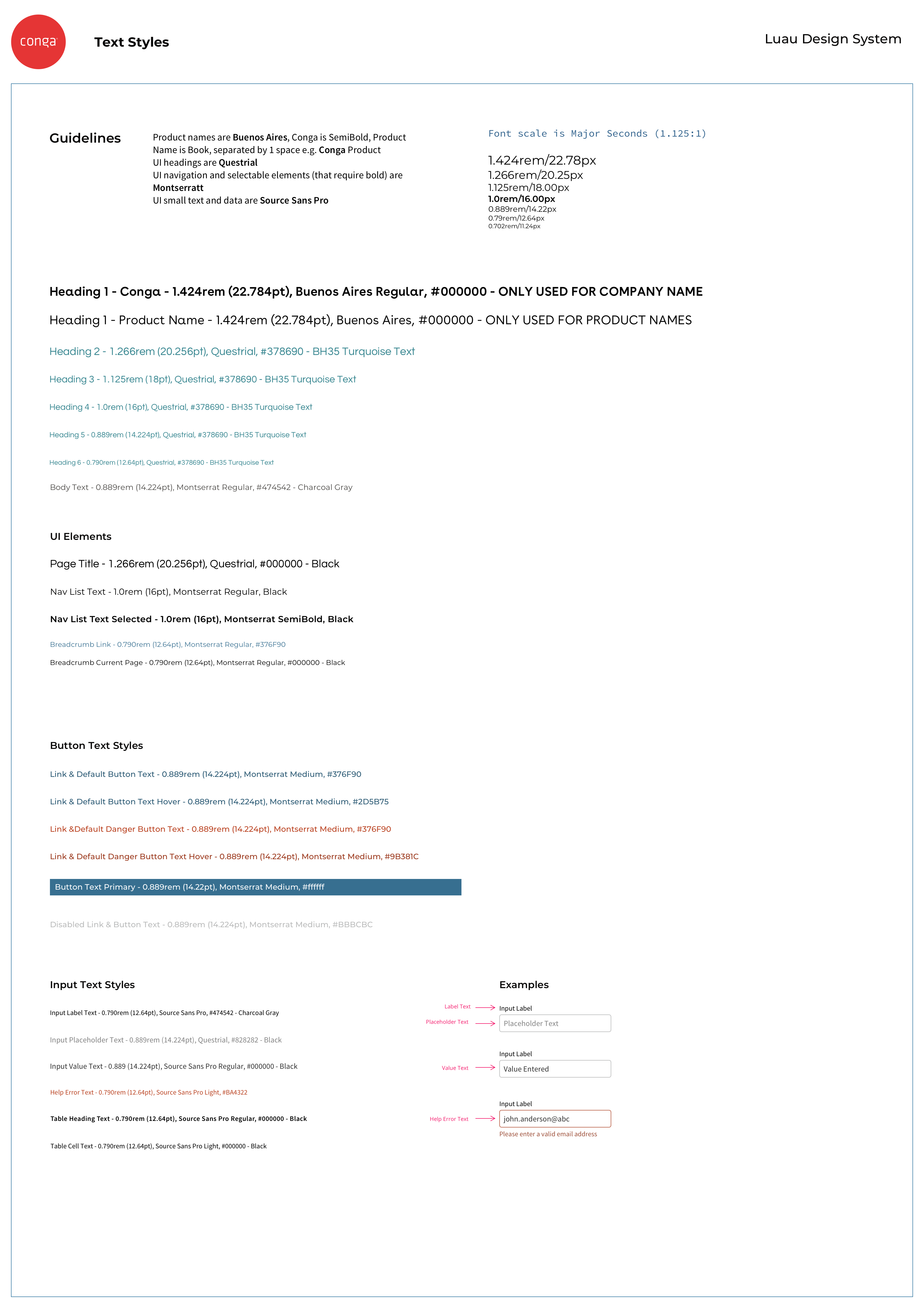
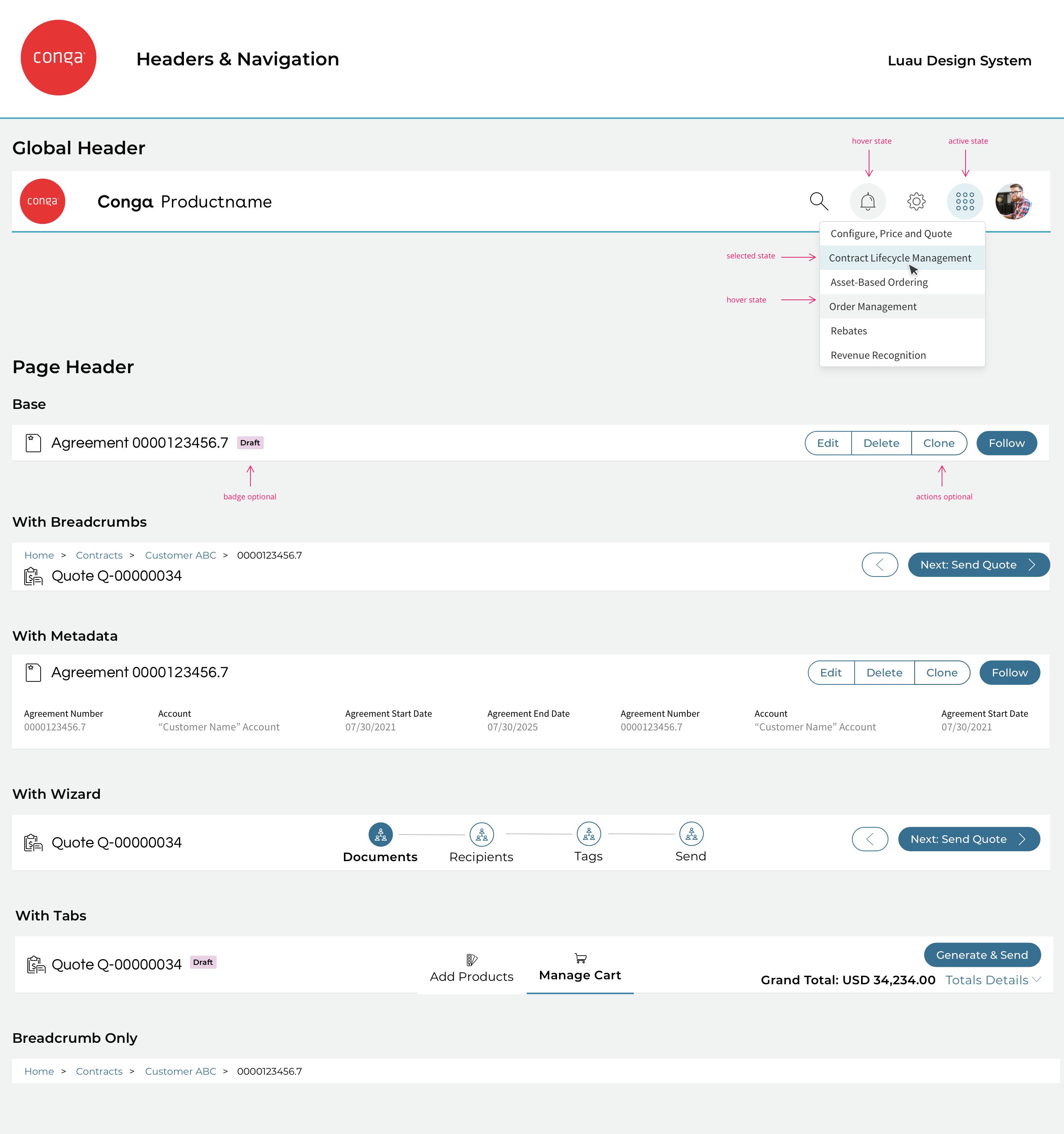
Base brand colors of the Conga Luau Design System. Extended color palette to be used by the Conga Luau Design System.  These are a full range of colors calculated off the base brand color specifications. UI color palette example screen showing how UI colors might be applied to a typical UI using the Conga Luau Design System. Text style specification for the Conga Luau Design System. Header bar specification for the Conga Luau Design System.

UX Team Lead, Coach and Advisor NOVA Design System (Apttus)

Contribution:
UX Team Lead, Coach and Advisor
Target Users:
UX Designers, UI Developers, Product Managers, Partners, Customers
Customers:
IBM
Products:
Enterprise-wide
Outcome:
Customer IBM was so impressed with the Apttus product design style, they requested access to the Apttus Design System so they could use it to match their surrounding apps with our design style. I've never seen such a thing happen at IBM before.
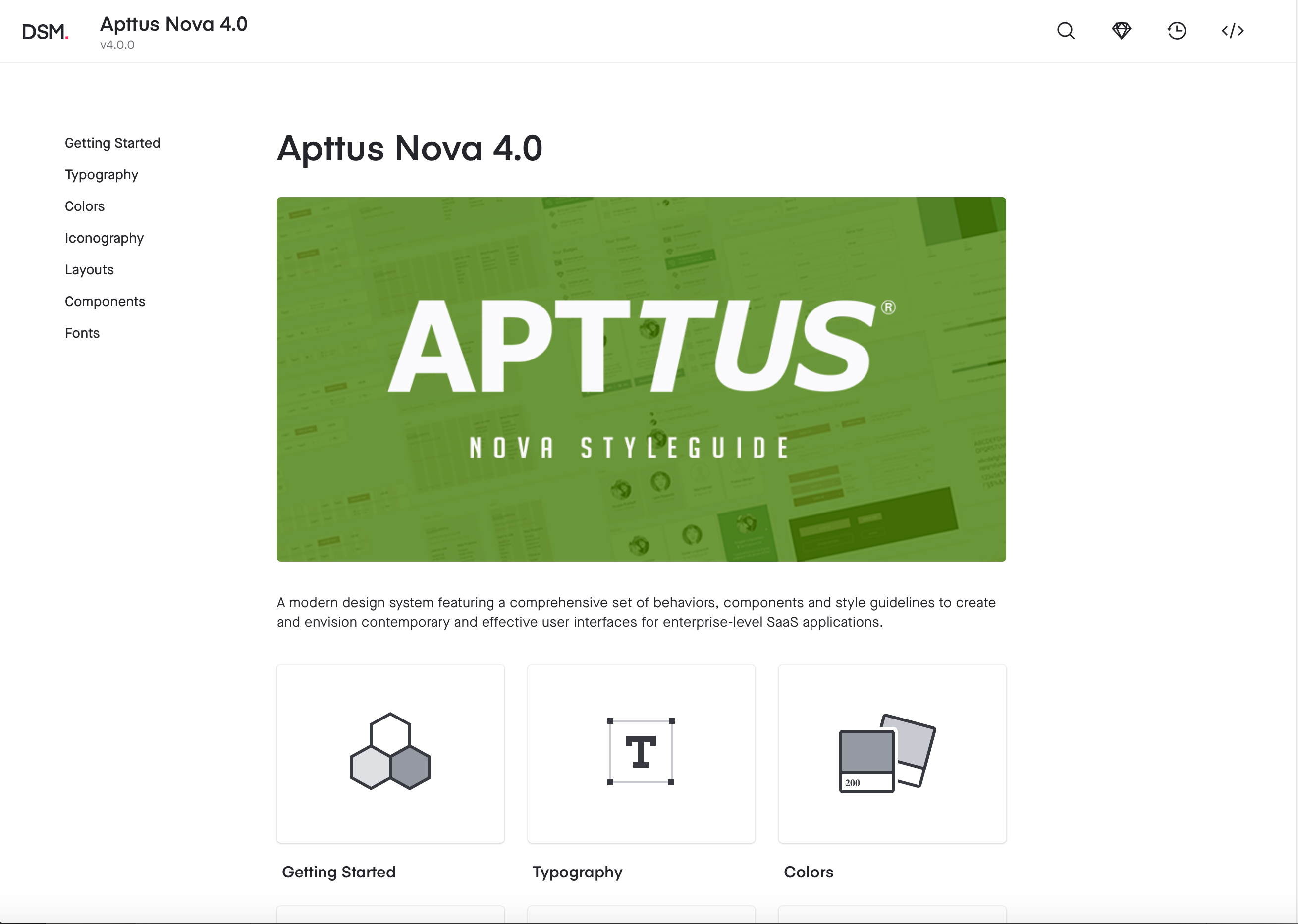
Screen capture of the customer-facing version of the Apttus NOVA Design System.

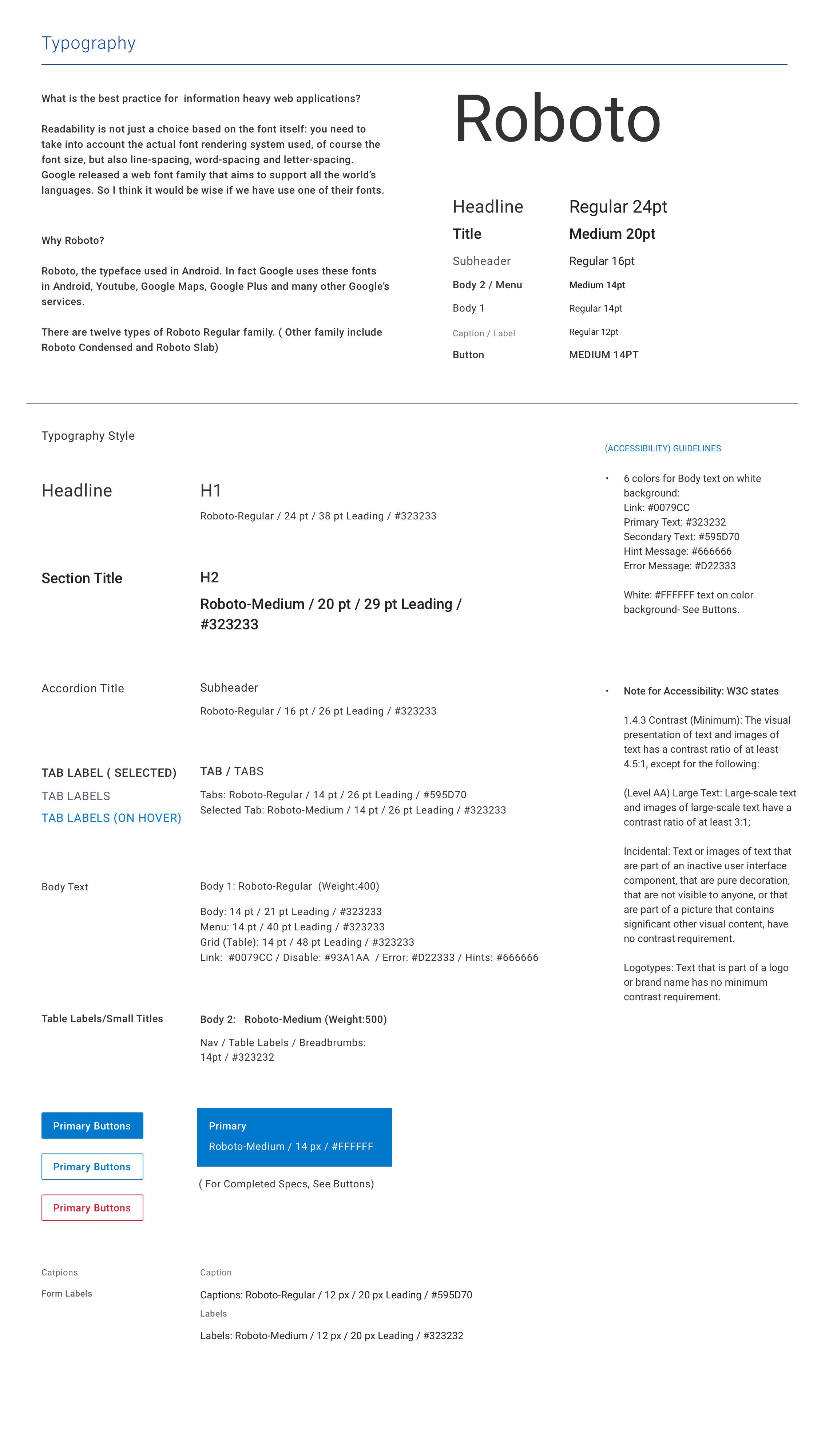
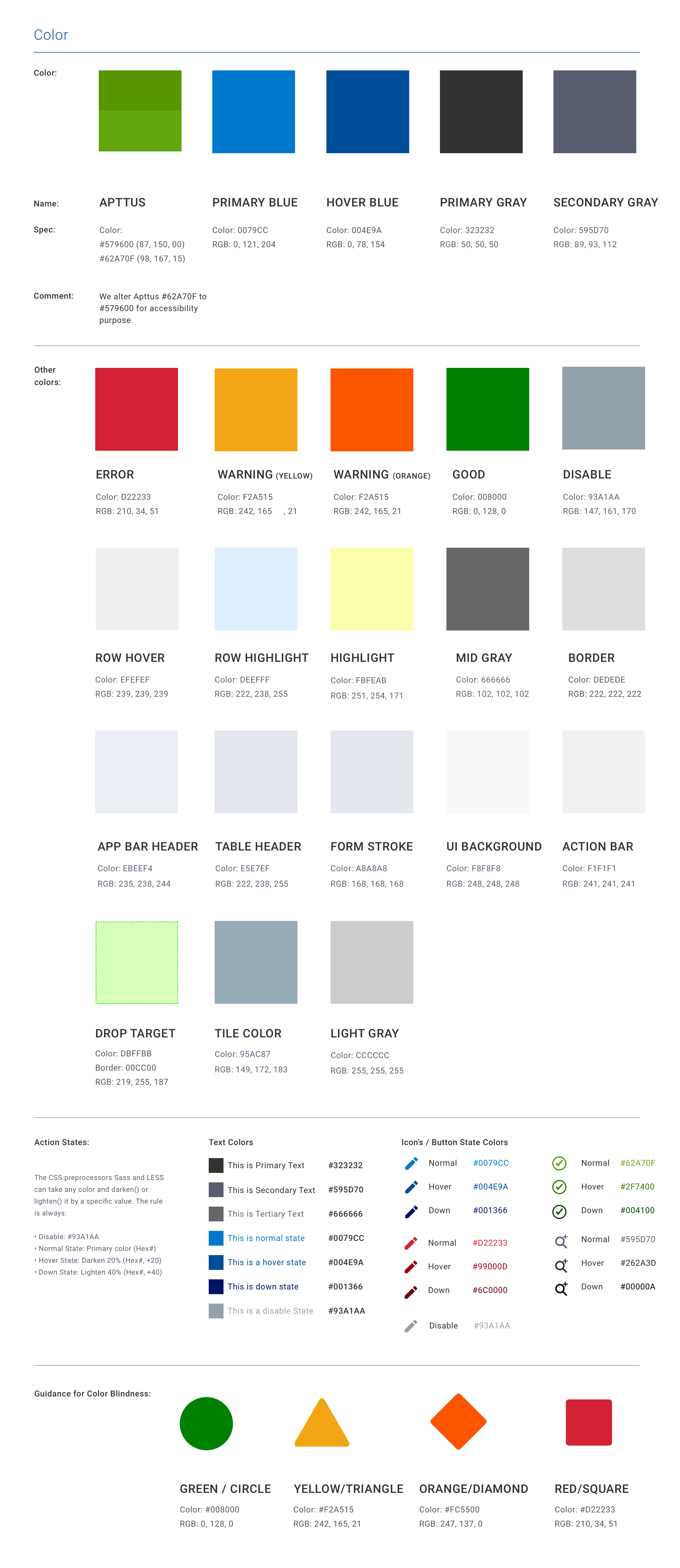
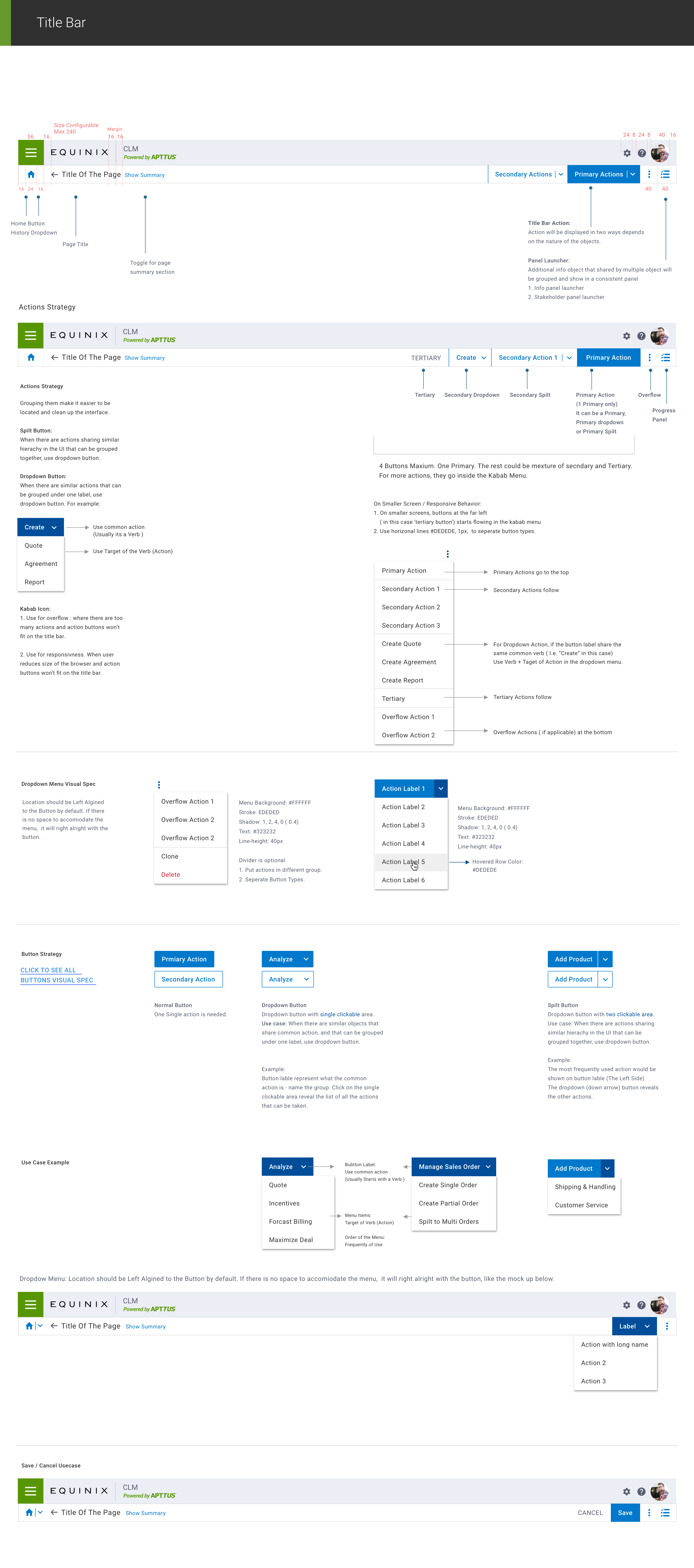
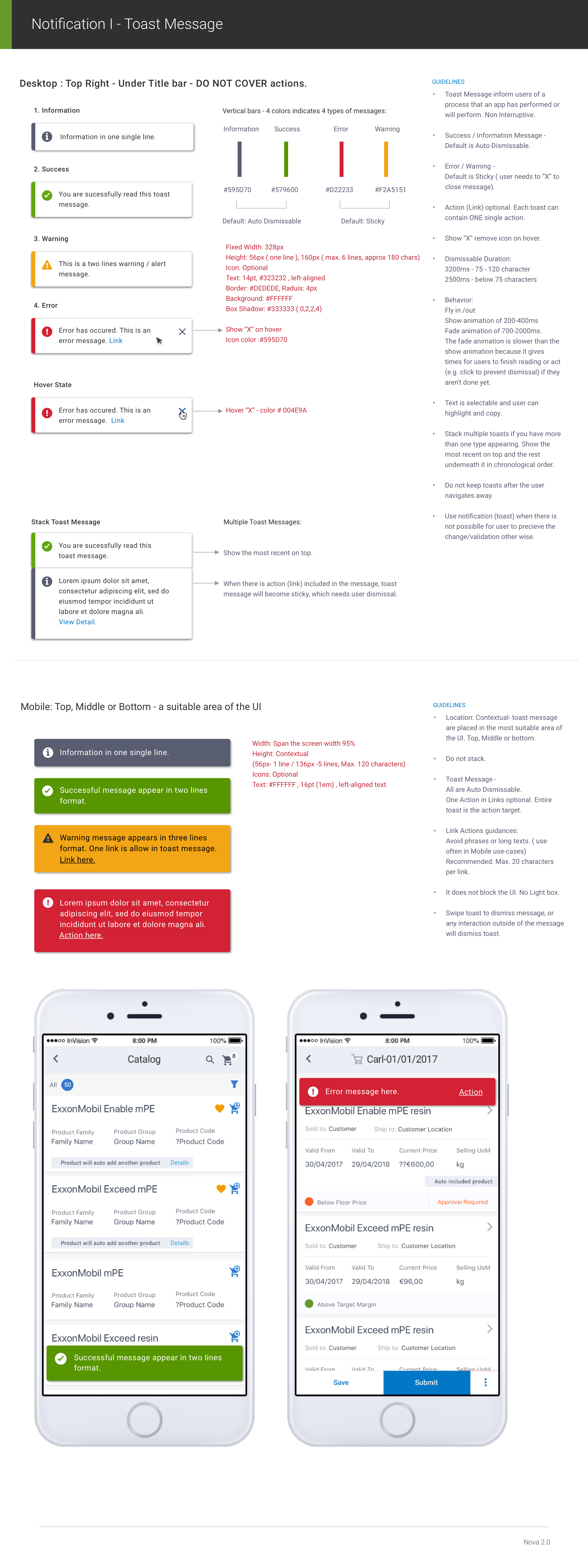
I led the UX team creating the Apttus NOVA Design System, a design system and library of components. Worked with PMs and development teams to design and build Angular components with the Apttus corporate branded look and feel. Moved the UX team to using JIRA to track work and deliver component designs which improved collaboration with development by directly delivering designs on developer JIRA tickets. Provided guidance to the UX team on internationalization and accessibility, and provided input on interaction design for common UX patterns, based on prior user testing experience. Led the UX team in publishing the NOVA Design System using InVision's DSM (Design System Manager) for internals and customers to access.

Type specification screen from the Apttus NOVA Design System. Color specification screen from the Apttus NOVA Design System. Title bar specification screen from the Apttus NOVA Design System. Notification specification screen from the Apttus NOVA Design System. Data table specification screen from the Apttus NOVA Design System.

UI Guidelines Author User Interface Guidelines (Callidus)

Contribution:
Guidelines Author, Interaction Design, Sample Code
Target Users:
UI Developers, UX Designers, Product Managers
Customers:
CallidusCloud
Products:
Enterprise-wide
Outcome:
The CallidusCloud UI Guidelines were part of the key to unifying 16 enterprise products, more than half acquisitions, into a cohesive integrated portfolio.
Screen capture of CallidusCloud UI Guidelines.

I authored the corporate UI guidelines through several revisions. Worked with the Marketing team on branding elements and utilized marketing brand to inform visual treatment in our design language, from fonts, colors, graphics and layouts.

Version 1 I authored in just 2 months to unify all products by the summer conference.
Version 2 was in force over the next 12 months and with occasional updates.
Version 3 was a timeboxed 4-month effort, with UI pattern contributions from 2 other UXers.

Screen capture of a later revision of the CallidusCloud UI Guidelines.

Mobile Design User Research, Interaction Design

Early Adopter iWatch Design Litmos iWatch App (Callidus)

Contribution:
Visual Design
Target Users:
Sales Managers, Education Developers
Product:
Litmos (LMS - Learning Management System)
Outcome:
This was implemented into a working POC to impress customers at our annual conference. It showed us as leading the industry in mobile and wearables as the iWatch design guidelines were not even final at the time.

I had a 2-week window to design a cutting-edge iWatch app for a new education product to be launched at a conference. Apple iWatch design guidelines were not even complete at the time.

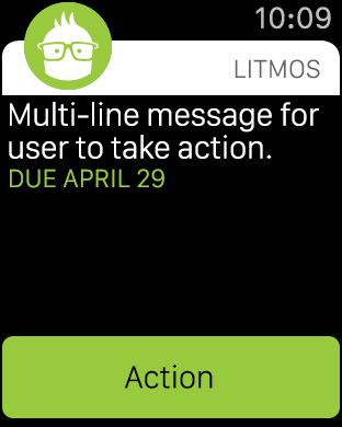
iWatch short look design, activated by rotating the wrist to see the screen.
iWatch long look design, activated by touching the watch screen.
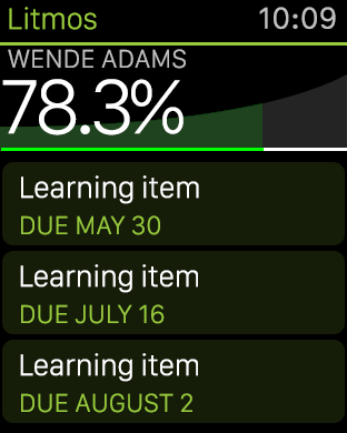
iWatch Litmos home screen design.
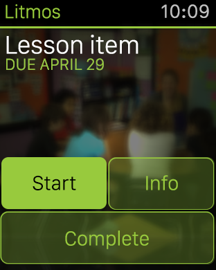
iWatch Litmos example lesson screen design.

Responsive Web Design Apttus Rebates

Contribution:
Visual/UX Design
Target Users:
Sales, Finance Ops
Product:
Rebates

I promoted working out at least the main 'hero' screens for the various target device/formats we supported to ensure designs would be responsive. Our mobile app is native, integrated into Salesforce, so we applied similar styles as the web, but there are significant differences we couldn't control.

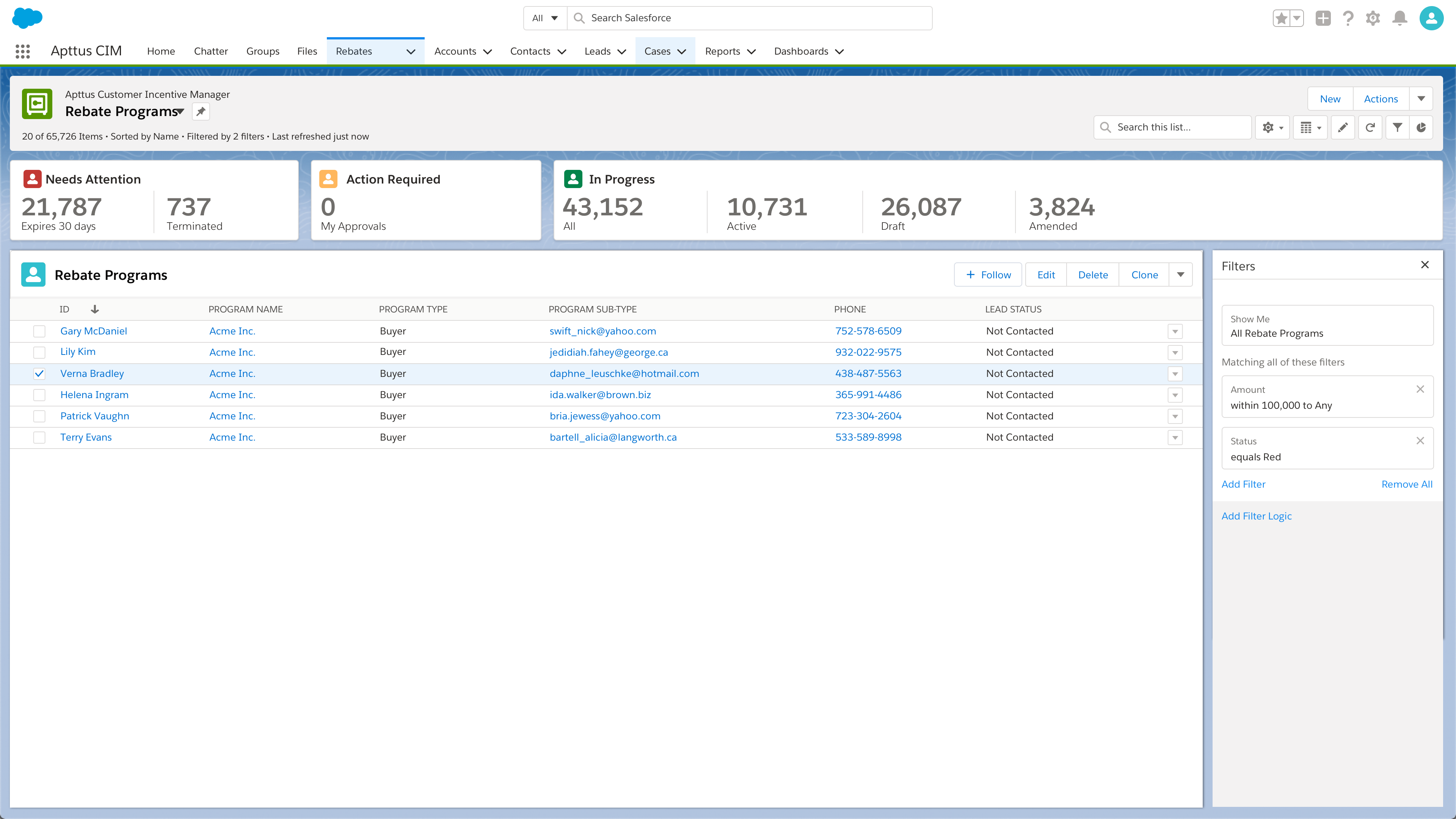
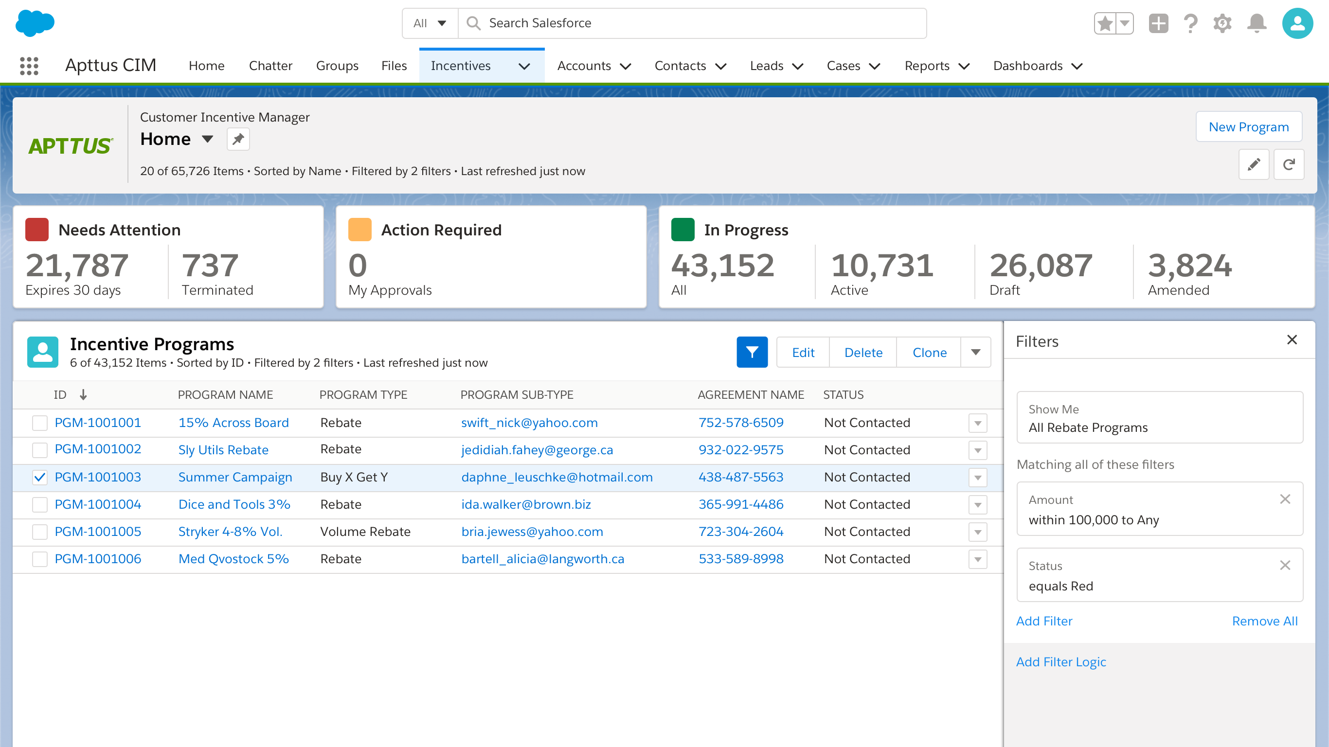
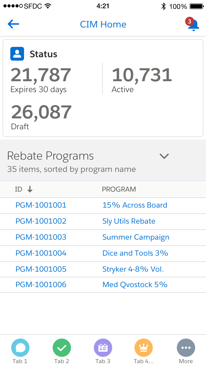
External monitor size version of Apttus Rebates main dashboard UI. Laptop size version of Apttus Rebates main dashboard UI. Smart phone size version of Apttus Rebates main dashboard UI.

Enterprise Mobile Catalog and Shopping Cart Prototyping CPQ Mobile Catalog (Apttus)

Contribution:
Prototyping, Interaction Design
Target Users:
Sales, Account Executives
Customers:
Philips, Illumina; also tested on UserTesting.com
Product:
CPQ
Outcome:
Both A and B versions tested well above passing for ease of use with 100% task success for complicated enterprise quote creation, averaging less than 15 minutes on mobile devices. This mobile version was new to the market when released.

I helped build out the mobile prototypes for an A/B test of our Configure, Price, Quote Catalog, as well as define the test materials and run some of the tests. The design was done by my colleague on the team (Nico Arrington). The design style is following Salesforce Lightning Design guidelines for mobile. This project was 184 screens just for my B test. This was accomplished within two sprints. These are just a handful of samples.

Mobile screen showing Salesforce news feed with Apttus tasks. Mobile screen showing Salesforce app main menu with Apttus applications integrated. Mobile screen showing Apttus proposal list page inside Salesforce app. Mobile screen showing initial Apttus CPQ Catalog page. Mobile screen showing Apttus CPQ Catalog filter page. Mobile screen showing Product Comparison page in Apttus CPQ. Mobile screen showing Product Configuration page in Apttus CPQ. Mobile screen showing Apttus CPQ Cart Summary page.

iPad Design Storage Capacity Planner App (IBM)

Contribution:
Visual Design
Target Users:
CIO, I.T. Operations, Storage Managers
Customers:
BNY Mellon, IBM (internal)
Product:
Storage Capacity Planner
Outcome:
The design and development of this product made it possible for CIOs and Operations to deploy, manage and retire storage capacity across very large enterprises remotely via mobile devices. This capability previously only existed as a spreadsheet.
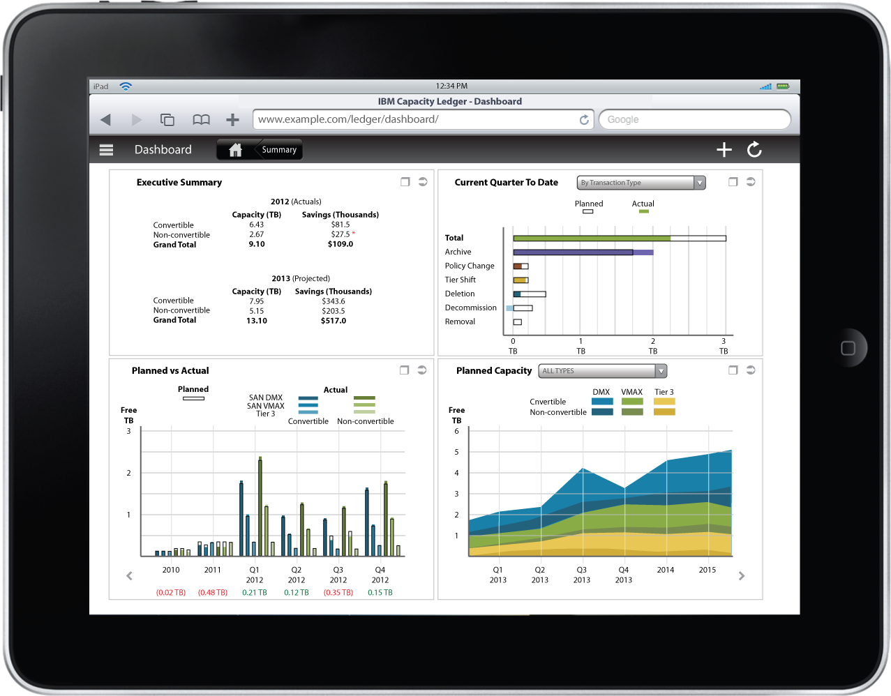
iPad mockup of a proposal for IBM Storage Capacity Planner application.

I collaborated with another colleague to redesign a very complex spreadsheet calculator into a visual dashboard on mobile for managing enterprise storage capacity, showing historic usage and projected usage to aid in decisions around decommissioning and reclaiming storage devices and space. This was one of IBM's earliest forays into mobile applications.

Innovation, Patents Interaction Designer, Inventor

Invention to Improve Usability of Long Select Lists (IBM)

Contribution:
Inventor, Human Factors Engineer

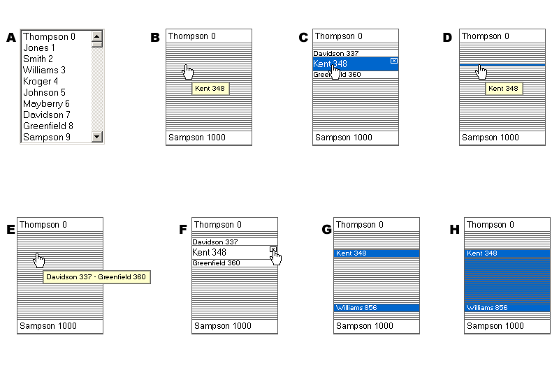
Large lists are historicallly difficult to use.

  1. You can't see the range of values at a glance
  2. You can't see everything selected at a glance
  3. Scrolling up and down to view and select is not ergonomical
  4. Paging back and forth to recall selections has a cognitive load

This design innovation aimed to solve these issues.

  • US Patent US 9652117 B2 - US patent search (Search using only the number 9652117)
  • Japan Patent JP 5528134 B - English search (Search using only the number 5528134).
8 wireframes of my patent design in a single image.  The first screen shows the problem, the other 7 images show various states as the patent design is in use.  Versions of these were used in the actual patent submission.

Innovation for Average User to Visually Create a Query

Contribution:
Interaction Designer, User Research, User Testing
Target Users:
Legal, Attorneys
Product:
eDiscovery

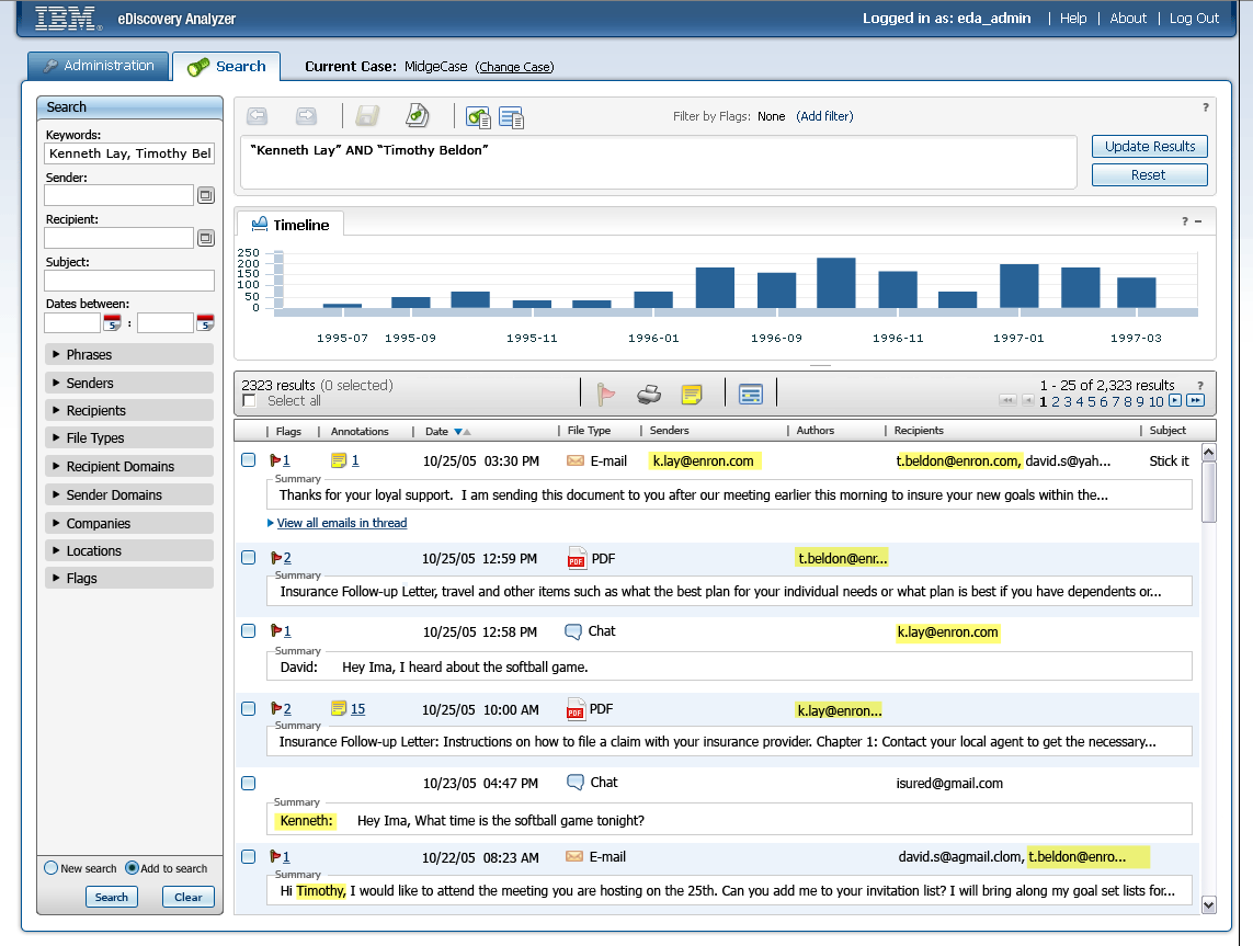
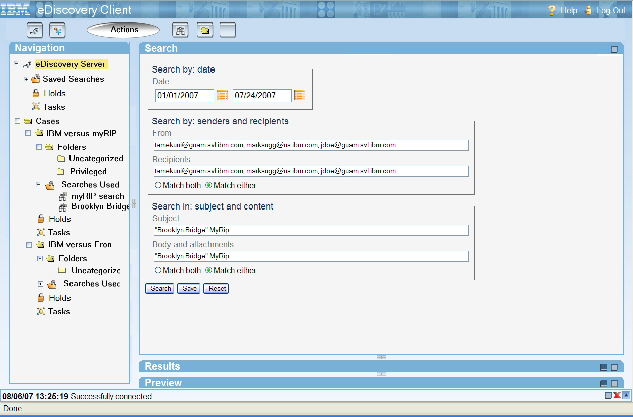
The original version of eDiscovery was just a simple email search. But that only works if you know the exact contents of the email you are searching for. For legal discovery, the contents are unknown and the attorney needs assistance to help uncover what contents are there and quickly determine if it's responsive in a case.

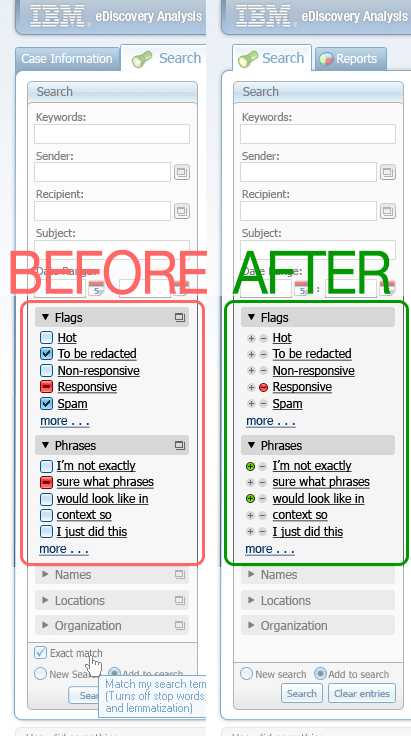
The first thing we did was add the ability to search with query language, not restricted to common fields like From, To, CC and the subject line. The problem with that is not all people can recall and use query syntax.

The second addition to assist searching was detecting and surfacing 'facets' in the contents to allow the attorney to discover what terms were common and pick those to visually generate the query for them.

We struggled a bit with how to visually show AND vs OR and IS vs NOT. For example, using multi-state checkboxes was confusing. Eventually, through user testing, we hit upon using plus/minus signs for IS and NOT, and we made all selections within a facet AND while selections across different facets OR. This proved very intuitive for users in building queries and avoided them having to know syntax, putting parenthesis in the correct places and choosing the correct operators in the query.

We filed for a patent. It was released as a publication (authored by team member Tina Adams) to protect the idea. Read the publication here.

Click on the images to view full size and see the details.

Screen capture of initial state of eDiscovery UI after redesign.  Just shows the search and facet panel on the left, the actual query on top, and the results below that. Close-up comparison view of the facet panel showing before using multi-state checkboxes, and after using plus and minus symbols. Close up of the query input box showing a sample mockup query string. Screen capture of original eDiscovery UI before redesign.  Just a basic search on from and to fields and the subject line.

Meaningful Motion

Contribution:
Interaction Designer
Product:
Commissions, CPQ, all Sales Performance Management

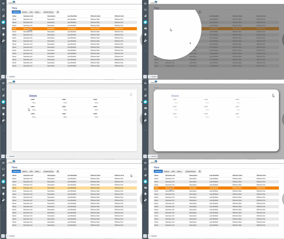
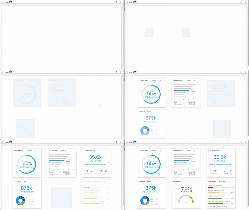
Problem: the cognitive load of when a user clicks on navigation and there is a huge contextual shift when content just appears, often overtaking the screen, leaving the user feeling like they are just being thrown from application to application and unable to track where they are or where they came from.

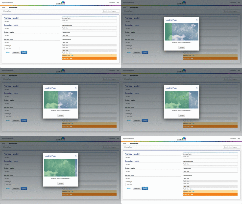
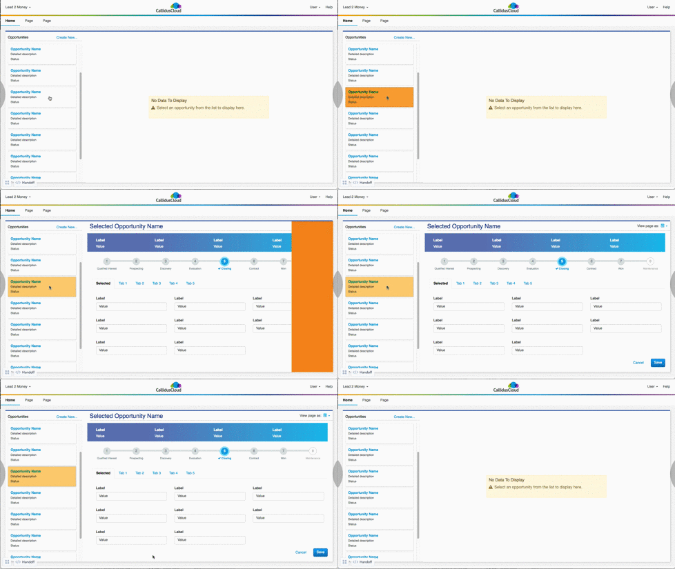
Proposed solution: I recommended utilizing 'meaningful motion' to illustrate for the user where the new content is coming from, show the connection between what they clicked on and the new content, and reassure them where hidden content went so they can get back to it. Additionally, explored different ways to improve the loading experience of data intensive UIs.

Note: these are really wireframes of the ideas and should not be regarded as high-fidelity final proposals. Actual final design and implementation would be more subtle and elegant in appearance.

Animation showing a data table where a user clicks on a row to get details, and the row expands to fill the table area showing field/value pairs as details, then collapses back into the row when done. Animation showing a dashboard of KPI widgets loading asynchronously, each expanding from a single point and growing to full size while the data fades into the display at the same time. Animation showing an alternate way to display a progress dialog where the progress bar is a picture frame showing clouds floating from right to left, while the transparent green progress bar itself flows from left to right on top of that, the clouds still visible through the transparent green progress bar. Animation showing a user click on the third item in a list, which then wipes to the right to fill the content area with the item details.

The Dashboards with AI prototype also has some meaningful motion implemented. For example, when clicking a button or menu item, the source element has a filled outline that scales and moves to the location where the content appears to make the connection. (After linking to the Dashboards with AI section, scroll down to where the link to the prototype and the script to follow are).

Full-Stack UX Design User Research, Interaction Design, Visual Design, Front End Developer

UX Designer, UI Developer Corporate Tax Solution (Liquid Engines)

Contribution:
UX Designer, UI Developer
Target Users:
Corporate Tax Preparers
Customers:
KPMG, Thomson Reuters
Products:
GPM (FIN 48 corporate tax calculation), AMx (state apportionment)
Outcome:
GPM was so well-received by customers that two additional products were spun off from it (AMx, STx) and led to Liquid Engines being acquired by Thomson Reuters.

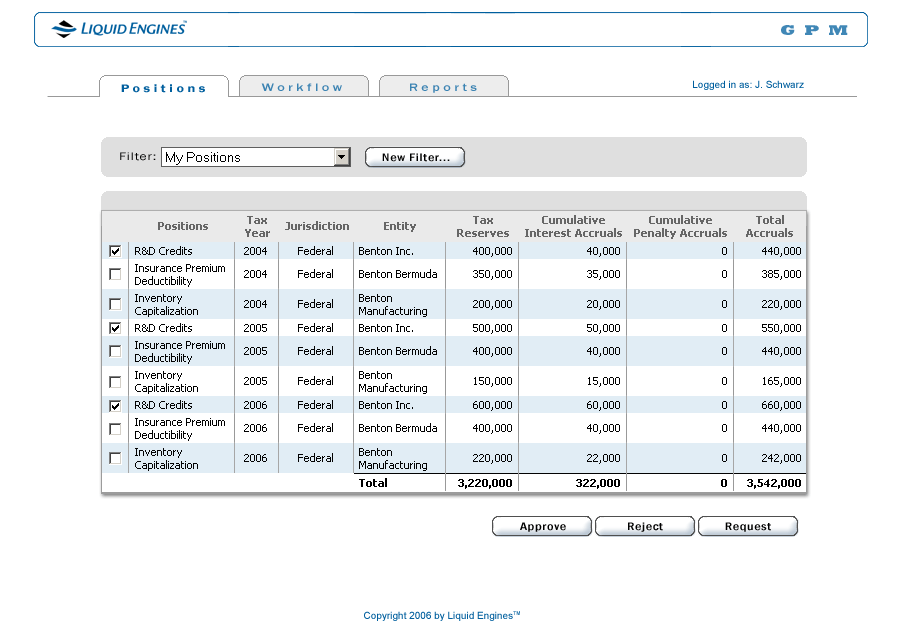
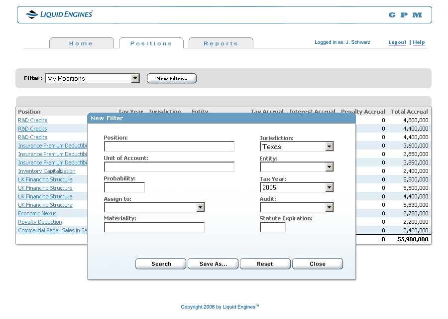
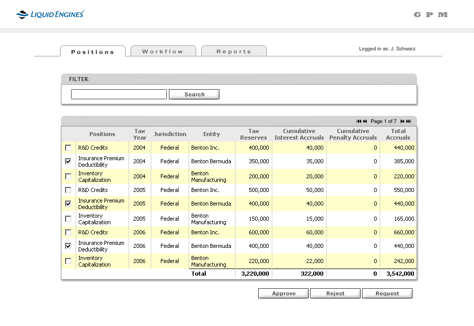
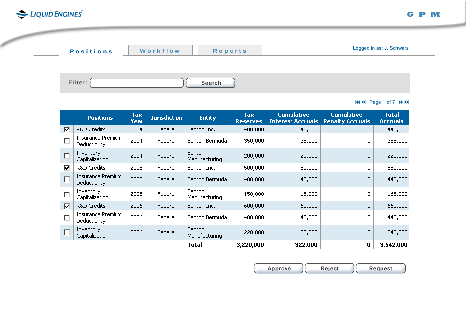
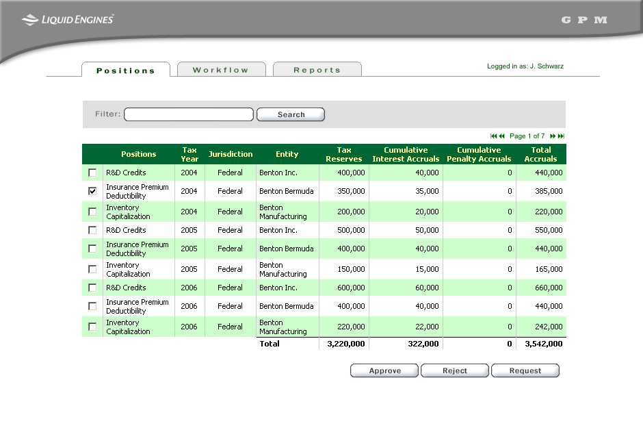
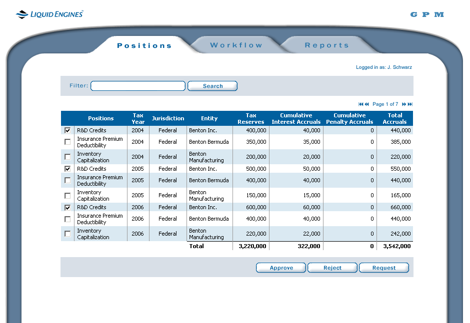
This product was created to manage the complexities of FIN 48 rules. Needed to make a user-friendly, easy to use, guided experience for users with corporate tax domain knowledge. Users will spend hours in these screens on the desktop, so kept the color scheme very light and as easy on the eyes as possible. The data in the tables was the focus. My HTML/CSS/JS was production-ready and used as the UI of the actual product. KPMG raved about the UI, and Thomson Reuters bought the company.

I was the sole UX designer, doing User Research, Interaction Design, Visual Design and Front End Development. My DHTML code prototypes were used as the initial basis for the product UI in the build.

Photoshop Mockup
Final Photoshop mockup submitted to LiquidEngines team for approval.
Product
Screen capture of DHTML code used as intial UI for LiquidEngines GPM software.
Presentation Mockups
One of 8 presentation mockups shown to LiquidEngines team to set the look and feel of their software. One of 8 presentation mockups shown to LiquidEngines team to set the look and feel of their software. One of 8 presentation mockups shown to LiquidEngines team to set the look and feel of their software. One of 8 presentation mockups shown to LiquidEngines team to set the look and feel of their software.
Final Design

The customer chose a hybrid of elements they liked for the final version.

Final Photoshop mockup submitted to LiquidEngines team for approval.

Working HTML Prototypes Sales Compensation Plan Redesign (Callidus)

Contribution:
UI Developer, UX Designer
Target Users:
Sales Ops
Customers:
Kaiser, Medtronic, Lexus Nexus, Sunrun, Vivint
Product:
Commissions
Outcome:
This interface made it so compensation plans could be created in mere minutes with 100% task success and tested well above passing for ease of use. Previously Commissions had a minimum 1-year learning curve (per customer interviews) and creation of individual compensation plans took an hour or more.

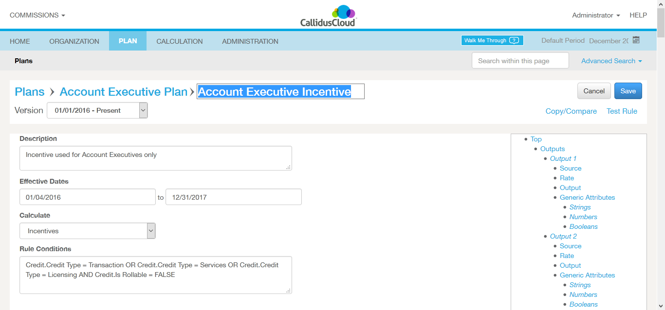
Screen capture of a fully-interactive HTML/CSS/JS stand-alone application prototype that simulated how the actual product would work.  This prototype was used for A/B testing of proposed designs.

This critical core feature was needed to enable advanced users to create complex compensation plans composed of dozens, even hundreds, of complex calculation rules. The complexity meant it would be impossible to design without a proper user test and real user input. So we created a couple version of working HTML prototypes to test as if it was live product and A/B tested those two versions.

Run the 'A' prototype (Test script to use with the prototype).

Personas, Empathy MapsUser Research

Empathy Maps

Contribution:
User Research, Author
Target Users:
Sales, Sales Ops, Legal, Legal Ops, Financial Ops, Business Analysts, IT Administrators
Product:
B2B Commerce File Transfer Multi-Enterprise Gateway, Territory and Quota, Commissions, Sales Reporting

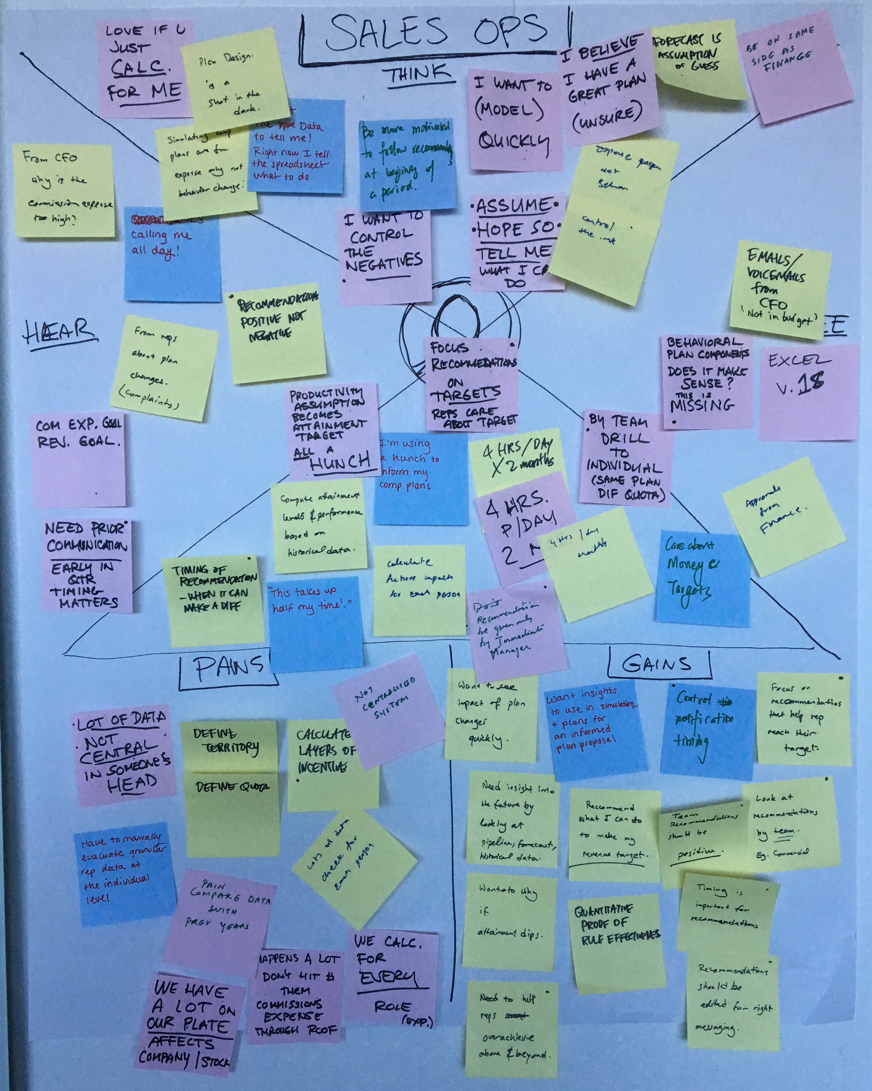
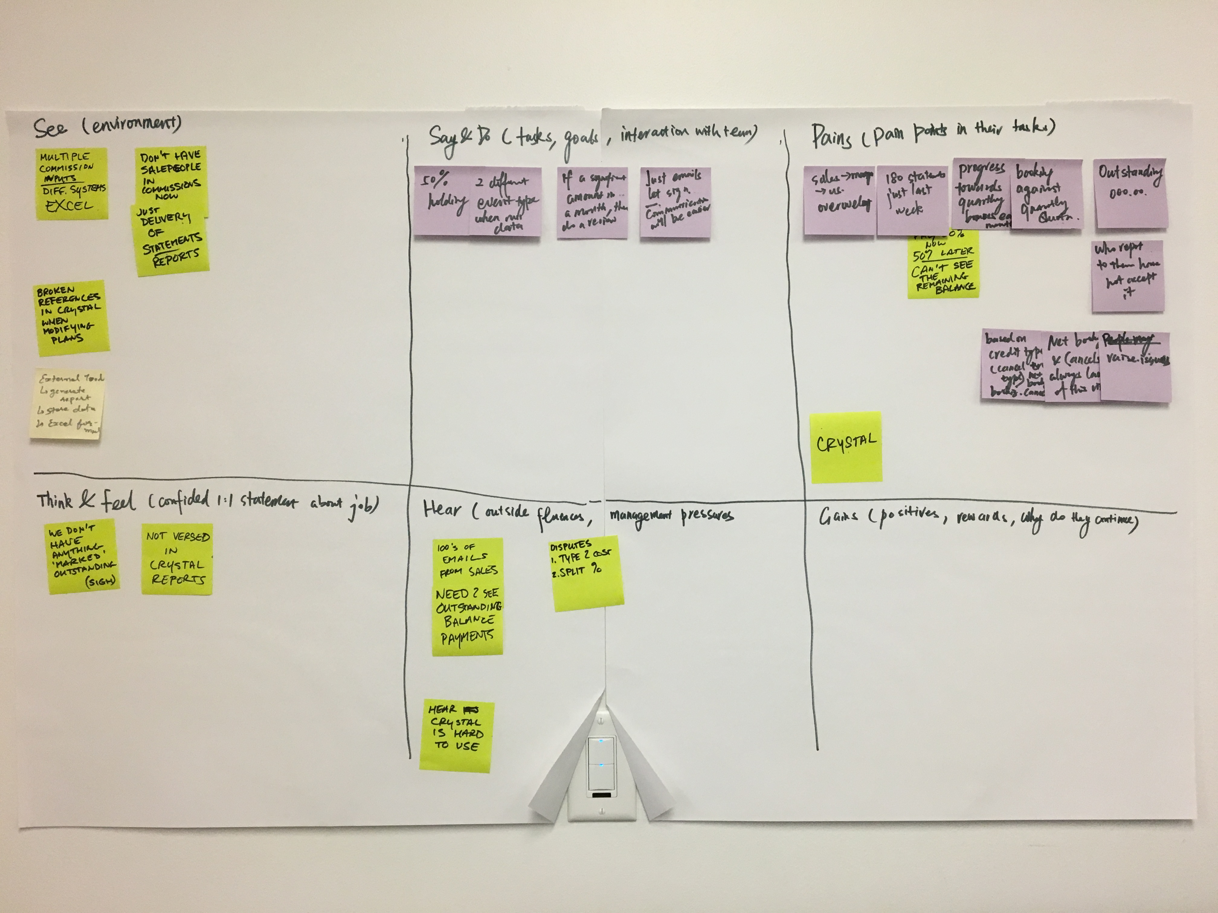
Since being trained in Design Thinking and promoting and adopting the process in every company since, a key initial artifact the team creates is an Empthy Map, which are based on direct user interviews and compiled as a lean way to get to know the user as a generalized persona we can design for. My goal here is to have sufficient information to satisfy a variant of the 80/20 rule: that 80% of our users will be satisfied with the resulting solution and the other 20% can still live with it and be successful.

Mind map image used as the Empathy Map for one of the IBM Control Center personas. Whiteboard showing Empthy Map for a Territory Administrator. Whiteboard showing Empthy Map for a Sales Ops. Whiteboard showing Empthy Map for Commissions Manager.

Personas (IBM)

Contribution:
User Research, Persona Author
Target Users:
Business Analysts, Database Administrators, IT Administrators
Customers:
State Farm Insurance
Product:
Content Manager, Document Manager, Records Manager, Case Manager, Business Process Manager

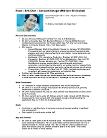
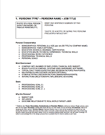
I was part of a team that developed a template for personas (based on the Alan Cooper model) and authored multiple personas for use with our enterprise search, discovery and repository products. I authored the template and the personas linked here. These were based on customer user research and secondary research on the roles as found in the job market, online resumes and professional profiles. Click each image to see that actual persona document.

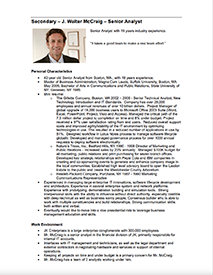
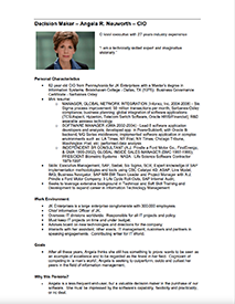
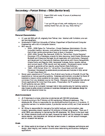
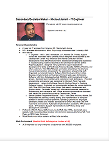
Screen capture of Mid-level Business Analyst persona document. Screen capture of Senior Business Analyst persona document. Screen capture of CIO persona document. Screen capture of DBA persona document. Screen capture of IT persona document. Screen capture of persona template document.

Web DesignHTML/CSS/JavaScript, since 1997

Mortgage Broker Web Site - loanz.com

Contribution:
Web Design, HTML/CSS code
Target Users:
Home buyers
Customer:
Myers Internet Services, Loanz.com

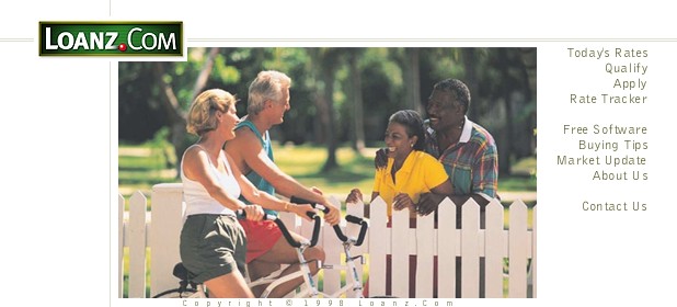
Customer wanted an elegant, enterprise-looking design that made their company look like a larger organization than they are and competed with the real "loans.com" and hoped might be confused with the real "loans.com" at the time. These are presentation mockups. (Site went live with design #1, but that version is offline today).

Presentation mockup that was accepted as the final design for the Loanz.com web site.  It shows two people in an office looking at some papers. Alternate presentation mockup for Loanz.com web site.  This one shows what appears to be neighbors talking to each other over a pickett fence. Alternate presentation mockup for Loanz.com web site.  This one shows the same neighbors inside a home, toasting with a juice drink.

Sculptor Web Site - richardhübscher.com

Contribution:
Web Design, HTML/CSS code
Target Users:
Interior decorators, home decor shoppers, art enthusiats
Customer:
Richard Hübscher

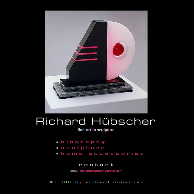
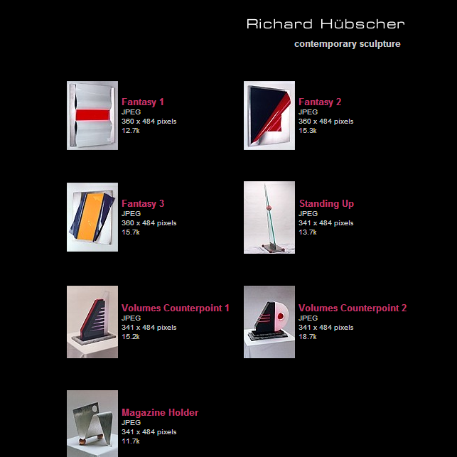
Customer is a sculptor and wanted a web site that complimented and showcased his forms. This was at a time when HTML/CSS were quite limited. To highlight the art work, I used a minimal approach to the surrounding content and used a few HTML tricks of the day to orient text like the art identifiers in museums. (Site is offline)

Screen capture of home page for the web site of sculptor, Richard Hubscher. Screen capture of catalog listing page for the web site of sculptor, Richard Hubscher. Screen capture of a detail page for the web site of sculptor, Richard Hubscher.

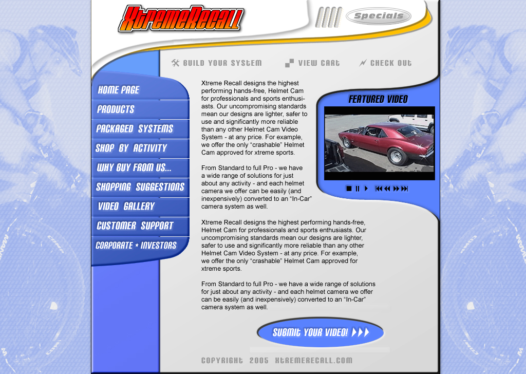
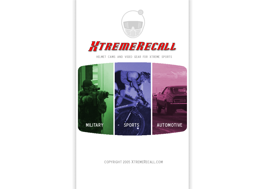
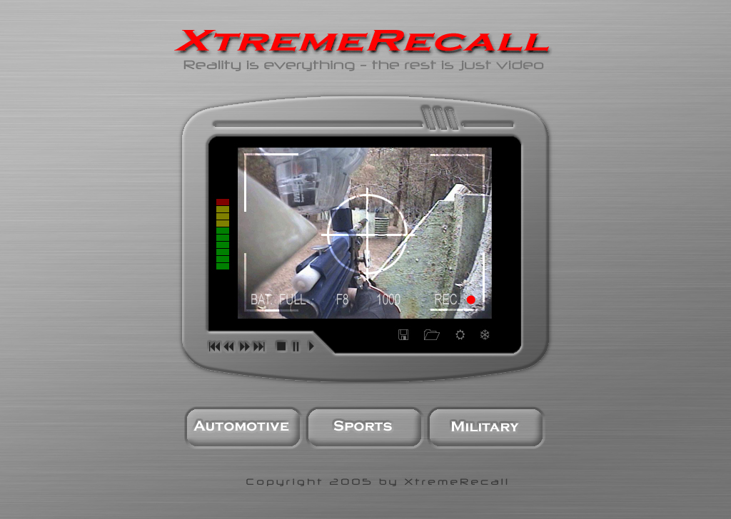
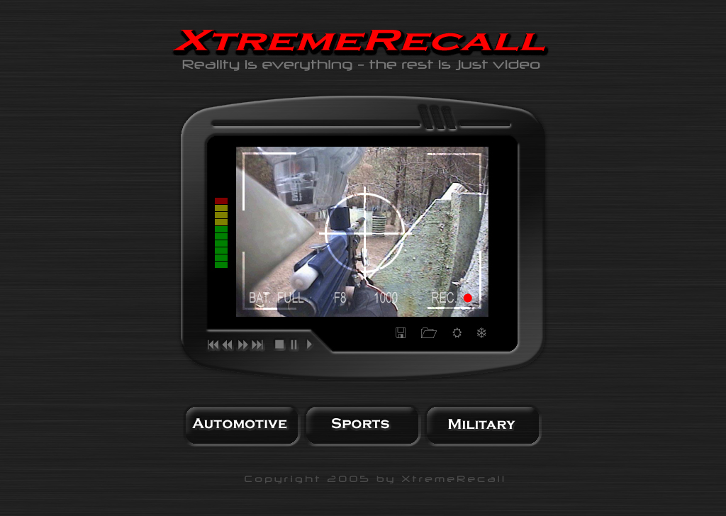
Xtreme Video Web Site - xtremerecall.com

Contribution:
Web Design
Target Users:
X-treme sports enthusiasts
Customer:
xtremerecall.com

These were presentation mockups for web site design. This was done back when Photoshop was version 3.0, which required being really creative to get special effects. Skeuomorphism was just barely becoming 'a thing' at the time. (Site is offline)

Mockup of home page for Xtreme Recall web site.

Visual Design Graphic Designer

ISMP Installer Splash Screens - Alphablox

Contribution:
Graphic designer
Target Users:
I.T. Administrators
Customers:
All
Product:
Alphablox Analysis Suite

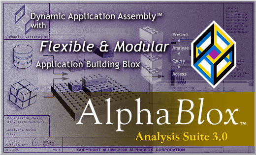
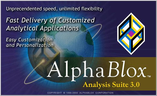
Billboards for the InstallShield Multi-Platform (ISMP) product installer. Created imagery to present marketing messages during the product install process, which could take a while, needing to distract and entertain the user during that time.

The globe and the gears were actually hand-painted by me in watercolor on canvas, then scanned in with other digital elements added.

The first billboard screen shown during the installation of AlphaBlox Analysis Suite 3.0.  It shows a globe with several screen shots of Analysis Suite connected by lines around the globe. The second billboard screen shown during the installation of AlphaBlox Analysis Suite 3.0.  It shows gears interlocked with images of Analysis Suite overlayed on top. The third billboard screen shown during the installation of AlphaBlox Analysis Suite 3.0.  It shows what looks like a paper architectural blueprint with Lego blocks interlocking to symbolize components of AlphaBlox interlocking to funcion. The fourth billboard screen shown during the installation of AlphaBlox Analysis Suite 3.0.  It shows a globe with an atom circling around it and landing in the center of the AlphaBlox Escher logo.


Portfolio


Password incorrect.